如何在facet_grid中更改每行的列数

5
通过使用下面的代码,我可以通过ggplot得到如下图所示的绘图。但是如果像这样绘制,我根本看不到x轴。我想知道是否有任何方法可以解决这个问题,例如更改每行中的列数。我已经尝试在facet_grid中使用ncol命令,但它不允许我这样做。
ggplot(derivative, aes(x = factor(move), fill = factor(move)), colour = black)+ 
geom_bar()+
facet_grid(Market~Season)+
 scale_fill_discrete(name="Relative Market Move",
                  breaks=c("neg.big", "neg.small", "pos.big", "pos.small"),
                  labels=c("Big Negative", "Small Negative", "Big Positive", "Small Positive"))+
 scale_x_discrete(labels=c("Large Negative", "Small Negative", "large Positive", "Small Positive"))+
labs( x = "") +ylab("Count") 

cramped faceted plot


2
你不能(据我所知)使用
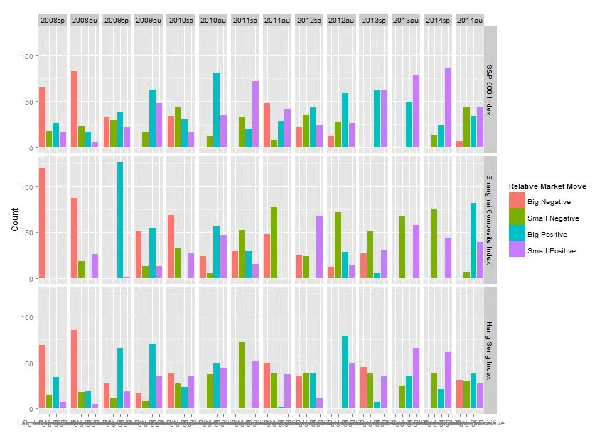
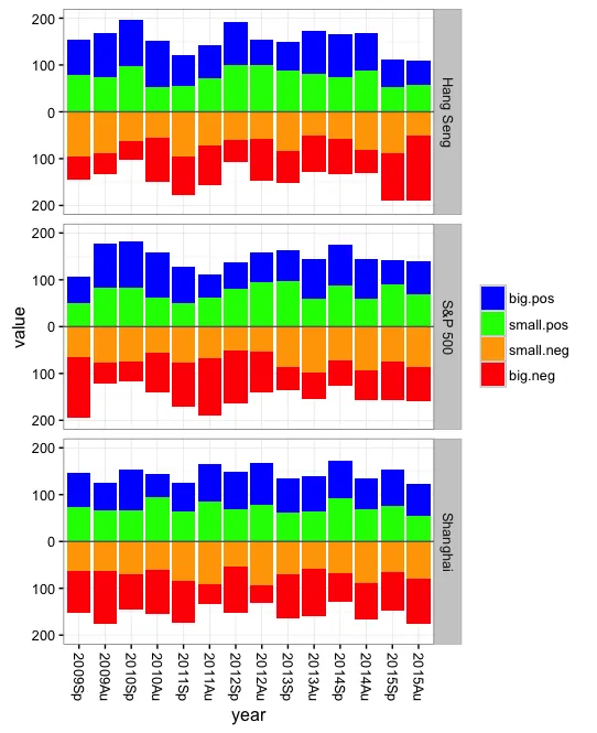
facet_grid设置列数。你可以将一半的列分别绘制在一个图表中,另一半绘制在另一个图表中,但这样你就失去了轻松比较同一行数据的能力。那么,只需显示具有更宽的纵横比的图表,或者将x标签旋转90度呢? - eipi10
网格的确定取决于您传递的公式中变量的级别数量,因此在不更改设置的情况下,最好的选择是按照eipi10所说的将纵横比调宽。替代方案:i 删除x轴标签,因为它们与颜色相同。 ii 使用facet_wrap并仔细计划。 iii 由于水平分面无论如何都是季节,因此将它们作为x轴,并继续使用颜色来制作仅由市场分面的分组条形图。 - alistaire
1个回答

2

你最好使用堆积条形图,并让“负数”条形向下指。这样可以更有效地利用水平空间,更容易看出时间趋势。例如:

library(reshape2)

首先创建一些虚假数据:

set.seed(199)
dat = data.frame(index=rep(c("S&P 500","Shanghai","Hang Seng"), each=7),
                 year=rep(paste0(rep(2009:2015,each=2),rep(c("Sp","Au"),7)), 3),
                 replicate(3, sample(50:100,14*3)))
dat$big.neg = 300 - rowSums(dat[,3:5])
names(dat)[3:5] = c("big.pos","small.pos","small.neg")

# Set year order
dat$year = factor(dat$year, levels=dat$year[1:14])

# Melt to long format
dat = melt(dat, id.var=c("year","index"))

现在开始讲剧情:
ggplot() +
  geom_bar(data=dat[dat$variable %in% c("big.pos","small.pos"),], 
           aes(x=year, y=value, fill=rev(variable)), stat="identity") +
  geom_bar(data=dat[dat$variable %in% c("big.neg","small.neg"),], 
           aes(x=year, y=-value, fill=variable), stat="identity") +
  geom_hline(yintercept=0, colour="grey40") +
  facet_grid(index ~ .) +
  scale_fill_manual(breaks=c("big.neg","small.neg","small.pos","big.pos"),
                    values=c("red","blue","orange","green")) +
  scale_y_continuous(limits=c(-200,200), breaks=seq(-200,200,100), 
                     labels=c(200,100,0,100,200)) +
  guides(fill=guide_legend(reverse=TRUE)) +
  labs(fill="") + theme_bw() +
  theme(axis.text.x=element_text(angle=-90, vjust=0.5)) 

enter image description here


网页内容由stack overflow 提供, 点击上面的
可以查看英文原文,
原文链接