使用背景图片的自定义形状<div>标签

4
我正在尝试实现一个弹出框设计。每个弹出框都有一个带动态生成背景图像的标题。设计要求在标题顶部有一个指针,但我无法想到一种方法来实现这一点并保持背景图像。
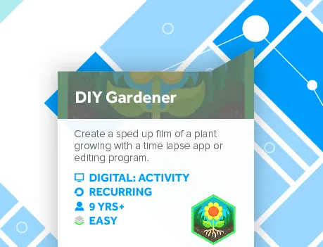
我在这里附上了设计截图。 这是当前标记,不包括指针:
        <div class="popup">
            <header class="popup-header" style="background-image: url(http://thebusstopsherefoundation.com/images/bettis_wave.jpg);">
                <h1>
                    <a class="resourceName" href="" target="_blank"></a>
                </h1>
                <div class="overlay"></div>
            </header>
            <main class="popup-body">
                <section class="details">
                    <div class="resourceDescription">
                        <p></p>
                    </div><!-- /resource-description-->
                    <div class="attributes">
                    </div><!-- attronites-->
                </section><!-- / details-->
                <section class="organization">
                    <h3>Organization Information</h3>
                    <h2 class="orgName">
                        <a href="" target="_blank"></a>
                    </h2>
                    <div class="orgDescription">
                    </div><!-- /orgdescription-->
                </section><!-- /organization-->
            </main>
            <section class="cta">
                <a class="btn" href="" target="_blank">Participate</a>
            </section><!-- cta-->
        </div><!--popup-->

我知道的每个CSS形状实现都需要边框或盒子阴影,但这两者在此处都不适用。你有什么办法来实现这个形状吗?

1
实际上将图像的那一部分设置为透明,并将其作为正方形的背景? - user4639281
请查看剪辑路径 https://css-tricks.com/clipping-masking-css/ 并根据需要将其应用于顶部部分。 - lemieuxster
@TinyGiant 很好的想法,但我相当确定那不会起作用,因为弹出窗口上有盒子阴影。 - Mike
2个回答

2
可以使用CSS clip-path,并以多边形作为参数来实现。这是一个例子:
<div class="dialog"></div>

还有CSS

.dialog{
  position: absolute;
  top: 10px;
  left: 10px;
  right: 10px;
  bottom: 10px;
  width: 500px;
  height: 200px;
  background-color: #d3d0c9;
  background-image: url(http://lorempixel.com/400/200/sports/1/Dummy-Text/);
  background-size: cover;
  background-position: center center;
  -webkit-clip-path: polygon(0% 25%, 85% 25%, 100% 0%, 100% 100%, 0% 100%);
  clip-path: polygon(0% 25%, 85% 25%, 100% 0%, 100% 100%, 0% 100%);
}
<div class="dialog"></div>

浏览器支持有限,仅限于现代浏览器

你可以使用这个工具进行试验:http://bennettfeely.com/clippy/


重要提示:目前此功能仅适用于Webkit浏览器(Chrome,Safari,Opera等)。关于Firefox / IE / Edge仅支持url语法的说明,请参阅caniuse上的说明。为了获得浏览器支持,您需要使用SVG。 - Maximillian Laumeister

1
这是一个使用 transform 实现所需角落效果的解决方案。虽然此解决方案比接受的解决方案更复杂,但几乎可以在所有现代浏览器上实现。通过使用几个 transform polyfills,该解决方案可以在各种浏览器上实现。
该解决方案背后的算法通过 skewX() 变换实现了一个角落元素,该变换在图像(设置为背景)和其容器上均等应用,只是以不同的方向(例如,-63.43deg63.43deg,具体取决于角落元素的尺寸)。然后生成的角落元素与标题的背景完美对齐。
这是一个 fiddle: http://jsfiddle.net/bLbt11a3/
HTML:
<div class = "popup">
    <header>
        <h1>DIY Gardener</h1>
        <div class = "corner-holder">
            <div class = "corner"></div>
        </div>
    </header>
</div>

CSS:
* {
    margin: 0;
    padding: 0;
    border: 0;
}

body {
    padding: 10px;
    background-color: #eee;
}

.popup {
    box-shadow: 0 0 10px #ccc;
    height: 240px;
    width: 186px;
    position: fixed;
    top: 50px;
    background-color: #fff;
}

.popup h1 {
    font: bold 20px/3 Sans-Serif;
    color: #fff;
    padding: 0 20px;
    background: url(http://thebusstopsherefoundation.com/images/bettis_wave.jpg)
                no-repeat
                -80px -90px/600px;
}

.popup header {
    position: relative;
}

.corner-holder {
    position: absolute;
    right: 0;
    top: 0;
    height: 30px;
    width: 60px;
    overflow: hidden;
    transform: translateY(-100%);
}

.corner-holder .corner,
.corner-holder .corner:before {
    position: absolute;
    top: 0;
    left: 0;
    width: 100%;
    height: 100%;
    transform-origin: bottom left;
    /* webkit trick to get rid of jagged edges */
    -webkit-backface-visibility: hidden;
}

.corner-holder .corner {
    overflow: hidden;
    transform: skewX(-63.43deg);
}

.corner-holder .corner:before {
    content: "";
    background: url(http://thebusstopsherefoundation.com/images/bettis_wave.jpg)
                no-repeat
                -206px -60px/600px;
    transform: skewX(63.43deg);
}

这样做需要更多的标记,但在IE支持clip-path或Microsoft完全放弃IE之前(哦,拜托Microsoft!拜托!!!),我认为除了在浏览器扩展中可以保证不必支持IE之外,不应该使用clip-path。 - Mike
我完全同意。因此,这个解决方案。clip-path规范不像transforms稳定。Transforms从IE 9版本开始提供。虽然有一些clip-path的polyfills可用,但我没有测试过任何一个。 - DRD

网页内容由stack overflow 提供, 点击上面的
可以查看英文原文,
原文链接