如何在 matplotlib 中将轴标签移动到箭头附近

4
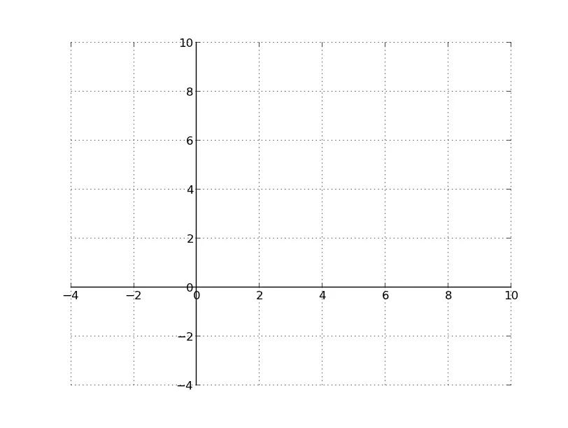
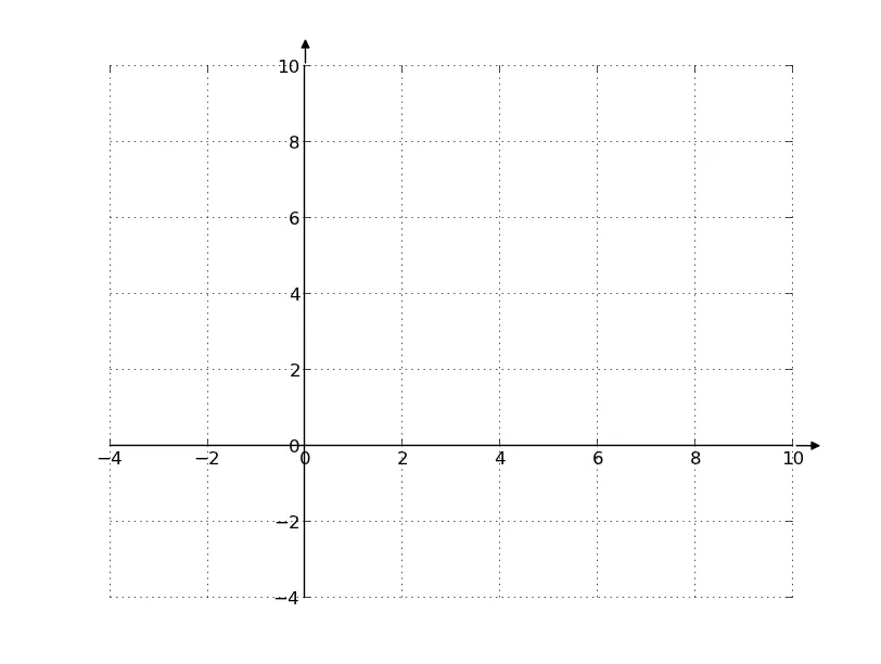
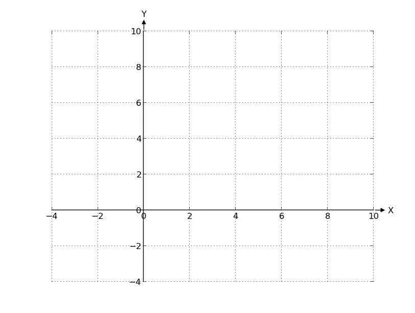
下面是我的代码,用于绘制函数。我需要将“X”和“Y”标签移动到第一象限,放置在相应箭头附近的惯例位置。如何实现这一点?
import pylab as p
import numpy as n

from mpl_toolkits.axes_grid import axislines


def cubic(x) :
    return x**3 + 6*x


def set_axes():
    fig = p.figure(1)
    ax = axislines.SubplotZero(fig, 111)
    fig.add_subplot(ax)

    for direction in ['xzero', 'yzero']:
        ax.axis[direction].set_axisline_style('->', size=2)
        ax.axis[direction].set_visible(True)

    for direction in ['right', 'top', 'left', 'bottom']:
        ax.axis[direction].set_visible(False)

    ax.axis['xzero'].set_label('X')
    ax.axis['yzero'].set_label('Y')

    ax.axis['yzero'].major_ticklabels.set_axis_direction('right')
    ax.axis['yzero'].set_axislabel_direction('+')
    ax.axis['yzero'].label.set_rotation(-90)
    ax.axis['yzero'].label.set_va('center')


set_axes()

X = n.linspace(-15,15,100)
Y = cubic(X)

p.plot(X, Y)

p.xlim(-5.0, 5.0)
p.ylim(-15.0, 15.0)

p.xticks(n.linspace(-5, 5, 11, endpoint=True))
p.grid(True)

p.show()
1个回答

9

通常情况下,要更改轴(例如ax.xaxis)的标签位置,您需要执行axis.label.set_position(xy)。或者您可以只设置一个坐标,例如'ax.xaxis.set_x(1)`。

在您的情况下,应该是这样的:

ax['xzero'].label.set_x(1)
ax['yzero'].label.set_y(1)

然而,axislines(以及axisartistaxes_grid中的任何其他内容)是一个有些过时的模块(这就是为什么存在axes_grid1)。在某些情况下,它没有正确地子类化一些东西。因此,当我们尝试设置标签的x和y位置时,没有任何变化!
一个快速的解决方法是使用ax.annotate将标签放置在箭头的末端。然而,让我们先尝试另一种绘制图表的方法(之后我们最终还是会回到annotate)。
现在,你最好使用新的脊柱功能来完成你想要实现的目标。
将x轴和y轴设置为“零”非常简单:
import matplotlib.pyplot as plt

fig, ax = plt.subplots()

for spine in ['left', 'bottom']:
    ax.spines[spine].set_position('zero')

# Hide the other spines...  
for spine in ['right', 'top']:
    ax.spines[spine].set_color('none')

ax.axis([-4, 10, -4, 10])
ax.grid()

plt.show()

在此输入图片描述

然而,我们仍需要漂亮的箭头装饰。这有点复杂,但只需要使用适当的参数进行两次注释调用即可。

import matplotlib.pyplot as plt

fig, ax = plt.subplots()

#-- Set axis spines at 0
for spine in ['left', 'bottom']:
    ax.spines[spine].set_position('zero')

# Hide the other spines...
for spine in ['right', 'top']:
    ax.spines[spine].set_color('none')

#-- Decorate the spins
arrow_length = 20 # In points

# X-axis arrow
ax.annotate('', xy=(1, 0), xycoords=('axes fraction', 'data'), 
            xytext=(arrow_length, 0), textcoords='offset points',
            arrowprops=dict(arrowstyle='<|-', fc='black'))

# Y-axis arrow
ax.annotate('', xy=(0, 1), xycoords=('data', 'axes fraction'), 
            xytext=(0, arrow_length), textcoords='offset points',
            arrowprops=dict(arrowstyle='<|-', fc='black'))

#-- Plot
ax.axis([-4, 10, -4, 10])
ax.grid()

plt.show()

在此输入图片描述

箭头的宽度受文本大小(或arrowprops的可选参数)控制,因此向annotate指定size=16将使箭头稍微宽一些,如果您需要的话。


这时,最简单的方法是将“X”和“Y”标签作为注释的一部分添加,尽管设置它们的位置也可以。

如果我们将注释的第一个参数传递为标签而不是空字符串(并稍微更改对齐方式),我们将在箭头的末端得到漂亮的标签:

import matplotlib.pyplot as plt

fig, ax = plt.subplots()

#-- Set axis spines at 0
for spine in ['left', 'bottom']:
    ax.spines[spine].set_position('zero')

# Hide the other spines...
for spine in ['right', 'top']:
    ax.spines[spine].set_color('none')

#-- Decorate the spins
arrow_length = 20 # In points

# X-axis arrow
ax.annotate('X', xy=(1, 0), xycoords=('axes fraction', 'data'), 
            xytext=(arrow_length, 0), textcoords='offset points',
            ha='left', va='center',
            arrowprops=dict(arrowstyle='<|-', fc='black'))

# Y-axis arrow
ax.annotate('Y', xy=(0, 1), xycoords=('data', 'axes fraction'), 
            xytext=(0, arrow_length), textcoords='offset points',
            ha='center', va='bottom',
            arrowprops=dict(arrowstyle='<|-', fc='black'))

#-- Plot
ax.axis([-4, 10, -4, 10])
ax.grid()

plt.show()

显示图片描述

只需要稍微多做一点工作(直接访问脊柱的变换),你就可以将注释的使用泛化,以适用于任何类型的脊柱对齐(例如“下降”的脊柱等)。

无论如何,希望这能有所帮助。如果您愿意,还可以更加高级地使用它


使用注释绘制箭头的一个问题是箭头比轴线稍微粗一点。 - akonsu

网页内容由stack overflow 提供, 点击上面的
可以查看英文原文,
原文链接