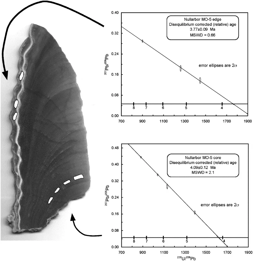
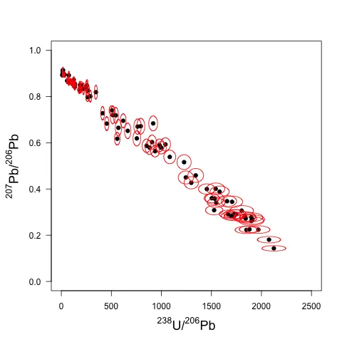
我正在尝试绘制一个U-Pb等时线图,基本上是一个xy坐标系的图表,每个数据点周围有误差椭圆来表示该数据点的精度。这是我想要实现的示例,唯一的区别是我有更多的数据点:
我在x和y空间中的每个数据点都有对称的+和-误差,我希望使用它们来决定误差椭圆的形状。
以下是我迄今为止编写的代码。这绘制了我的数据,但目前只有误差条,而不是误差椭圆。
# Select data file.
fname<-file.choose()
# Rename imported data file.
upbiso <- read.table(file=fname, header= TRUE)
# Attaches data file as default data source.
attach(upbiso)
# Reads and display column headers in console.
names(upbiso)
# Sets margins around plot.
par(mar=c(5,5,4,2))
# Plots 238U/206Pb vs 207Pb/206Pb with superscript notation for isotopic masses, xlim and ylim sets min and max limit for axes, las rotates y axis labels, cex.lab increases the size of the axis labels.
plot(UPb, PbPb, xlab = expression({}^238*"U/"*{}^206*"Pb"), ylab = expression({}^207*"Pb/"*{}^206*"Pb"), xlim = c(0,2500),ylim = c(0, 1), las=1, cex.lab = 1.5)
# Opens Oceanographic package to run errorbars function and runs 1 sigma percent error bars for x-y co-ordinates.
library(oce)
errorbars(UPb,PbPb,UPbErrP,PbPbErrP, percent=T)
我该如何用误差椭圆替换误差条呢?
这里是我的数据的Google文档链接,格式为.txt。
https://docs.google.com/file/d/0B75P9iT4wwlTNUpQand2WVRWV2s/edit?usp=sharing
列分别是UPb,UPbErrP(UPb的1 sigma %误差),UPbErrAbs(UPb的绝对误差),然后同样适用于PbPb数据。
如果需要我澄清任何内容,请告诉我,我会尽力而为。
dput(head(mydata))的输出作为代码块粘贴将有所帮助。请参见此帖子以了解如何创建一个出色的可重现示例... - Simon O'Hanlon