有一个指南:
http://matplotlib.org/examples/pylab_examples/scatter_symbol.html
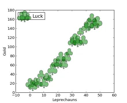
# http://matplotlib.org/examples/pylab_examples/scatter_symbol.html
from matplotlib import pyplot as plt
import numpy as np
import matplotlib

x = np.arange(0.0, 50.0, 2.0)
y = x ** 1.3 + np.random.rand(*x.shape) * 30.0
s = np.random.rand(*x.shape) * 800 + 500

plt.scatter(x, y, s, c="g", alpha=0.5, marker=r'$\clubsuit$',
            label="Luck")
plt.xlabel("Leprechauns")
plt.ylabel("Gold")
plt.legend(loc=2)
plt.show()
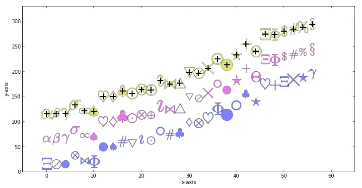
但是如果你像我一样不想使用俱乐部标记,那怎么办呢?
你该如何制作自己的标记_________?
更新
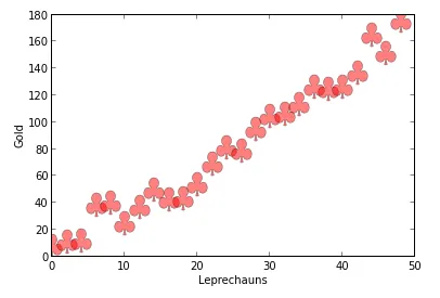
我喜欢这种特殊标记类型的原因是它可以使用简单的matplotlib语法进行调整:
from matplotlib import pyplot as plt
import numpy as np
import matplotlib

x = np.arange(0.0, 50.0, 2.0)
y = x ** 1.3 + np.random.rand(*x.shape) * 30.0
s = np.random.rand(*x.shape) * 800 + 500

plt.plot(x, y, "ro", alpha=0.5, marker=r'$\clubsuit$', markersize=22)
plt.xlabel("Leprechauns")
plt.ylabel("Gold")
plt.show()
