CSS网格滚动问题:右侧填充和边框“重叠”内容

3
我不理解这种行为。这是一个 bug 吗?我应该怎么做才能让右侧的填充和边框留在(橙色)内容外面?
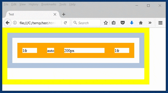
更新:我需要滚动。问题在于右侧的填充和边框没有被推到正确的位置,而是重叠在(橙色)内容上方。 enter image description here

<!doctype html>
<html>
<title>Test</title>
<head>
<meta http-equiv='content-type' content='text/html; charset=UTF-8'>
<style>
*, *:before, *:after { padding: 0px; border: 0px; margin: 0px; box-sizing: border-box; }
#grid > div { border: 20px solid orange; }
</style>
</head>
<body style='width: 90vw; height: 90vh;'>
  <div id='scrollpane' style='width: 100%; height: 100%; overflow: auto; border: 20px solid yellow;'>
    <div id='grid' style='width: 100%; display: grid; grid-template-columns: 1fr auto 200px 1fr; border: 20px solid lightsteelblue; padding: 20px;'>
      <div>1fr</div><div>auto</div><div>200px</div><div>1fr</div>
    </div>
  </div>
</body>
</html>

2个回答

5
在滚动窗格上使用display: grid;

*, *:before, *:after {
padding: 0px;
border: 0px;
margin: 0px;
box-sizing: border-box;
}

body {
width: 90vw;
height: 90vh;
}

#scrollpane {
width: 100%;
height: 100%;
overflow: auto;
border: 20px solid yellow;
display: grid; /* solution */
justify-items: stretch; /* or 'start' if you do not want content to track the scrollpane width */
align-items: start; /* or 'stretch' if you want content to track the scrollpane height */
}

#grid {
width: 100%;
display: grid;
grid-template-columns: 1fr auto 200px 1fr;
padding: 20px;
border: 20px solid lightsteelblue;
}

#grid>div {
border: 20px solid orange;
}
<body>
  <div id='scrollpane'>
    <div id='grid'>
      <div>1fr</div>
      <div>auto</div>
      <div>200px</div>
      <div>1fr</div>
    </div>
  </div>
</body>


即使我使用15%而不是200px,我仍然遇到相同的问题(但无论如何,我需要恒定宽度,而不是百分比)。 - Reto Höhener
常数宽度将覆盖父容器,因为父容器是以百分比定义的。因此,您需要在某个地方修复容器的宽度和最小宽度。最小宽度意味着容器的宽度不能小于定义的宽度。即使宽度变小于最小宽度,最小宽度也会接管控制。 - Amit Kumar Singh
我更新了问题,问题不是滚动,我想要那个。问题是右侧的填充和边框“粘”在那里,而且没有向右推。 - Reto Höhener
你想让橙色框的滚动吗?您可以将overflow:auto应用到div id grid,并从div id scrollpane中删除overflow:auto。 - Amit Kumar Singh
滚动条现在就这样很好(我想要它用于ID为“scrollpane”的黄色div)。看一下右侧内容的蓝色边框。 - Reto Höhener

2
可以通过定位来解决这个问题 -
1. 将 #grid 添加 position: absolutemin-width: 100% 2. 将 #scrollpane 添加 position: relative (当您将位置设置为 absolute 相对于 scrollpane 时,它会从流中取出并且溢出的行为现在得到处理。)
请参见以下演示:

*,
*:before,
*:after {
  padding: 0px;
  border: 0px;
  margin: 0px;
  box-sizing: border-box;
}

body {
  width: 90vw;
  height: 90vh;
}

#scrollpane {
  width: 100%;
  height: 100%;
  overflow: auto;
  border: 20px solid yellow;
  position: relative; /* ADDED */
}

#grid {
  position: absolute; /* ADDED */
  min-width: 100%; /* ADDED */
  /*width: 100%;*/
  display: grid;
  grid-template-columns: 1fr auto 200px 1fr;
  border: 20px solid lightsteelblue;
  padding: 20px;
}

#grid>div {
  border: 20px solid orange;
}
<div id='scrollpane'>
  <div id='grid'>
    <div>1fr</div>
    <div>auto</div>
    <div>200px</div>
    <div>1fr</div>
  </div>
</div>

或者更好的是,您可以将您的scrollpane也变成一个网格,并给出align-items: flex-start - 请参见下面的演示:

*,
*:before,
*:after {
  padding: 0px;
  border: 0px;
  margin: 0px;
  box-sizing: border-box;
}

body {
  width: 90vw;
  height: 90vh;
}

#scrollpane {
  width: 100%;
  height: 100%;
  overflow: auto;
  border: 20px solid yellow;
  display: grid;/* ADDED */
  align-items: flex-start;/* ADDED */
}

#grid {
  width: 100%;
  display: grid;
  grid-template-columns: 1fr auto 200px 1fr;
  border: 20px solid lightsteelblue;
  padding: 20px;
}

#grid>div {
  border: 20px solid orange;
}
<div id='scrollpane'>
  <div id='grid'>
    <div>1fr</div>
    <div>auto</div>
    <div>200px</div>
    <div>1fr</div>
  </div>
</div>


1
确实!您确实了解CSS!现在有两个可行的解决方案。我真的不理解这些位置指令,您可以详细说明一下吗? - Reto Höhener
1
当您将位置设置为“absolute”时,它会脱离文档流,而“overflow”属性的行为也会随之改变...我猜将“display: grid”添加到“scrollpane”中也可以起作用... - kukkuz
1
因为如果没有指定,absolute 定位将基于 body 元素... 同时,答案已更新。 - kukkuz
1
我喜欢Amit的答案,因为它更简短,也更神奇。我喜欢你的答案,因为它让我更好地理解了这个问题。 - Reto Höhener
1
哦,这些内联样式!你可以将Amit的答案标记为正确 :) - kukkuz
显示剩余2条评论

网页内容由stack overflow 提供, 点击上面的
可以查看英文原文,
原文链接