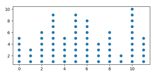
我想创建一种统计学中称为“点图”的图表,其中图表中的点数等于观察数。以下是来自mathisfun.com的示例:

在此示例中,X轴上0值上方有六个点,表示值为零的六个观察结果。
看起来,“点图”可以有几种变化形式。在查找如何使用Matplotlib创建此类图时,我只发现了我所知道的表示X和Y值之间关系的数据点的散点图。
我能否使用Matplotlib创建我要创建的这种类型的图?
我想创建一种统计学中称为“点图”的图表,其中图表中的点数等于观察数。以下是来自mathisfun.com的示例:
在此示例中,X轴上0值上方有六个点,表示值为零的六个观察结果。
看起来,“点图”可以有几种变化形式。在查找如何使用Matplotlib创建此类图时,我只发现了我所知道的表示X和Y值之间关系的数据点的散点图。
我能否使用Matplotlib创建我要创建的这种类型的图?
假设你有一些数据,可以生成以下直方图:
import numpy as np; np.random.seed(13)
import matplotlib.pyplot as plt

data = np.random.randint(0,12,size=72)

plt.hist(data, bins=np.arange(13)-0.5, ec="k")

plt.show()

您可以通过计算直方图并绘制散点图来创建您的点图,点的颜色为白色,如果它们超过直方图给出的数字。
import numpy as np; np.random.seed(13)
import matplotlib.pyplot as plt

data = np.random.randint(0,12,size=72)
bins = np.arange(13)-0.5

hist, edges = np.histogram(data, bins=bins)

y = np.arange(1,hist.max()+1)
x = np.arange(12)
X,Y = np.meshgrid(x,y)

plt.scatter(X,Y, c=Y<=hist, cmap="Greys")

plt.show()
或者您可以将不需要的点设置为nan,
Y = Y.astype(np.float)
Y[Y>hist] = np.nan

plt.scatter(X,Y)
这个答案是建立在eyllanesc在评论中发布的代码上,我认为它足够优雅,值得提供一个说明性的例子。我提供了两个版本:一个简单版本,在该版本中手动设置了格式化参数;第二个版本中,一些格式化参数是根据数据自动设置的。
import numpy as np                 # v 1.19.2
import matplotlib.pyplot as plt    # v 3.3.2

# Create random data
rng = np.random.default_rng(123) # random number generator
data = rng.integers(0, 13, size=40)
values, counts = np.unique(data, return_counts=True)

# Draw dot plot with appropriate figure size, marker size and y-axis limits
fig, ax = plt.subplots(figsize=(6, 2.25))
for value, count in zip(values, counts):
    ax.plot([value]*count, list(range(count)), 'co', ms=10, linestyle='')
for spine in ['top', 'right', 'left']:
    ax.spines[spine].set_visible(False)
ax.yaxis.set_visible(False)
ax.set_ylim(-1, max(counts))
ax.set_xticks(range(min(values), max(values)+1))
ax.tick_params(axis='x', length=0, pad=8, labelsize=12)

plt.show()
如果您经常使用这种图形,添加一些自动格式化参数以获得适当的图形尺寸和标记大小将非常有用。在下面的例子中,参数被定义为适用于此类型图形通常有用的数据(整数数据,范围为几十个单位,不超过几百个数据点)。
# Create random data
rng = np.random.default_rng(1) # random number generator
data = rng.integers(0, 21, size=100)
values, counts = np.unique(data, return_counts=True)

# Set formatting parameters based on data
data_range = max(values)-min(values)
width = data_range/2 if data_range<30 else 15
height = max(counts)/3 if data_range<50 else max(counts)/4
marker_size = 10 if data_range<50 else np.ceil(30/(data_range//10))

# Create dot plot with appropriate format
fig, ax = plt.subplots(figsize=(width, height))
for value, count in zip(values, counts):
    ax.plot([value]*count, list(range(count)), marker='o', color='tab:blue',
            ms=marker_size, linestyle='')
for spine in ['top', 'right', 'left']:
    ax.spines[spine].set_visible(False)
ax.yaxis.set_visible(False)
ax.set_ylim(-1, max(counts))
ax.set_xticks(range(min(values), max(values)+1))
ax.tick_params(axis='x', length=0, pad=10)

plt.show()

def dot_diagram(dataset):
    values, counts = np.unique(dataset, return_counts=True)
    data_range = max(values)-min(values)
    width = data_range/2 if data_range<30 else 15
    height = max(counts)/3 if data_range<50 else max(counts)/4
    marker_size = 10 if data_range<50 else np.ceil(30/(data_range//10))
    fig, ax = plt.subplots(figsize=(width, height))
    for value, count in zip(values, counts):
        ax.plot([value]*count, list(range(count)), marker='o', color='tab:blue',
                ms=marker_size, linestyle='')
    for spine in ['top', 'right', 'left']:
        ax.spines[spine].set_visible(False)
    ax.yaxis.set_visible(False)
    ax.set_ylim(-1, max(counts))
    ax.set_xticks(range(min(values), max(values)+1))
    ax.tick_params(axis='x', length=0, pad=10)
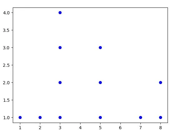
假设这是我的数据:
data = [5,8,3,7,1,5,3,2,3,3,8,5]
pos = []
keys = {} # this dict will help to keep track ...

# this loop will give us a list of frequencies to each number
for num in data:
   if num not in keys:
      keys[num] = 1
      pos.append(1)
   else:
      keys[num] += 1
      apos.append(keys[num])


print(pos)
[1, 1, 1, 1, 1, 2, 2, 1, 3, 4, 2, 3]

plt.scatter(data, pos)
plt.show()
最近,我也想到了类似的东西。我已经为我的情况做了以下事情。
希望这对你有所帮助。
好的,我们首先生成频率表,然后从中生成点来制作散点图。就是这样!非常简单。
例如,在您的情况下,我们有0分钟,6个人。这个频率可以转换成
[(0,1),(0,2),(0,3),(0,4),(0,5),(0,6)]
pyplot.scatter简单地绘制出来。import numpy as np
import matplotlib.pyplot as plt
def generate_points_for_dotplot(arr):
freq = np.unique(arr,return_counts=True)
ls = []
for (value, count) in zip(freq[0],freq[1]):
ls += [(value,num) for num in range(count)]
x = [x for (x,y) in ls]
y = [y for (x,y) in ls]
return np.array([x,y])
arr = np.random.randint(1,21,size=100)
x,y = generate_points_for_dotplot(arr)

# Plotting
fig,ax = plt.subplots(figsize = (max(x)/3,3)) # feel free to use Patricks answer to make it more dynamic
ax.scatter(x,y,s=100,facecolors='none',edgecolors='black')
ax.set_xticks(np.unique(x))
ax.yaxis.set_visible(False)
# removing the spines
for spine in ['top', 'right', 'left']:
    ax.spines[spine].set_visible(False)
plt.show()
输出:
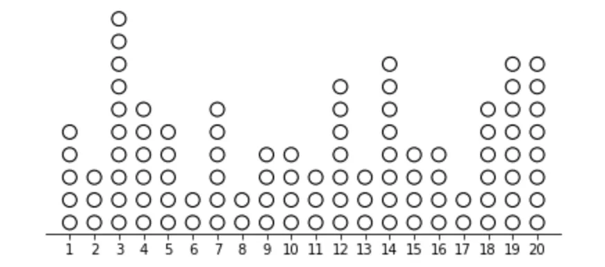
可能,如果x轴刻度过多,您可以将它们旋转。但是,对于更多的值,这也变得笨拙。
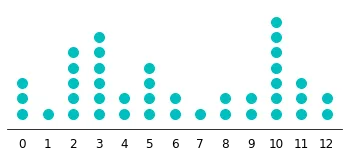
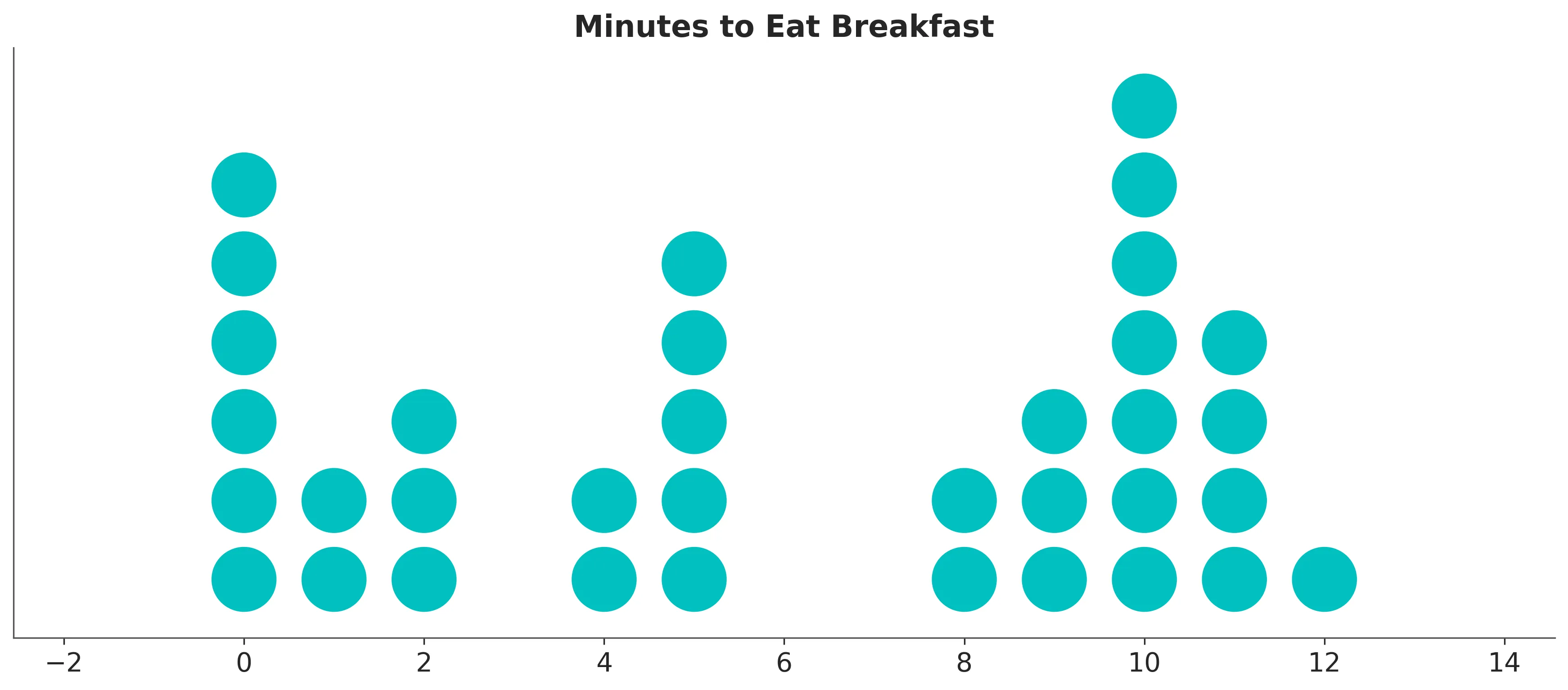
如果您可以使用其他包,我建议使用ArviZ,它在底层使用Matplotlib,并提供了适当的点图。
import matplotlib.pyplot as plt
import numpy as np
import arviz as az


# Data is hardcoded here while a more sophisticated method can be used
data = np.array([0, 0, 0, 0, 0, 0, 1, 1, 2, 2, 2, 4, 4, 5, 5, 5, 5, 5, 8, 8, 9, 9, 9, 10, 10, 10, 10, 10, 10, 10, 11, 11, 11, 11, 12])

# The main plotting function call
ax = az.plot_dot(data, dotcolor="C1", dotsize=0.8)

# Setting title
ax.set_title("Minutes to Eat Breakfast")

plt.show()
for x, y in zip(xs, ys): plt.plot([x]*y, list(range(y)), 'ro') plt.show()翻译为:对于xs和ys中的每个x和y,使用红色圆形绘制[x]*y与y的范围列表之间的线条,然后显示图形。- eyllanesc