我的数据框如下所示:
我想使用ggplot制作数据框的饼图。
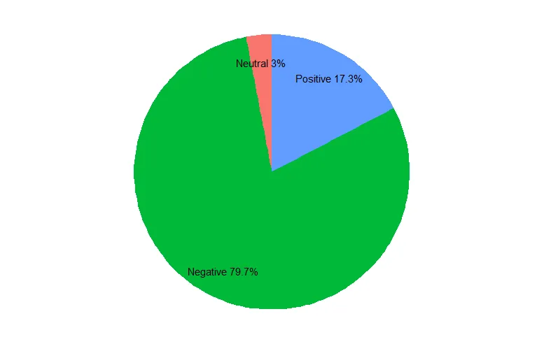
这是我的饼图。
但是当我尝试在图表上添加百分比标签时,遇到了问题。
这是我的结果。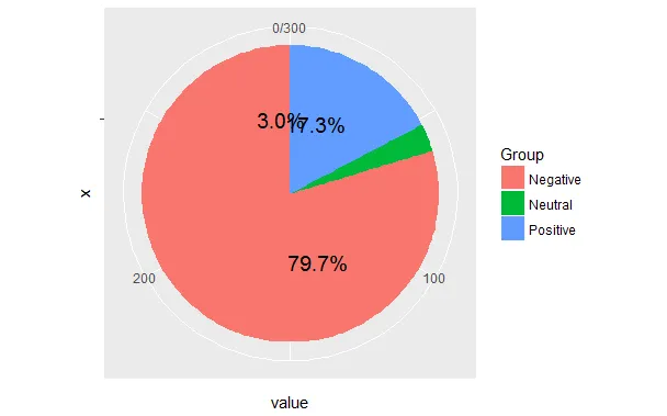 我已经看过很多与我的问题相同的问题,例如 R + ggplot2 => 如何在分面饼图上添加标签,但这些解决方案并没有帮到我。
df
   Group   value
1 Positive    52
2 Negative   239
3 Neutral     9
我想使用ggplot制作数据框的饼图。
pie <- ggplot(df, aes(x="", y=value, fill=Group)) +
       geom_bar(width = 1, stat = "identity") +
       coord_polar("y", start=0)
这是我的饼图。
但是当我尝试在图表上添加百分比标签时,遇到了问题。
pie <- ggplot(df, aes(x="", y=value, fill=Group)) +
       geom_bar(width = 1, stat = "identity") +
       coord_polar("y", start=0) +
       geom_text(aes(y = value/2 + c(0, cumsum(value)[-length(value)]),
                 label = percent(value/300 )), size=5)
这是我的结果。
我已经看过很多与我的问题相同的问题,例如 R + ggplot2 => 如何在分面饼图上添加标签,但这些解决方案并没有帮到我。