我在文档中包含了一个饼图,其他的图表都是使用ggplot2制作的,所以我希望使用ggplot2来保持图表的一致性。然而,这个饼图没有延伸到边缘。
dat <- structure(list(y = c(0.0714285714285714,
                            0.0714285714285714,
                            0.107142857142857,
                            0.160714285714286,
                            0.25,
                            0.339285714285714),
                      x = structure(c(1L, 3L, 4L, 5L, 6L, 2L),
                                    .Label = c("1 to 5", "6", "7", "8", "9", "10"),
                                    class = "factor")),
                 class = "data.frame",
                 .Names = c("y", "x"), row.names = c(NA, -6L))

ggplot(dat, aes(x = factor(1), y = y, fill = factor(x))) +
  geom_bar(width = 1, stat = "identity") +
  coord_polar(theta  = "y") +
  theme_grey()
我将使用
theme_void(); 我已经使用theme_grey来说明这一点:饼图的边缘没有延伸到面板的足够远。如何使饼的直径等于(或非常接近)面板的宽度?修改width=1或scale_x_discrete(expand = c(0,0))都没有效果。 coord_polar的参数似乎也没有提供任何线索。
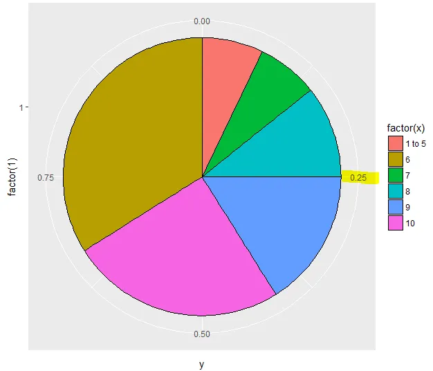
plot.margin?不过,所有的统计学家和数据可视化专家现在都强烈建议不再使用饼图。已经有很多重要的研究表明,它们比其他视觉效果更难以解释,但相对于使用的空间,传达的信息相对较少。无论如何,如果有答案,可能是其中之一http://docs.ggplot2.org/0.9.3/theme.html。 - Hack-Rplot.margin = margin(0,0,0,0)没有效果。 - Hugh