当你想对刻度标签进行此实现时,在面板绘图中使用scales="free_x"使得自动化变得困难。但是,通过一些调整和其他几个软件包的帮助,你也可以采用以下方法:
1) 总结数据,以便获得在x轴上需要哪些刻度标签/间断点的想法:
library(data.table)
minmax <- melt(setDT(CO2.melt)[, .(min.val = min(value), max.val = max(value),
                                   floor.end = 10*ceiling(min(value)/10),
                                   ceil.end = 10*floor((max(value)-1)/10)),
                               variable][],
               measure.vars = patterns('.val','.end'),
               variable.name = 'var',
               value.name = c('minmax','ends'))
这将会得到:
> minmax
   variable var minmax ends
1:     conc   1   95.0  100
2:   uptake   1    7.7   10
3:     conc   2 1000.0  990
4:   uptake   2   45.5   40
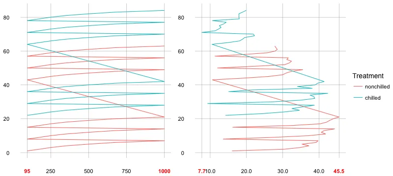
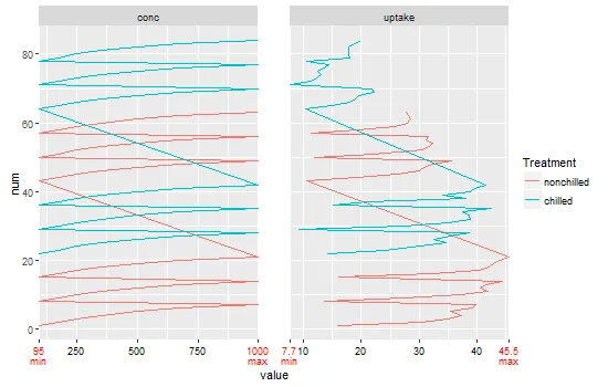
2) 为每个面创建断点向量:
brks1 <- c(95,250,500,750,1000)
brks2 <- c(7.7,10,20,30,40,45.5)
3) 创建分类:
p1 <- ggplot(CO2.melt[CO2.melt$variable=="conc",],
             aes(x = value, y = num, colour = Treatment)) +
  geom_path() +
  scale_x_continuous(breaks = brks1) +
  theme_minimal(base_size = 14) +
  theme(axis.text.x = element_text(colour = c('red','black')[c(1,2,2,2,1)],
                                   face = c('bold','plain')[c(1,2,2,2,1)]),
        axis.title = element_blank(),
        panel.grid.major = element_line(colour = "grey60"),
        panel.grid.minor = element_blank())

p2 <- ggplot(CO2.melt[CO2.melt$variable=="uptake",],
             aes(x = value, y = num, colour = Treatment)) +
  geom_path() +
  scale_x_continuous(breaks = brks2) +
  theme_minimal(base_size = 14) +
  theme(axis.text.x = element_text(colour = c('red','black')[c(1,2,2,2,2,1)],
                                   face = c('bold','plain')[c(1,2,2,2,2,1)]),
        axis.title = element_blank(),
        panel.grid.major = element_line(colour = "grey60"),
        panel.grid.minor = element_blank())
4) 将图例提取到一个单独的对象中:
library(grid)
library(gtable)
fill.legend <- gtable_filter(ggplot_gtable(ggplot_build(p2)), "guide-box")
legGrob <- grobTree(fill.legend)
5) 创建最终的图表:
library(gridExtra)
grid.arrange(p1 + theme(legend.position="none"),
             p2 + theme(legend.position="none"),
             legGrob, ncol=3, widths = c(4,4,1))
这导致结果如下所示:
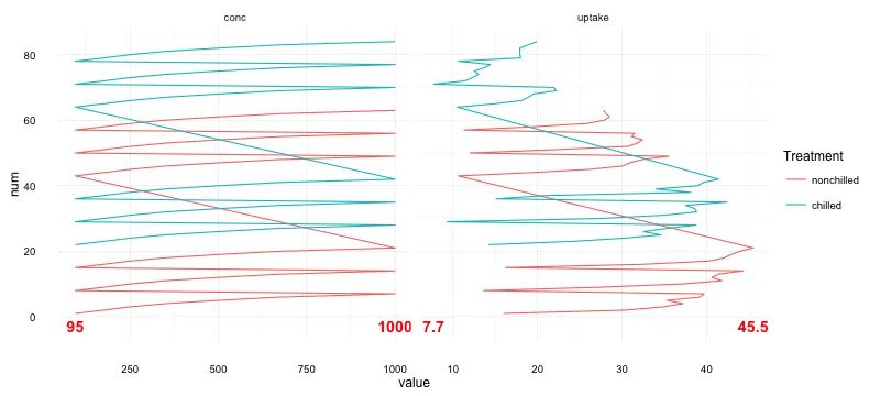
自动实现此操作的可能替代方案是使用
geom_text或
geom_label。以下是示例,展示了如何实现此功能:
library(dplyr)
library(tidyr)
minmax <- CO2.melt %>%
group_by(variable) %>%
summarise(minx = min(value), maxx = max(value)) %>%
gather(lbl, val, -1)
ggplot(CO2.melt, aes(x = value, y = num, color = Treatment)) +
geom_path() +
geom_text(data = minmax,
aes(x = val, y = -3, label = val),
colour = "red", fontface = "bold", size = 5) +
facet_wrap( ~ variable, scales = "free_x", nrow=1) +
theme_minimal()
这将会得到:
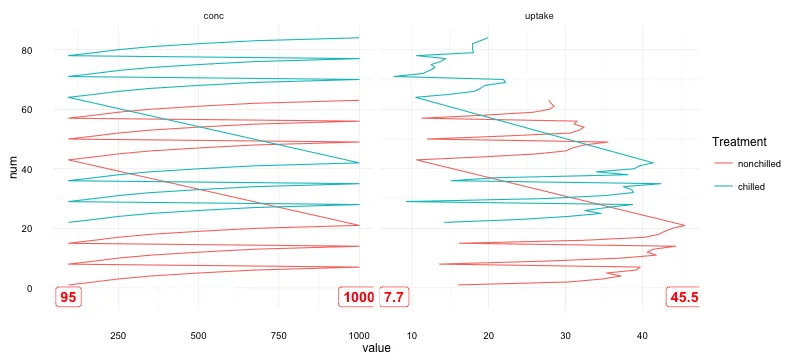
你也可以在 ggplot 中实时获取最小值和最大值(感谢 @eipi10)。以下是使用 geom_label 的另一个示例:
ggplot(CO2.melt, aes(x = value, y = num, color = Treatment)) +
  geom_path() +
  geom_label(data = CO2.melt %>%
               group_by(variable) %>%
               summarise(minx = min(value), maxx = max(value)) %>%
               gather(lbl, val, -1),
             aes(x = val, y = -3, label = val),
             colour = "red", fontface = "bold", size = 5) +
  facet_wrap( ~ variable, scales = "free_x", nrow=1) +
  theme_minimal()
这将会提供以下内容:
