我正在使用ggplot绘制图表。这是使用ggplot包的示例:
df <- data.frame(
  gp = factor(rep(letters[1:3], each = 10)),
  y = rnorm(30)
)
ds <- plyr::ddply(df, "gp", plyr::summarise, mean = mean(y), sd = sd(y))

ggplot(df, aes(gp, y)) +
  geom_point() +
  geom_point(data = ds, aes(y = mean), colour = 'red', size = 3) +
  theme(    axis.text.y = element_text(hjust = 3),
            axis.text.x = element_text(vjust = 5),
            axis.ticks.length = unit(-0.25,
                                     "cm"), # length of the axis ticks

  )
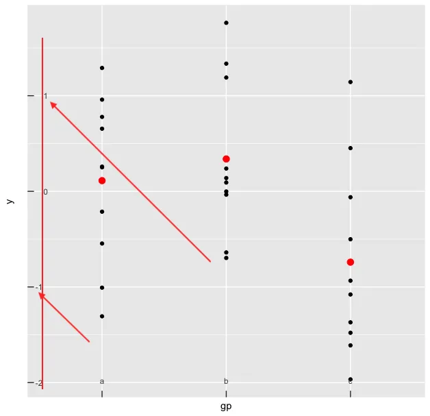
这里是输出:
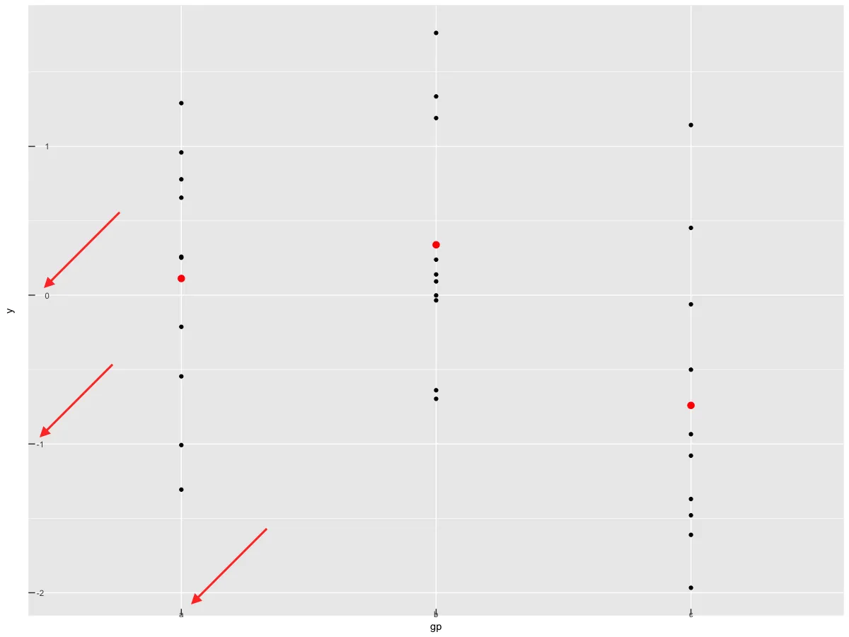
因此,最终我希望刻度线在图表内部,坐标轴标签(数字)在ggplot图表内部。我听说应该使用边距工具,但我不确定如何指定图表内部的边距。
编辑:您可以看到,在使用margin函数时,数字的对齐方式不正确...