我需要绘制几个数据点,它们被定义为
c(x,y, stdev_x, stdev_y)
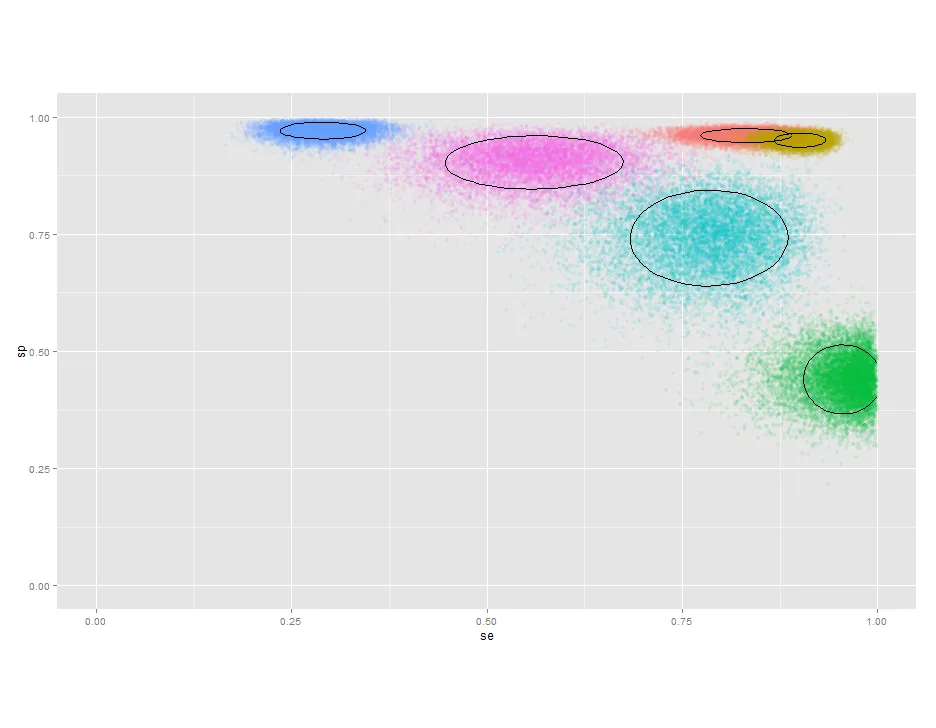
作为一个散点图,显示它们的95%置信区间的表示,例如显示该点和周围的一个轮廓。理想情况下,我想在点周围绘制一个椭圆形,但不知道如何实现。我考虑构建样本并绘制它们,添加stat_density2d(),但需要将轮廓数量限制为1,并且无法弄清楚如何实现。
require(ggplot2)
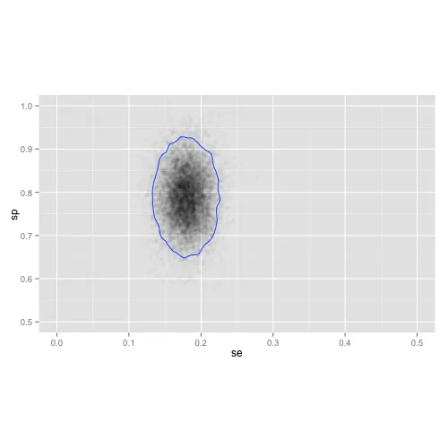
n=10000
d <- data.frame(id=rep("A", n),
se=rnorm(n, 0.18,0.02),
sp=rnorm(n, 0.79,0.06) )
g <- ggplot (d, aes(se,sp)) +
scale_x_continuous(limits=c(0,1))+
scale_y_continuous(limits=c(0,1)) +
theme(aspect.ratio=0.6)
g + geom_point(alpha=I(1/50)) +
stat_density2d()