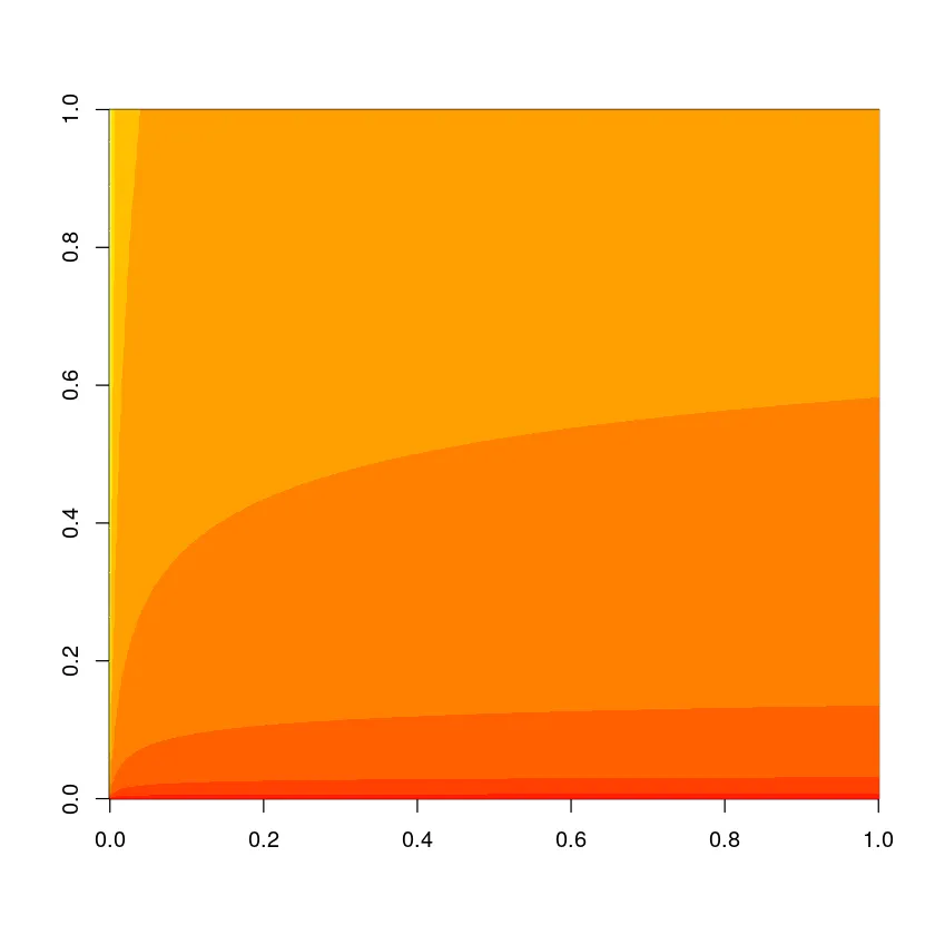
我想绘制一个接受两个参数的函数。到目前为止,我找到的最好的方法是使用image函数,但我很想找到更好的3D图或像这样更好的ggplot等高线图:
x_seq = seq(1,1000)

y_seq = seq(1,5000)

z = outer(contributor_idx, size_estimate, function(x,y) log(y+1) + log(y+1)/log(x+1))

image(z)
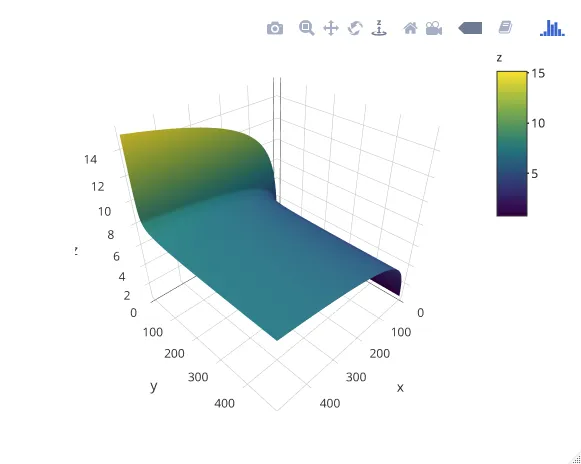
Plotly对绘制曲面图有很好的支持(交互效果也更佳):
library(plotly)

df <- data.frame(x = seq(500),
                 y = seq(500))

z <- outer(df$x, df$y, function(x, y) log(y + 1) + log(y + 1) / log(x + 1))

plot_ly(df, x = ~x, y = ~y, z = ~z) %>%
    add_surface()
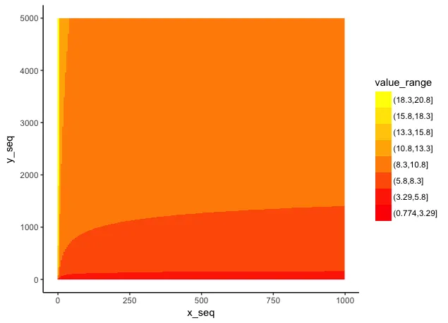
library(tidyverse)

# Every 5th value to reduce plotting time for the example
x_seq = seq(1,1000,5)
y_seq = seq(1,5000,5)

z = outer(x_seq, y_seq, function(x,y) log(y+1) + log(y+1)/log(x+1))

colnames(z) = y_seq
rownames(z) = x_seq

# Convert to long format, convert row and column values to numeric, and create groups for colors
dat = as.data.frame(z) %>%
  rownames_to_column(var="x_seq") %>%
  gather(y_seq, value, -x_seq) %>%
  mutate(y_seq=as.numeric(y_seq),
         x_seq=as.numeric(x_seq),
         value_range = cut(value, 8))

ggplot(dat, aes(x_seq, y_seq, fill=value_range)) +
  geom_raster() +
  scale_fill_manual(values=colorRampPalette(c("red","orange","yellow"))(8)) +
  theme_classic() +
  guides(fill=guide_legend(reverse=TRUE))
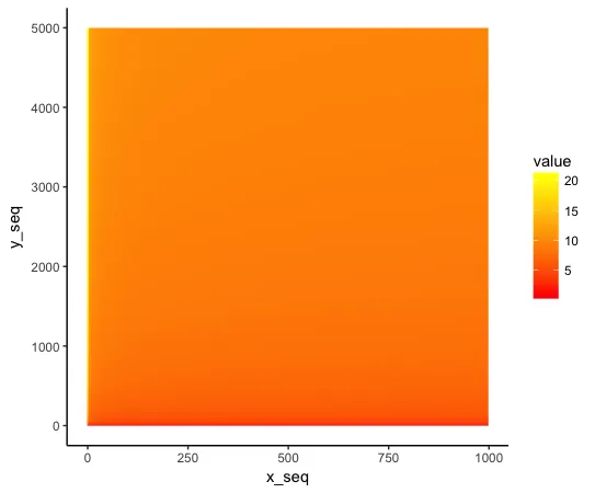
您可以使用平滑的颜色渐变,但在这种情况下它没有足够的对比度来使其更加明显。
ggplot(dat, aes(x_seq, y_seq, fill=value)) +
  geom_raster() +
  scale_fill_gradient(low="red", high="yellow") +
  theme_classic()
metR。我会看看能不能安装它。 - eipi10
geom_contour()函数。Lattice库提供了一些很好的函数用于显示3D图形。 - scottkosty