是否有可能使用jqplot实现并排堆叠柱状图?例如,X轴是给定的月份,对于每个月份,您将有一些堆叠的条形图。
类似于这样:
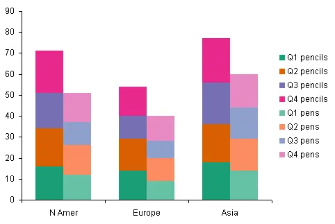
注意:我正在寻求与普通堆叠图不同的东西。请查看图片以更好地理解我的意图。
是的,这是可能的。
参考 jqplot。
源代码:
$(document).ready(function(){
  var s1 = [2, 6, 7, 10];
  var s2 = [7, 5, 3, 4];
  var s3 = [14, 9, 3, 8];
  plot3 = $.jqplot('chart3', [s1, s2, s3], {
    // Tell the plot to stack the bars.
    stackSeries: true,
    captureRightClick: true,
    seriesDefaults:{
      renderer:$.jqplot.BarRenderer,
      rendererOptions: {
          // Put a 30 pixel margin between bars.
          barMargin: 30,
          // Highlight bars when mouse button pressed.
          // Disables default highlighting on mouse over.
          highlightMouseDown: true
      },
      pointLabels: {show: true}
    },
    axes: {
      xaxis: {
          renderer: $.jqplot.CategoryAxisRenderer
      },
      yaxis: {
        // Don't pad out the bottom of the data range.  By default,
        // axes scaled as if data extended 10% above and below the
        // actual range to prevent data points right on grid boundaries.
        // Don't want to do that here.
        padMin: 0
      }
    },
    legend: {
      show: true,
      location: 'e',
      placement: 'outside'
    }
  });
  // Bind a listener to the "jqplotDataClick" event.  Here, simply change
  // the text of the info3 element to show what series and ponit were
  // clicked along with the data for that point.
  $('#chart3').bind('jqplotDataClick',
    function (ev, seriesIndex, pointIndex, data) {
      $('#info3').html('series: '+seriesIndex+', point: '+pointIndex+', data: '+data);
    }
  );
});
您需要在同一绘图基础上绘制两个图形,如果您不需要任何工具提示或其他内容,这将是可行的,因为它只适用于其中一个图形,请尝试以下操作-
$(document).ready(function(){
    /* graph config */
    var maxVal = 13;

    /* graph vals */
    var Bar1 = [5, 0, 10, 0, 12, 0];
    var Bar2 = [0, 17, 0, 20, 0, 12 ];
    var BaseVals=[0,0,0,0,0,0];
    /* graph ticks */
    var baseTicks=['Americas','','Europe','','Asia','']
    var EmptyTicks=['','','','','','']


    /* plot the base graph */
    plotbase = $.jqplot('chart3', [BaseVals], {
        seriesDefaults:{
            renderer:$.jqplot.BarRenderer,
            rendererOptions: {barMargin: 10},
            pointLabels: {show: false}
        },
        axesDefaults: {show: false},
        tickOptions: {showMark: false, angle: 90},
        axes: {
            showLabel: false,
            xaxis: {
                renderer: $.jqplot.CategoryAxisRenderer,
                ticks: baseTicks,
                tickOptions: {markSize: 0}
            },
            yaxis: {
                padMin: 0,
                min: 0,
                max: maxVal,
                showLabel: false,
                show: false
            }
        }
    });


    plot2 = $.jqplot('chart3', [Bar1], {
        seriesColors: ["#67ce64", "#da9831","#67ce64", "#da9831"],\\this can be changed
        stackSeries: true,
        captureRightClick: true,
        seriesDefaults:{
            renderer:$.jqplot.BarRenderer,
            rendererOptions: {barMargin: 10, highlightMouseOver: true},
            pointLabels: {show: false}
        },
        axesDefaults: {show: false},
        tickOptions: {showMark: false},
        axes: {
            showLabel: false,
            xaxis: {
                renderer: $.jqplot.CategoryAxisRenderer,
                ticks: EmptyTicks
            },
            yaxis: {
                padMin: 0,
                min: 0,
                max: maxVal,
                showLabel: false,
                show: false
            }
        },
        grid: {background: 'transparent', drawGridLines: false, gridLineColor: 'transparent', borderColor: 'transparent'}
    });


    plot1 = $.jqplot('chart3', [Bar2], {
        stackSeries: true,
        captureRightClick: true,
        seriesColors: ["#effa38", "#37d1f8", "#5129b6","#5129b6"],//this can be changed
        seriesDefaults:{
            renderer:$.jqplot.BarRenderer,
            rendererOptions: {barMargin: 10, highlightMouseOver: true },
            pointLabels: {show: false}
        },
        axes: {
            xaxis: {
                renderer: $.jqplot.CategoryAxisRenderer,
                tickRenderer:$.jqplot.CanvasAxisTickRenderer,
                ticks: EmptyTicks,
                tickOptions: {
                    angle: -90,
                }
            },
            yaxis: {
                padMin: 0,
                min: 0,
                max: maxVal
            }
        }, grid: {background: 'transparent', drawGridLines: false, gridLineColor: 'transparent', borderColor: 'transparent'}
    });

});
但请注意,您只能在其中一个图表上应用工具提示/高亮显示器。