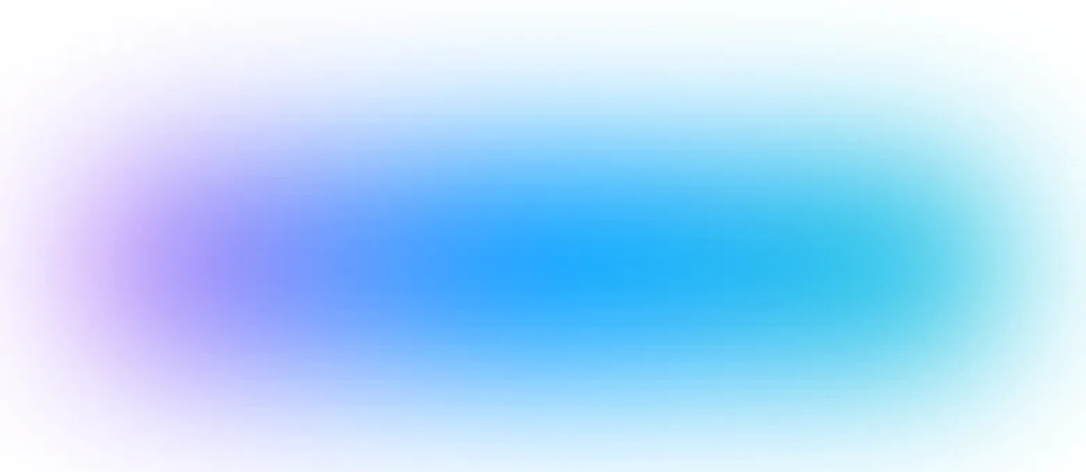
使用CSS可以制作模糊渐变阴影吗?

7

这里有一个阴影:

enter image description here

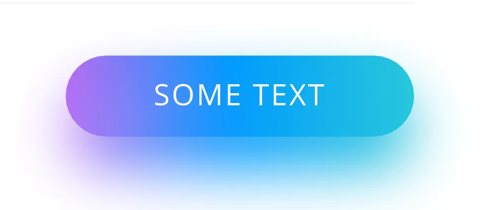
因此,我需要在按钮悬停时出现这个阴影。我知道这是CSS,但我无法模糊任何内容:

所以我需要的是当按钮被悬停时会出现的阴影。我知道这与CSS有关,但我没有成功实现任何模糊效果。

background-image: linear-gradient(-90deg, #CF77F3 0%, #009BFF 47%, #2AC9DB 100%);
border-radius: 100px;
filter: blur(5px);

所以,两个基本问题:

  1. 是否可以使用CSS制作模糊效果?
  2. 如果可以,是否可以将其制作成按钮阴影?或者我该如何解决这个问题?一个想法是只需制作一个带有绝对定位的png图片,但这有点hacky。

更新

因此,我想要实现的最终结果看起来像这样:

enter image description here

阴影重复了按钮渐变色。

linear-gradient(-90deg, #CF77F3 0%, #009BFF 47%, #2AC9DB 100%);
2个回答

13

新答案

我制作了一个在线生成器,可以帮助您轻松获得渐变阴影效果: https://css-generators.com/gradient-shadows/

您只需调整一些值并获取代码即可。

button {
  margin: 50px;
  border-radius: 999px;
  padding: 10px 30px;
  font-size: 25px;
  color: #fff;
  text-align: center;
  line-height: 50px;
  border: none;
  background: linear-gradient(-90deg, #CF77F3 0%, #009BFF 47%, #2AC9DB 100%);
  position: relative;
  transform-style: preserve-3d;
}
button::before {
  content: "";
  position: absolute; 
  inset: -10px;
  background: inherit;
  filter: blur(20px);
  transform: translate3d(15px,15px,-1px);
  border-radius: inherit;
  pointer-events: none;
}
<button >
  this a button
</button>

更多细节请参考:https://css-tricks.com/different-ways-to-get-css-gradient-shadows/

旧回答

多重 box-shadow 怎么样:

.box {
 margin:50px;
 width:100px;
 height:50px;
 border-radius:20px;
 color:#fff;
 text-align:center;
 line-height:50px;
 box-shadow:
 20px 5px 40px #CF77F3,
   0px 5px 40px #009BFF,
  -20px 5px 40px #2AC9DB;
  background-image: linear-gradient(-90deg, #CF77F3 0%, #009BFF 47%, #2AC9DB 100%);
}
<div class="box">
this a button
</div>


谢谢你的回答! :) 我没能用按钮实现它,看看我需要实现什么:http://prntscr.com/j05juu,以及我得到的:http://prntscr.com/j05k71。我意识到当我们使用多个投影时,它们会“叠加”在彼此上面或类似于这样,这不是一个精确的渐变阴影? - Victor
@Victor 是的,它们重叠了 :) 我的意图是让它们像阴影一样表现得像渐变... 顺便说一下,在问题中添加您想要的图像,我会更新更好的结果 ;) - Temani Afif
好的,已添加最终结果 :) 这只是来自Sketch的屏幕截图 :) 谢谢! - Victor
@Victor 如果你还感兴趣,我已经更新了我的答案,提供了更准确的方法(包括生成器和详细文章)。 - Temani Afif

2
你可以在现代浏览器中使用伪元素,并应用模糊滤镜来实现此效果。
要兼容IE,你也可以设置一个伪元素,并使用内嵌阴影来获得模糊边框。至少在Chrome中,仍然可以看到一个小的残留边框。

.test {
  margin: 20px;
  background-image: linear-gradient(-90deg, #CF77F3 0%, #009BFF 47%, #2AC9DB 100%);;
  border-radius: 50px;
  display: inline-block;
  height: 100px;
  width: 200px;
  position: relative;
  border: solid 4px black;
}

#test1:after {
  content: "";
  position: absolute;
  background-image: inherit;
  border-radius: inherit;
  width: inherit;
  height: inherit;
  transform: translate(0px, 20px) scale(1.1);
  z-index: -1;
  filter: blur(14px);
}

#test2:after {
  content: "";
  position: absolute;
  border-radius: 90px;
  width: 250px;
  height: 150px;
  z-index: -1;
  top: 1px;
  left: -25px;
  background-image: linear-gradient(-90deg, #CF77F3 0%, #009BFF 47%, #2AC9DB 100%);
  box-shadow: inset 0px 0px 25px 18px white;
}
<div class="test" id="test1">
</div>
<div class="test" id="test2">
</div>


网页内容由stack overflow 提供, 点击上面的
可以查看英文原文,
原文链接