我有一个 plotly 的图表,标题默认放在图表区域内。我想把图表标题移到图表区域外。
我的当前代码仅在绘图的布局中具有标题参数。
plt <- plt %>%
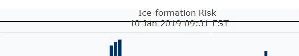
layout(
title = sprintf('Ice-formation Risk <br>%s',
format(Sys.time(),format = '%d %b %Y %H:%M %Z')))
我尝试过根据plotly参考中的一些参数进行调整,但没有成功:
plt <- plt %>%
layout(
  title = list(
    text = sprintf('Ice-formation Risk <br>%s',
                   format(Sys.time(),format = '%d %b %Y %H:%M %Z')),
    xref = 'paper', yref = 'paper',
    color = 'rgb(17,17,17)'
  )
)
当我将
title属性从字符串更改为list时,图表标题消失了。我尝试过删除xref和yref参数,只保留相同结果的text属性。
示例代码
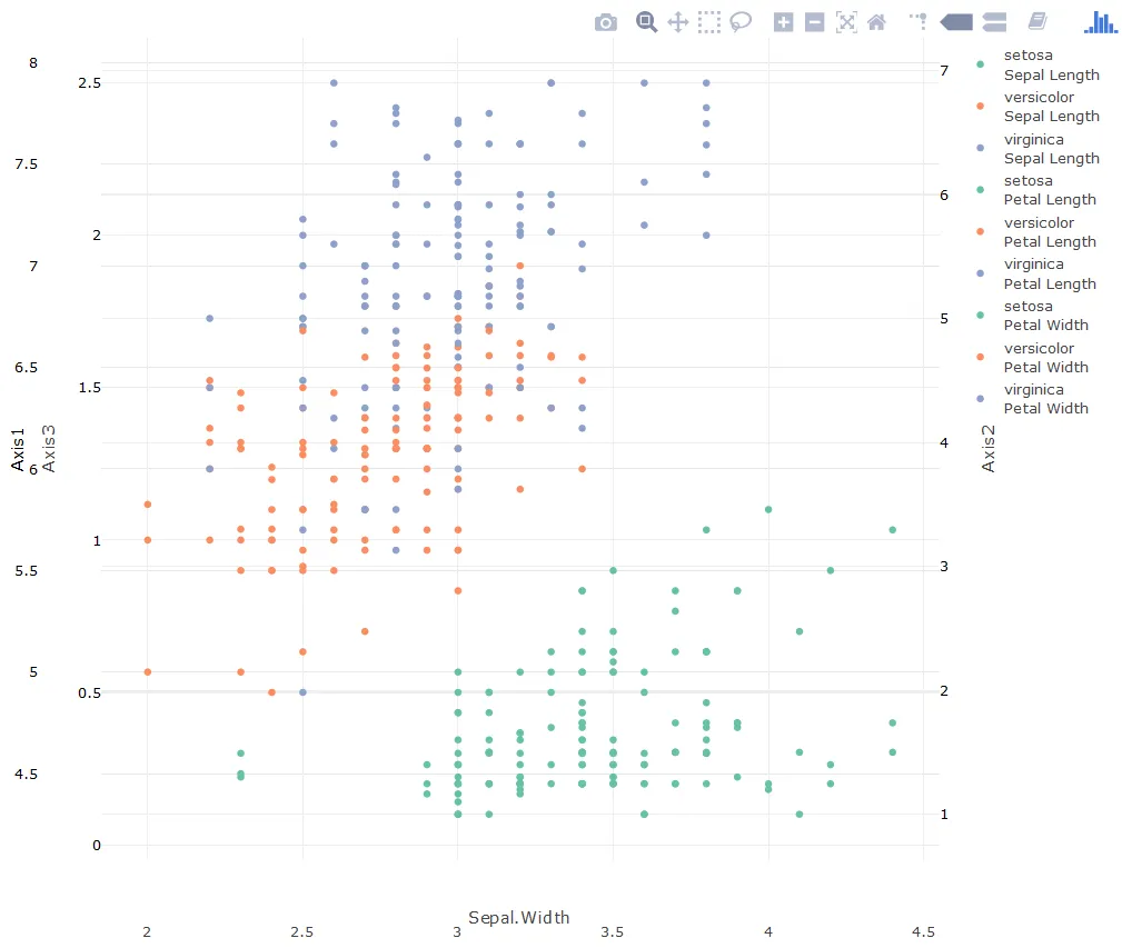
plot1 <- plot_ly(iris) %>%
  layout(
    title = list(
      text = 'sample plot', xref = 'x', yref = 'y', x = 0.5, y = 1, color = 'rgb(217,83,79)'
    ),
    margin = list( pad = 50, b = 90, l = 130, r = 50 ),
    yaxis = list(
      showline = F, side = 'left', title = 'Axis1', color = 'black',
      overlaying = 'y3', zeroline = F
    ),
    yaxis2 = list(
      tickfont = list(color = "black"), showline = F, overlaying = "y3", side = "right",
      title = "Axis2", zeroline = F, anchor = 'free', position = 1
    ),
    yaxis3 = list(
      tickfont = list(color = "black"), side = "left", title = "Axis3",
      zeroline = F, anchor = 'free'
    )
  ) %>%
  add_trace(x = ~Sepal.Width, y = ~Sepal.Length, name = 'Sepal Length', color = ~Species,
            type = 'scatter', mode = 'markers') %>%
  add_trace(x = ~Sepal.Width, y = ~Petal.Length, name = 'Petal Length', color = ~Species,
            type = 'scatter', mode = 'markers', yaxis = 'y2') %>%
  add_trace(x = ~Sepal.Width, y = ~Petal.Width, name = 'Petal Width', color = ~Species,
            type = 'scatter', mode = 'markers', yaxis = 'y3')
情节标题仍然消失了。我需要三个y轴,因为我的实际情节需要三个。 margin值被“调整”以使轴标签正确显示,否则它们会重叠且无法读取。
 }}
}}
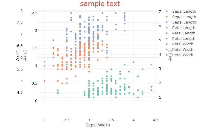
xref='x',x=0.5,yref='y',y=1。标题需要是一个列表。如果您需要更多帮助,请创建一个最小的可重现示例或共享您的plt对象的代码。 - 5thxref和yref参数不起作用 - 标题只是消失了。 - Gautam