在matplotlib中创建一个分散堆叠条形图

13

我有一些数据列表,表示对Likert问题的回答,其中使用了从1(非常不满意)到5(非常满意)的评分。 我想创建一个页面,显示这些列表作为倾斜的堆积水平条形图。 回答列表的大小可以不同(例如,当某人选择退出回答特定问题时)。以下是数据的最小示例:

likert1 = [1.0, 2.0, 1.0, 2.0, 1.0, 3.0, 3.0, 4.0, 4.0, 1.0, 1.0]
likert2 = [5.0, 4.0, 5.0, 4.0, 5.0, 3.0]

我希望能够使用类似下面这样的东西来绘制它:

plot_many_likerts(likert1, likert2)

目前,我编写了一个函数来遍历列表,并在matplotlib中的共享图形上绘制每个子图:

def plot_many_likerts(*lsts):
    #get the figure and the list of axes for this plot
    fig, axlst = plt.subplots(len(lsts), sharex=True)
    for i in range(len(lsts)):
        likert_horizontal_bar_list(lsts[i], axlst[i], xaxis=[1.0, 2.0, 3.0, 4.0, 5.0])
        axlst[i].axis('off')
    fig.show()

def likert_horizontal_bar_list(lst, ax, xaxis):
    cnt = Counter(lst)
    #del (cnt[None])
    i = 0
    colour_float = 0.00001
    previous_right = 0
    for key in sorted(xaxis):
        ax.barh(bottom=0, width=cnt[key], height=0.4, left=previous_right, color=plt.cm.jet(colour_float),label=str(key))
        i += 1
        previous_right = previous_right + cnt[key]
       colour_float = float(i) / float(len(xaxis))

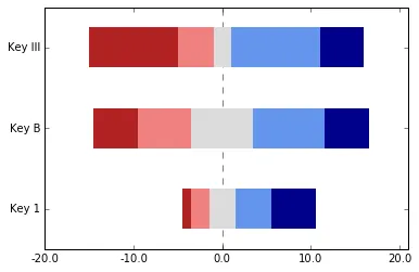
这个方法效果还不错,能够创建所有具有相同代表尺寸(例如宽度共享公共轴缩放)的堆叠条形图。以下是屏幕截图:

目前的成果 http://s7.postimg.org/vh0j816gn/figure_1.jpg

我希望这两个图表都以数据集模态值的中点为中心(数据集将具有相同的范围)。 例如:

我想要看到的内容 http://s29.postimg.org/z0qwv4ryr/figure_2.jpg

您有什么建议吗?


只需不断调整“left”即可。对于您的第二组条形图,可以将“previous_right”与任何您想要的值对齐。 - tacaswell
我希望有一种更简单的方法来做这件事,因为这意味着我必须跟踪每个创建的条形图的中点值。感觉我必须自己做太多的会计工作,而matplotlib应该为我处理这个问题。 - Christopher
有人解决过这个问题吗?它被称为分散堆叠条形图。R语言有一个模块可以实现(HH > Likert)。我也想创建一些,但希望避免重复造轮子。 - Julien Marrec
不,我只是把东西拼凑在一起,直到得到足够好的结果... - Christopher
2个回答

11

我需要制作一份针对Likert数据的分散条形图。我使用了pandas,但即使没有它,方法也可能是类似的。关键机制是在开头添加一个不可见的缓冲区。

likert_colors = ['white', 'firebrick','lightcoral','gainsboro','cornflowerblue', 'darkblue']
dummy = pd.DataFrame([[1,2,3,4, 5], [5,6,7,8, 5], [10, 4, 2, 10, 5]],
                     columns=["SD", "D", "N", "A", "SA"],
                    index=["Key 1", "Key B", "Key III"])
middles = dummy[["SD", "D"]].sum(axis=1)+dummy["N"]*.5
longest = middles.max()
complete_longest = dummy.sum(axis=1).max()
dummy.insert(0, '', (middles - longest).abs())

dummy.plot.barh(stacked=True, color=likert_colors, edgecolor='none', legend=False)
z = plt.axvline(longest, linestyle='--', color='black', alpha=.5)
z.set_zorder(-1)

plt.xlim(0, complete_longest)
xvalues = range(0,complete_longest,10)
xlabels = [str(x-longest) for x in xvalues]
plt.xticks(xvalues, xlabels)
plt.show()

这种方法有很多限制。首先,条形图不再有黑色轮廓线,图例将有一个额外的空元素。我只隐藏了图例(我想可能有一种方法只隐藏单个元素)。我不确定如何方便地使条形图具有轮廓线,而不会在缓冲元素中添加轮廓线。
首先,我们确定一些颜色和虚拟数据。然后,我们计算左两列和最中间一列(我知道分别为“SD”,“D”和“N”)的宽度。找到最长的列,并使用其宽度计算其他列所需的差异。接下来,我将这个新的缓冲列插入到第一列位置,并用一个空标题进行标记(感觉很恶心,让我告诉你)。为了保险起见,我还根据[2]的建议,在中间条的中间后面添加了一条垂直线(axvline)。最后,我通过偏移其标签来调整x轴以具有适当的比例。
您可能希望在左侧获得更多的水平空间-您可以通过添加到“longest”来轻松实现。

The aligned likert data

[2] Heiberger,Richard M.和Naomi B.Robbins。“适用于Likert量表和其他应用的分散堆叠条形图的设计。” 《统计软件杂志》57.5(2014):1-32。


在这个例子中,你如何定义complete_longest - John Karasinski
1
啊,我的错误,我漏掉了那一行。我已经编辑了代码,包括它的定义。基本上,它是所有行的总和的最大值(即最长行的长度)。 - Austin Cory Bart
谢谢@Austin。据我所知,这目前是用Python制作此类图表的最佳示例。 - John Karasinski

7

最近我也需要为一些Likert数据制作一个差异条形图。我采用了与@austin-cory-bart稍微不同的方法。

我修改了画廊中的一个示例,并创建了这个图表:

import numpy as np
import matplotlib.pyplot as plt


category_names = ['Strongly disagree', 'Disagree',
                  'Neither agree nor disagree', 'Agree', 'Strongly agree']
results = {
    'Question 1': [10, 15, 17, 32, 26],
    'Question 2': [26, 22, 29, 10, 13],
    'Question 3': [35, 37, 7, 2, 19],
    'Question 4': [32, 11, 9, 15, 33],
    'Question 5': [21, 29, 5, 5, 40],
    'Question 6': [8, 19, 5, 30, 38]
}


def survey(results, category_names):
    """
    Parameters
    ----------
    results : dict
        A mapping from question labels to a list of answers per category.
        It is assumed all lists contain the same number of entries and that
        it matches the length of *category_names*. The order is assumed
        to be from 'Strongly disagree' to 'Strongly aisagree'
    category_names : list of str
        The category labels.
    """
    
    labels = list(results.keys())
    data = np.array(list(results.values()))
    data_cum = data.cumsum(axis=1)
    middle_index = data.shape[1]//2
    offsets = data[:, range(middle_index)].sum(axis=1) + data[:, middle_index]/2
    
    # Color Mapping
    category_colors = plt.get_cmap('coolwarm_r')(
        np.linspace(0.15, 0.85, data.shape[1]))
    
    fig, ax = plt.subplots(figsize=(10, 5))
    
    # Plot Bars
    for i, (colname, color) in enumerate(zip(category_names, category_colors)):
        widths = data[:, i]
        starts = data_cum[:, i] - widths - offsets
        rects = ax.barh(labels, widths, left=starts, height=0.5,
                        label=colname, color=color)
    
    # Add Zero Reference Line
    ax.axvline(0, linestyle='--', color='black', alpha=.25)
    
    # X Axis
    ax.set_xlim(-90, 90)
    ax.set_xticks(np.arange(-90, 91, 10))
    ax.xaxis.set_major_formatter(lambda x, pos: str(abs(int(x))))
    
    # Y Axis
    ax.invert_yaxis()
    
    # Remove spines
    ax.spines['right'].set_visible(False)
    ax.spines['top'].set_visible(False)
    ax.spines['left'].set_visible(False)
    
    # Ledgend
    ax.legend(ncol=len(category_names), bbox_to_anchor=(0, 1),
              loc='lower left', fontsize='small')
    
    # Set Background Color
    fig.set_facecolor('#FFFFFF')

    return fig, ax


fig, ax = survey(results, category_names)
plt.show()

enter image description here


谢谢这个,非常有用。为了更方便部署,我将基于此的代码放入了一个Python包中,网址是https://github.com/davidfraser/powerbi_survey_charts/ - 希望对他人有所帮助... - David Fraser

网页内容由stack overflow 提供, 点击上面的
可以查看英文原文,
原文链接