我有一个数据框,其中包含以下数据:
> data_graph
# A tibble: 12 x 4
# Groups:   ATTPRO, ATTMAR [?]
       x     y group    nb
   <dbl> <dbl> <chr> <int>
 1     0     0     1  1060
 2     0     0     2   361
 3     0     0     3   267
 4     0     1     1   788
 5     0     1     2   215
 6     0     1     3    80
 7     1     0     1   485
 8     1     0     2   168
 9     1     0     3   101
10     1     1     1  6306
11     1     1     2  1501
12     1     1     3   379
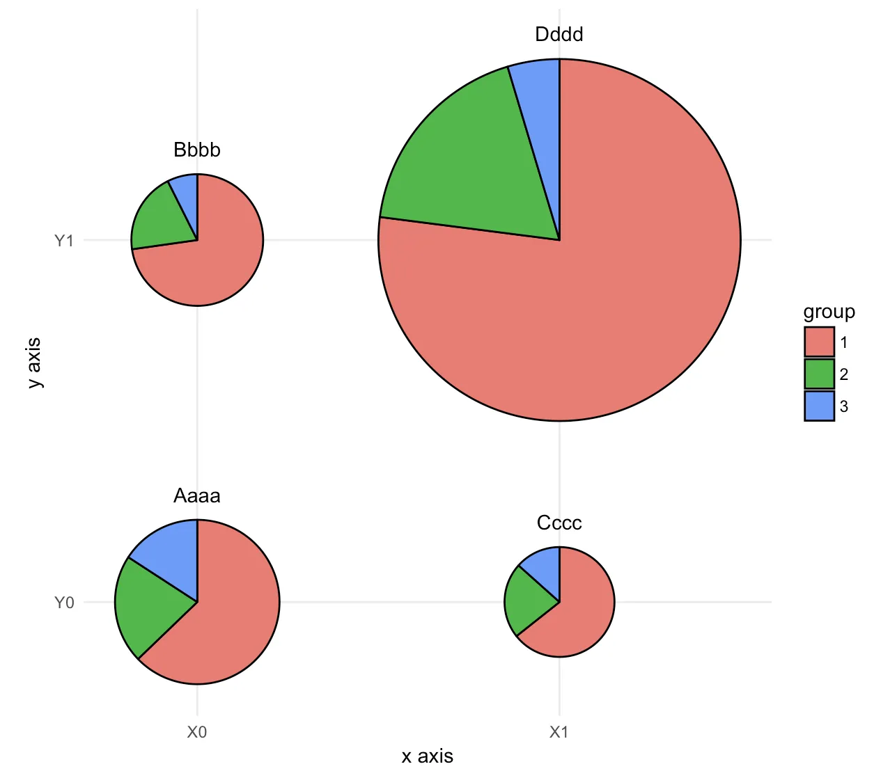
我的目标是有以下图表:
- 将定性变量x和y放在X/Y轴上
- nb表示饼图大小的定量变量
- group表示饼图部分的定性变量
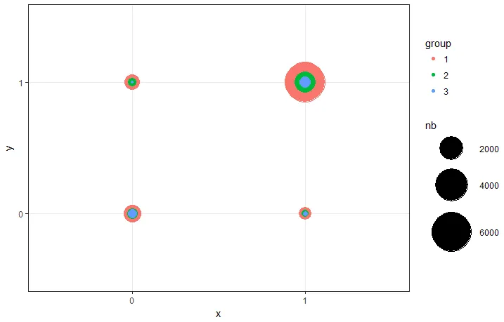
使用ggplot2包最接近这个目标的结果只能给我气泡图,使用以下代码。我找不到在其中放置饼图的解决方案:
library(ggplot2)
  ggplot(data_graph, aes(y = factor(y),x = factor(x))) +
  geom_point(aes(colour = group, size = nb)) +
  theme_bw() +
  cale_size(range = c(1, 20)) +
  labs(x = "x", y = "y", color = "group", size = "nb")
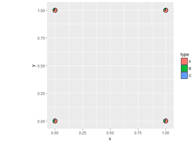
使用scatterpie包并没有太大帮助。这次饼图画得很好,但我找不到一种方法来使用nb定义饼图大小。此外,x和y被视为定量变量(我尝试了factor()没有任何机会),而不是定性变量。结果非常丑陋,没有完整的图例。
> tmp
  x y    A    B   C
1 0 0 1060  361 267
2 0 1  788  215  80
3 1 0  485  168 101
4 1 1 6306 1501 379

library(scatterpie)
ggplot() +
   geom_scatterpie(aes(x = x, y = y), data = tmp, cols = c("A", "B", "C")) +
   coord_fixed()
如何修改这段代码,让第一个图表的样式和第二个的饼状图一致呢?
dput()的输出,这样我们就可以将其直接复制到代码中并直接重新创建数据框。 - Claus Wilke