使用ggplot2制作特定顺序和百分比注释的饼图

11

我有一个如下所示的数据框:

+--------+-----------+-----+
|  make  |   model   | cnt |
+--------+-----------+-----+
| toyota |  camry    |  10 |
| toyota |  corolla  |   4 |
| honda  |  city     |   8 |
| honda  |  accord   |  13 |
| jeep   |  compass  |   3 |
| jeep   |  wrangler |   5 |
| jeep   |  renegade |   1 |
| accura |  x1       |   2 |
| accura |  x3       |   1 |
+--------+-----------+-----+

我需要创建一个饼图(是的,真的)显示每个品牌的百分比份额。

目前我正在做以下工作。

library(ggplot2)
library(dplyr)

df <- data.frame(Make=c('toyota','toyota','honda','honda','jeep','jeep','jeep','accura','accura'),
                 Model=c('camry','corolla','city','accord','compass', 'wrangler','renegade','x1', 'x3'),
                 Cnt=c(10, 4, 8, 13, 3, 5, 1, 2, 1))
dfc <- df %>%
  group_by(Make) %>%
  summarise(volume = sum(Cnt)) %>%
  mutate(share=volume/sum(volume)*100.0) %>%
  arrange(desc(volume))

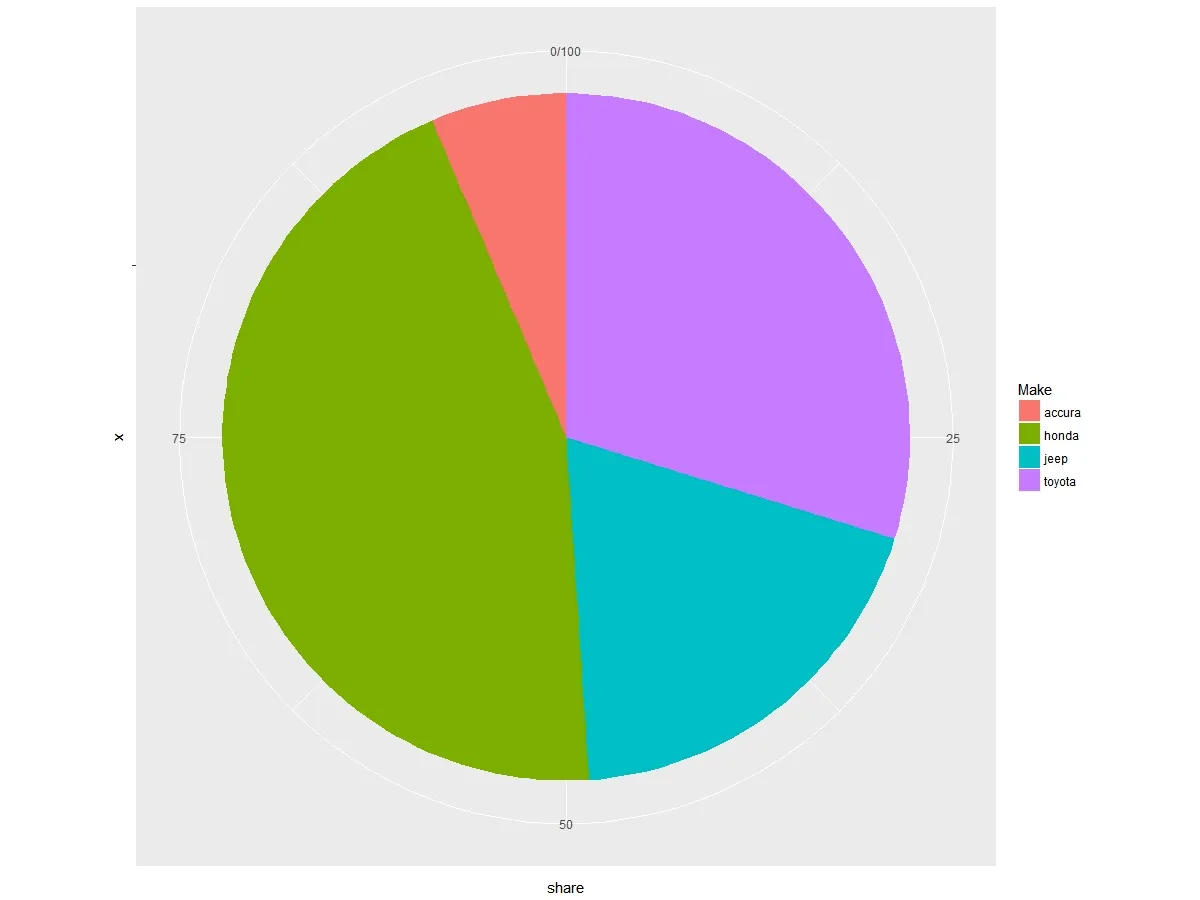
bp <- ggplot(dfc[c(1:10),], aes(x="", y= share, fill=Make)) +
  geom_bar(width = 1, stat = "identity")
pie <- bp + coord_polar("y")
pie

这给了我以下漂亮的饼图。

输入图片描述

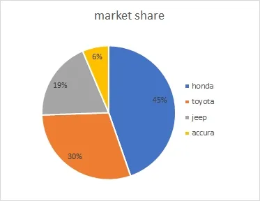
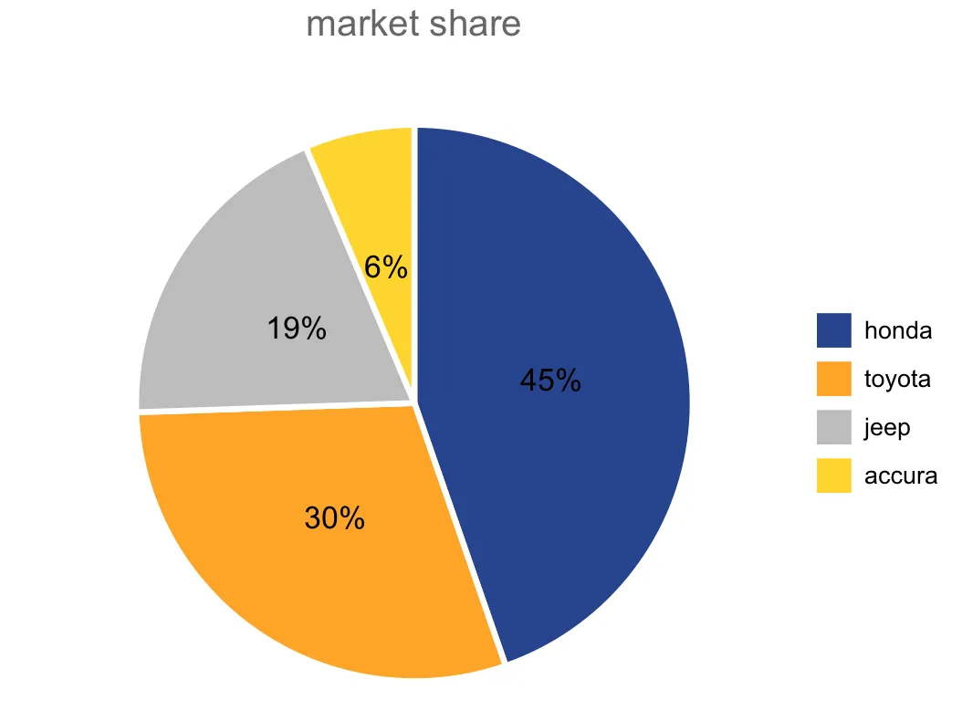
但是我需要使用以下方式增强它 - 就像下面的图像。

  1. 添加百分比标签
  2. share 的降序排序饼图
  3. 删除类似 0/100、25 的标签
  4. 添加标题

输入图片描述


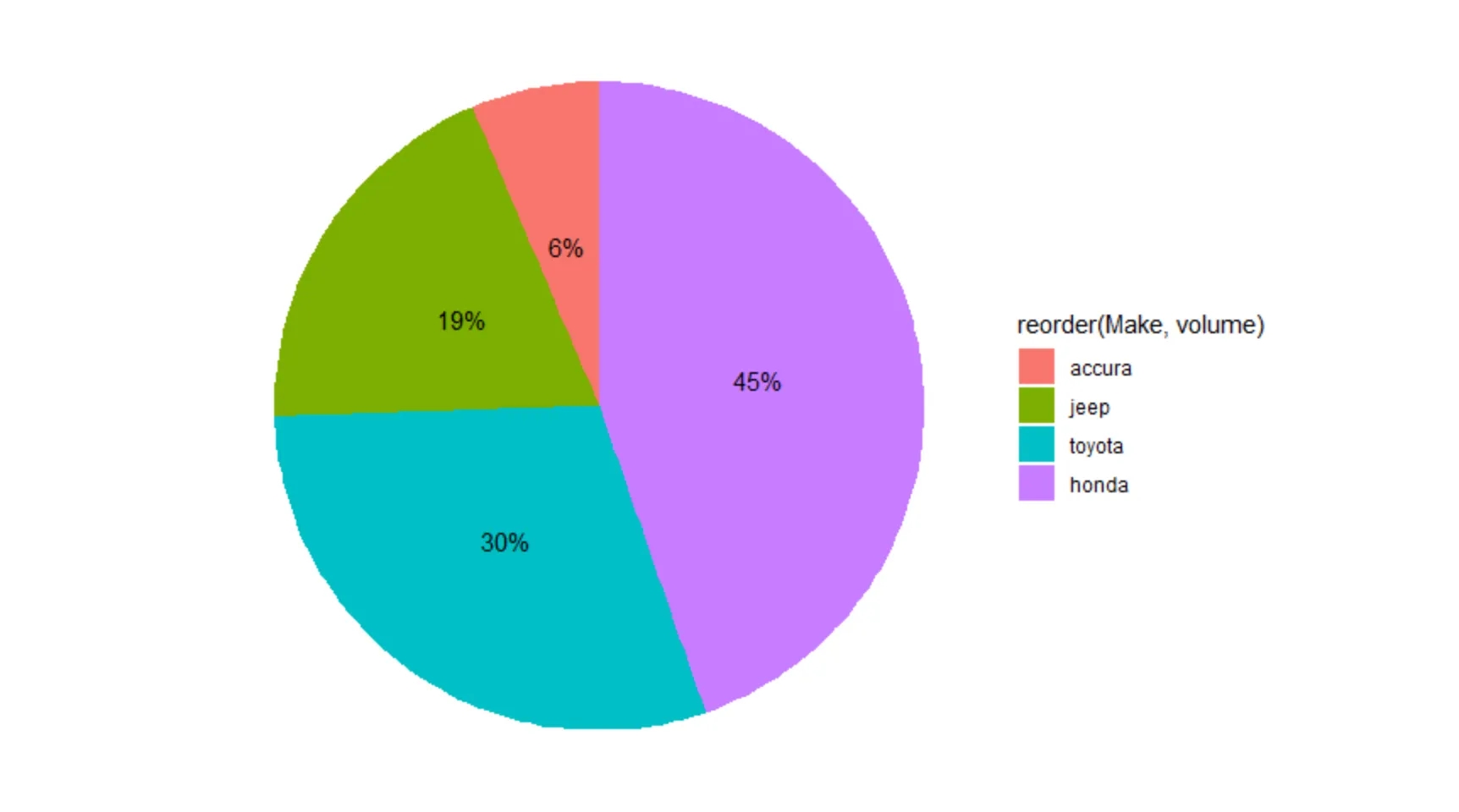
  1. 根据您喜欢的顺序设置“factor(share)”的“levels”。
  2. 重复的问题。
- Andre Elrico
使用geom_text来得到你想要的内容和位置。谷歌搜索“piechart r” -> 图片 -> 点击你喜欢的饼图图片。那里可能有你可以使用的代码。 - Andre Elrico
2个回答

29

如果提供的数据已经排序,您需要通过 份额交易量 更改 Make 的级别:

dfc$Make <- factor(dfc$Make, levels = rev(as.character(dfc$Make)))

并使用theme参数进行游戏:

ggplot(dfc[1:10, ], aes("", share, fill = Make)) +
    geom_bar(width = 1, size = 1, color = "white", stat = "identity") +
    coord_polar("y") +
    geom_text(aes(label = paste0(round(share), "%")), 
              position = position_stack(vjust = 0.5)) +
    labs(x = NULL, y = NULL, fill = NULL, 
         title = "market share") +
    guides(fill = guide_legend(reverse = TRUE)) +
    scale_fill_manual(values = c("#ffd700", "#bcbcbc", "#ffa500", "#254290")) +
    theme_classic() +
    theme(axis.line = element_blank(),
          axis.text = element_blank(),
          axis.ticks = element_blank(),
          plot.title = element_text(hjust = 0.5, color = "#666666"))

这里输入图片描述


非常好!您如何增加百分比标签的大小? - Microscone
1
@Microscone 在 geom_text 中更改字体大小。例如:geom_text(size = 10, ...) - pogibas

7
您可以尝试:
df %>%
  group_by(Make) %>%
  summarise(volume = sum(Cnt)) %>%
  mutate(share=volume/sum(volume)) %>%
  ggplot(aes(x="", y= share, fill=reorder(Make, volume))) +
   geom_col() +
   geom_text(aes(label = scales::percent(round(share,3))), position = position_stack(vjust = 0.5))+
   coord_polar(theta = "y") + 
   theme_void()

enter image description here

为了反转图例,添加guides(fill = guide_legend(reverse = TRUE))


馅饼的顺序需要按照份额百分比的顺序排列 - 因此本田应该在馅饼中排名第一。 - user3206440

网页内容由stack overflow 提供, 点击上面的
可以查看英文原文,
原文链接