我正在使用“lomb”包来计算Lomb-Scargle周期图,这是一种分析生物时间序列数据的方法。如果您要求它这样做,该包确实会创建一个图形。然而,与ggplot2图形相比,这些图形不太好看。因此,我想用ggplot绘制结果。但是,我不知道如何访问绘制曲线的函数...
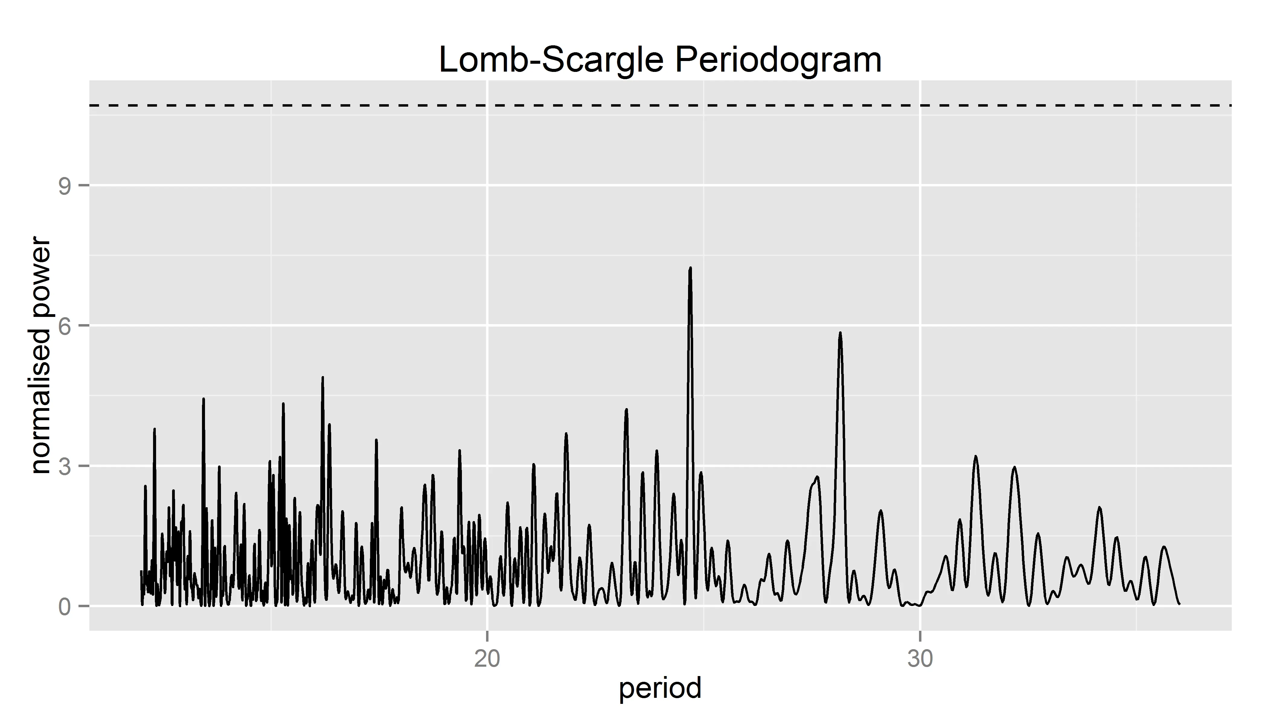
这是一个绘图的示例代码:
这是一个绘图的示例代码:
TempDiff <- runif(4033, 3.0, 18) % just generate random numbers
Time2 <- seq(1,4033) % Time vector
Rand.LombScargle <- randlsp(repeats=10, TempDiff, times = Time2, from = 12, to = 36,
                        type = c("period"), ofac = 10, alpha = 0.01, plot = T,
                        trace = T, xlab="period", main = "Lomb-Scargle Periodogram")
我也尝试着查找函数randlsp本身的信息,但是在那里我并没有找到任何有用的东西...
getAnywhere(randlsp)
A single object matching ‘randlsp’ was found
It was found in the following places
package:lomb
namespace:lomb
with value
function (repeats = 1000, x, times = NULL, from = NULL, to = NULL,
type = c("frequency", "period"), ofac = 1, alpha = 0.01,
plot = TRUE, trace = TRUE, ...)
{
if (is.ts(x)) {
x = as.vector(x)
}
if (!is.vector(x)) {
times <- x[, 1]
x <- x[, 2]
}
if (plot == TRUE) {
op <- par(mfrow = c(2, 1))
}
realres <- lsp(x, times, from, to, type, ofac, alpha, plot = plot,
...)
realpeak <- realres$peak
pks <- NULL
if (trace == TRUE)
cat("Repeats: ")
for (i in 1:repeats) {
randx <- sample(x, length(x))
randres <- lsp(randx, times, from, to, type, ofac, alpha,
plot = F)
pks <- c(pks, randres$peak)
if (trace == TRUE) {
if (i/10 == floor(i/10))
cat(i, " ")
}
}
if (trace == TRUE)
cat("\n")
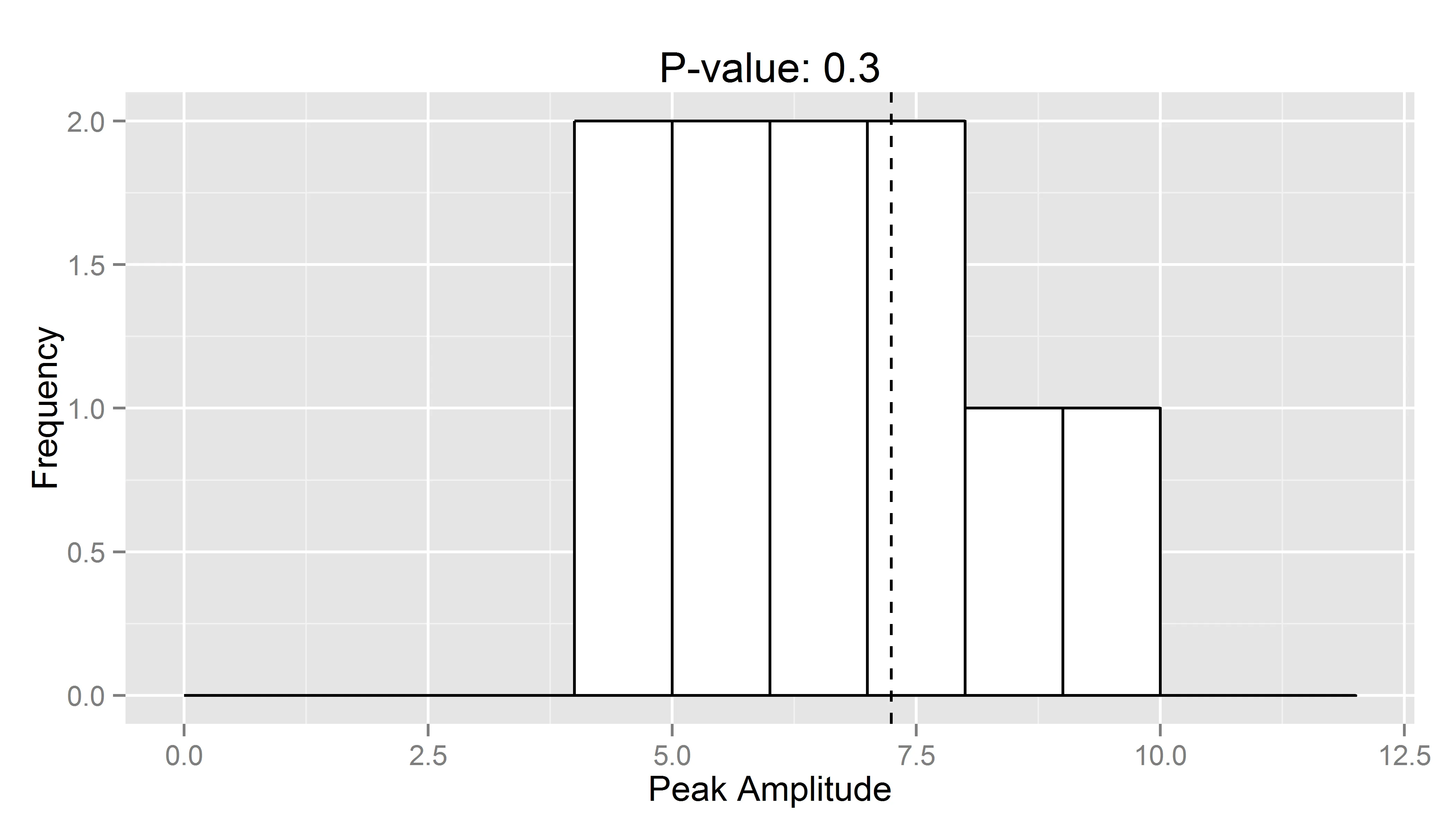
prop <- length(which(pks >= realpeak))
p.value <- prop/repeats
if (plot == TRUE) {
mx = max(c(pks, realpeak)) * 1.25
hist(pks, xlab = "Peak Amplitude", xlim = c(0, mx), main = paste("P-value: ",
p.value))
abline(v = realpeak)
par(op)
}
res = realres[-(8:9)]
res = res[-length(res)]
res$random.peaks = pks
res$repeats = repeats
res$p.value = p.value
class(res) = "randlsp"
return(invisible(res))
任何想法都将受到赞赏!
最好的祝福, 克里斯汀
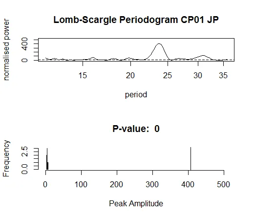
附:带有真实数据的图表示例。