使用sklearn绘制PCA载荷和生物图中的载荷(类似于R的autoplot)

25

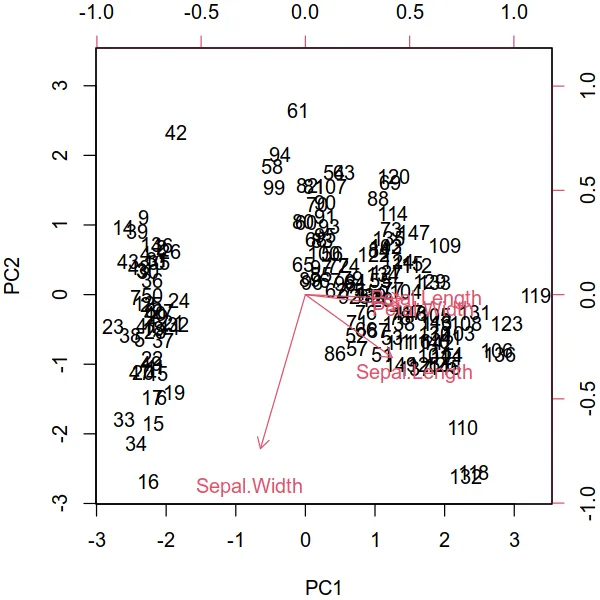
我在使用 autoplot 绘图的 R 教程中看到了这个。他们绘制了载荷和载荷标签:

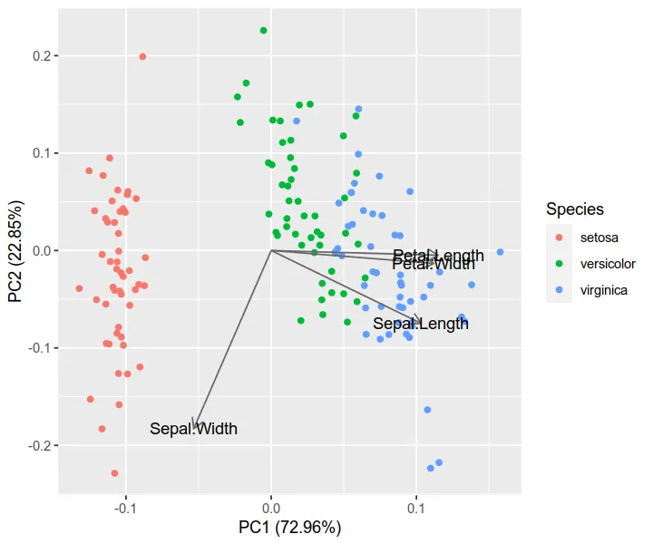
autoplot(prcomp(df), data = iris, colour = 'Species',
         loadings = TRUE, loadings.colour = 'blue',
         loadings.label = TRUE, loadings.label.size = 3)

enter image description here 
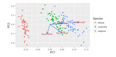
https://cran.r-project.org/web/packages/ggfortify/vignettes/plot_pca.html

我更喜欢使用 Python 3 matplotlib、scikit-learn 和 pandas 进行数据分析。但是,我不知道如何添加它们?

如何使用matplotlib绘制这些向量?

我一直在阅读Recovering features names of explained_variance_ratio_ in PCA with sklearn,但还没有弄清楚。
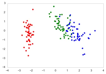
以下是我在Python中绘制的方式。

import numpy as np
import pandas as pd
import matplotlib.pyplot as plt
from sklearn.datasets import load_iris
from sklearn.preprocessing import StandardScaler
from sklearn import decomposition
import seaborn as sns; sns.set_style("whitegrid", {'axes.grid' : False})

%matplotlib inline
np.random.seed(0)

# Iris dataset
DF_data = pd.DataFrame(load_iris().data, 
                       index = ["iris_%d" % i for i in range(load_iris().data.shape[0])],
                       columns = load_iris().feature_names)

Se_targets = pd.Series(load_iris().target, 
                       index = ["iris_%d" % i for i in range(load_iris().data.shape[0])], 
                       name = "Species")

# Scaling mean = 0, var = 1
DF_standard = pd.DataFrame(StandardScaler().fit_transform(DF_data), 
                           index = DF_data.index,
                           columns = DF_data.columns)

# Sklearn for Principal Componenet Analysis
# Dims
m = DF_standard.shape[1]
K = 2

# PCA (How I tend to set it up)
Mod_PCA = decomposition.PCA(n_components=m)
DF_PCA = pd.DataFrame(Mod_PCA.fit_transform(DF_standard), 
                      columns=["PC%d" % k for k in range(1,m + 1)]).iloc[:,:K]
# Color classes
color_list = [{0:"r",1:"g",2:"b"}[x] for x in Se_targets]

fig, ax = plt.subplots()
ax.scatter(x=DF_PCA["PC1"], y=DF_PCA["PC2"], color=color_list)
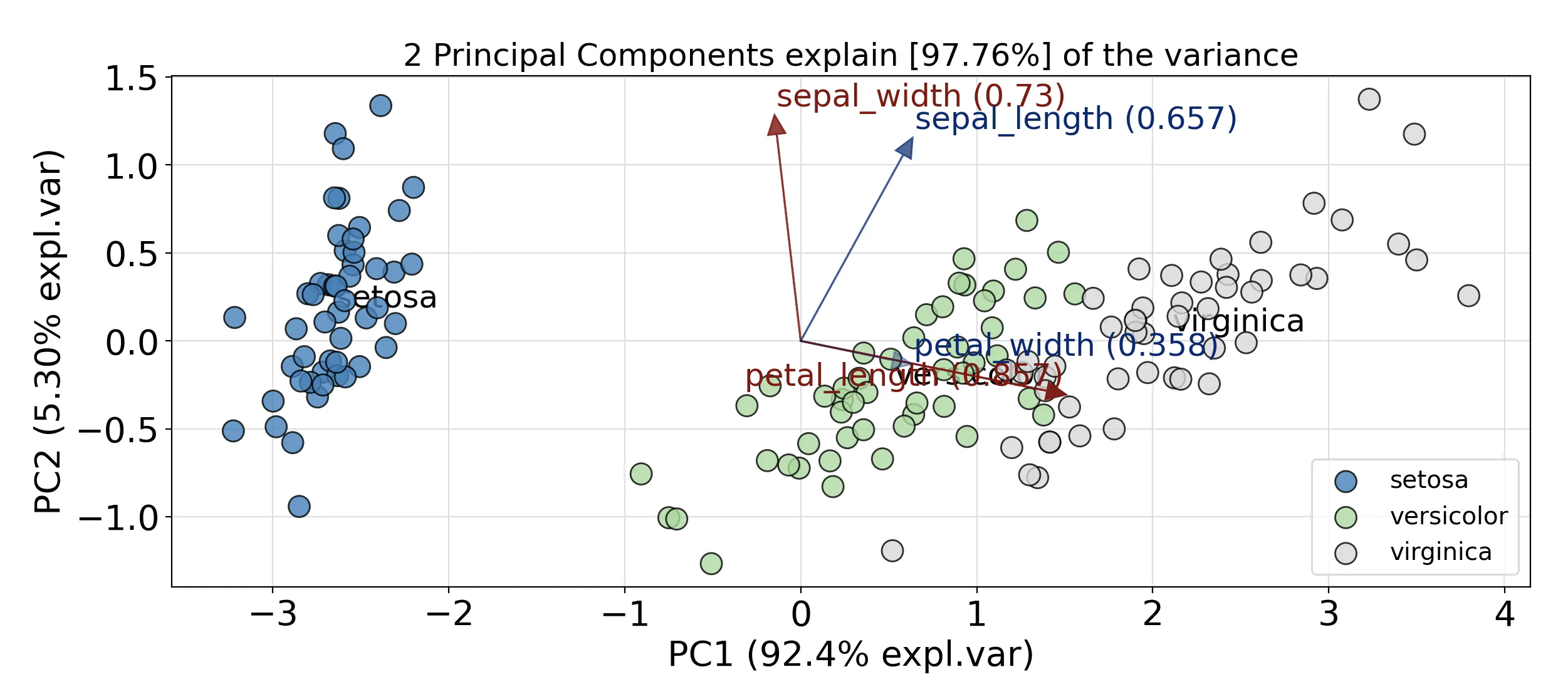
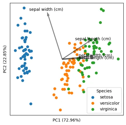
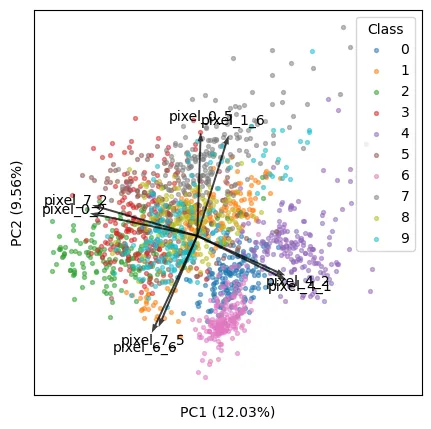
输入图像描述

5个回答

45
您可以通过创建一个名为biplot的函数来实现以下类似的操作。
很棒的文章在这里:https://towardsdatascience.com/pca-clearly-explained-how-when-why-to-use-it-and-feature-importance-a-guide-in-python-7c274582c37e?source=friends_link&sk=65bf5440e444c24aff192fedf9f8b64f

在此示例中,我使用鸢尾花数据:

import numpy as np
import matplotlib.pyplot as plt
from sklearn import datasets
from sklearn.decomposition import PCA
import pandas as pd
from sklearn.preprocessing import StandardScaler

iris = datasets.load_iris()
X = iris.data
y = iris.target

# In general, it's a good idea to scale the data prior to PCA.
scaler = StandardScaler()
scaler.fit(X)
X=scaler.transform(X)    
pca = PCA()
x_new = pca.fit_transform(X)

def myplot(score,coeff,labels=None):
    xs = score[:,0]
    ys = score[:,1]
    n = coeff.shape[0]
    scalex = 1.0/(xs.max() - xs.min())
    scaley = 1.0/(ys.max() - ys.min())
    plt.scatter(xs * scalex,ys * scaley, c = y)
    for i in range(n):
        plt.arrow(0, 0, coeff[i,0], coeff[i,1],color = 'r',alpha = 0.5)
        if labels is None:
            plt.text(coeff[i,0]* 1.15, coeff[i,1] * 1.15, "Var"+str(i+1), color = 'g', ha = 'center', va = 'center')
        else:
            plt.text(coeff[i,0]* 1.15, coeff[i,1] * 1.15, labels[i], color = 'g', ha = 'center', va = 'center')
    plt.xlim(-1,1)
    plt.ylim(-1,1)
    plt.xlabel("PC{}".format(1))
    plt.ylabel("PC{}".format(2))
    plt.grid()

#Call the function. Use only the 2 PCs.
myplot(x_new[:,0:2],np.transpose(pca.components_[0:2, :]))
plt.show()

结果

双标图结果


3
哇!这段代码非常简单易懂。我写了一个非常复杂和拼凑的版本。感谢您将它复活。我会把答案从我的改成您的。 - O.rka
@makis 简单问题:在你的回答中,score 代表原始数据的降维坐标(在 PC1 和 PC2 中),而 coeff 代表每个特征的特征向量。这是正确的吗? - Sos
1
正确。分数是预测特征,而coeff是特征向量的元素。 - seralouk
1
我在这里提供了有关术语的更多信息:https://dev59.com/z1YN5IYBdhLWcg3wfYG9#47371788 - seralouk
很好。如果您想了解更多关于所解释版本的信息,可以在此处查看另一个答案:https://dev59.com/llUL5IYBdhLWcg3wI1Ep#50845697 - seralouk
显示剩余5条评论

23

尝试使用PCA库。它可以很好地与Pandas对象配合使用(无需强制要求)。

首先安装该软件包:

pip install pca

以下将绘制解释方差、散点图和双图。
from pca import pca
import pandas as pd

###########################################################
# SETUP DATA
###########################################################
# Load sample data, represent the data as a pd.DataFrame
from sklearn.datasets import load_iris
iris = load_iris()
X = pd.DataFrame(data=iris.data, 
                 columns=iris.feature_names)
X.columns = ["sepal_length", "sepal_width", "petal_length", "petal_width"]
y = pd.Categorical.from_codes(iris.target,
                              iris.target_names)

###########################################################
# COMPUTE AND VISUALIZE PCA
###########################################################
# Initialize the PCA, either reduce the data to the number of
# principal components that explain 95% of the total variance...
model = pca(n_components=0.95)
# ... or explicitly specify the number of PCs
model = pca(n_components=2)

# Fit and transform
results = model.fit_transform(X=X, row_labels=y)

# Plot the explained variance
fig, ax = model.plot()

# Scatter the first two PCs
fig, ax = model.scatter()

# Create a biplot
fig, ax = model.biplot(n_feat=4)

标准的双图会看起来类似于这样。

enter image description here


有没有可能将这个推广到所有距离矩阵,而不仅仅是欧几里得距离?使用主坐标分析。 - O.rka
PCA基于正交线性变换。对于其他距离矩阵来说,可能不那么容易推广。我建议使用其他方法,如MDS、UMAP。 - erdogant
有没有办法根据原始X数据框中的列名向n_feat添加标签?我非常喜欢这个,但希望能够重命名向量的标签。谢谢! - Lee Whieldon
这是可能的,fit_transform()函数包含参数“col_labels”,您可以使用它。 - erdogant
从数学角度来看,如果矩阵可对角化,使用与协方差矩阵不同的矩阵执行与PCA相同的操作是非常简单的。查看一些充分条件的谱定理。 - Galen

5
我想给这个主题添加一个通用解决方案。在对现有解决方案(包括Python和R)和数据集(特别是生物“组学”数据集)进行仔细研究后,我找到了以下Python解决方案,它具有以下优点:
  1. 适当缩放分数(样本)和载荷(特征),使它们在一个图中视觉上更加美观。需要指出的是,样本和特征的相对比例没有任何数学意义(但它们的相对方向有),但使它们大小相似可以促进探索。
  2. 可以处理高维数据,在有许多特征并且只能可视化驱动数据最大方差的前几个特征(箭头)的情况下。这涉及显式选择和缩放顶部特征。
下面是使用“Moving Pictures”(我的研究领域中的经典数据集)的最终输出示例:
准备工作:
import numpy as np
import matplotlib.pyplot as plt
from sklearn import datasets
from sklearn.preprocessing import StandardScaler
from sklearn.decomposition import PCA

基本示例:显示所有特征(箭头)

我们将使用鸢尾花数据集(150个样本,4个特征)。

# load data
iris = datasets.load_iris()
X = iris.data
y = iris.target
targets = iris.target_names
features = iris.feature_names

# standardization
X_scaled = StandardScaler().fit_transform(X)

# PCA
pca = PCA(n_components=2).fit(X_scaled)
X_reduced = pca.transform(X_scaled)

# coordinates of samples (i.e., scores; let's take the first two axes)
scores = X_reduced[:, :2]

# coordinates of features (i.e., loadings; note the transpose)
loadings = pca.components_[:2].T

# proportions of variance explained by axes
pvars = pca.explained_variance_ratio_[:2] * 100

这里是关键部分:正确地缩放特征(箭头),使其与样本(点)匹配。以下代码将按每个轴上样本的最大绝对值进行缩放。

arrows = loadings * np.abs(scores).max(axis=0)

另一种方法,如seralouk的回答所讨论的那样,是按范围(最大值-最小值)进行缩放。但这会使箭头比点更大。
# arrows = loadings * np.ptp(scores, axis=0)

然后绘制出点和箭头:
plt.figure(figsize=(5, 5))

# samples as points
for i, name in enumerate(targets):
    plt.scatter(*zip(*scores[y == i]), label=name)
plt.legend(title='Species')

# empirical formula to determine arrow width
width = -0.0075 * np.min([np.subtract(*plt.xlim()), np.subtract(*plt.ylim())])

# features as arrows
for i, arrow in enumerate(arrows):
    plt.arrow(0, 0, *arrow, color='k', alpha=0.5, width=width, ec='none',
              length_includes_head=True)
    plt.text(*(arrow * 1.05), features[i],
             ha='center', va='center')

# axis labels
for i, axis in enumerate('xy'):
    getattr(plt, f'{axis}ticks')([])
    getattr(plt, f'{axis}label')(f'PC{i + 1} ({pvars[i]:.2f}%)')

鸢尾花双变量图

将结果与R解决方案进行比较,可以看出两者非常一致。(注意:已知R和scikit-learn的PCA轴相反。您可以翻转其中一个以使方向一致。)

iris.pca <- prcomp(iris[, 1:4], center = TRUE, scale. = TRUE)
biplot(iris.pca, scale = 0)

iris_r

library(ggfortify)
autoplot(iris.pca, data = iris, colour = 'Species',
         loadings = TRUE, loadings.colour = 'dimgrey',
         loadings.label = TRUE, loadings.label.colour = 'black')

高级示例:仅显示前 k 个特征

我们将使用数字数据集(1797个样本,每个样本有64个特征)。

iris_auto

# load data
digits = datasets.load_digits()
X = digits.data
y = digits.target
targets = digits.target_names
features = digits.feature_names

# analysis
X_scaled = StandardScaler().fit_transform(X)
pca = PCA(n_components=2).fit(X_scaled)
X_reduced = pca.transform(X_scaled)

# results
scores = X_reduced[:, :2]
loadings = pca.components_[:2].T
pvars = pca.explained_variance_ratio_[:2] * 100

现在,我们将找到最能解释我们数据的前k个特征。
k = 8

方法一:在可见图中找到出现最长(即距离原点最远)的前k个箭头:

  • 请注意,在mm的空间中,所有特征长度都是相等的。但在2乘m的空间中(其中m是特征总数),它们是不同的,以下代码是用来查找后者中最长的那些。
  • 这种方法与微生物组程序QIIME 2 / EMPeror (源代码)一致。
tops = (loadings ** 2).sum(axis=1).argsort()[-k:]
arrows = loadings[tops]

方法二:找到在可见PC中驱动最大方差的前k个特征。
# tops = (loadings * pvars).sum(axis=1).argsort()[-k:]
# arrows = loadings[tops]

现在有一个新的问题:当特征数很大时,因为前k个特征只占所有特征的一小部分,它们对数据方差的贡献非常小,因此它们在图中看起来很小。
为了解决这个问题,我想出了以下代码。其原理是:对于所有特征,每个PC的平方载荷之和始终为1。对于一小部分特征,我们应该将它们提高,使它们的平方载荷之和也为1。这种方法经过测试有效,并生成漂亮的图形。
arrows /= np.sqrt((arrows ** 2).sum(axis=0))

接下来,我们将按照上面讨论的方法缩放箭头以匹配样本:

arrows *= np.abs(scores).max(axis=0)

现在我们可以渲染双标图:
plt.figure(figsize=(5, 5))
for i, name in enumerate(targets):
    plt.scatter(*zip(*scores[y == i]), label=name, s=8, alpha=0.5)
plt.legend(title='Class')

width = -0.005 * np.min([np.subtract(*plt.xlim()), np.subtract(*plt.ylim())])
for i, arrow in zip(tops, arrows):
    plt.arrow(0, 0, *arrow, color='k', alpha=0.75, width=width, ec='none',
              length_includes_head=True)
    plt.text(*(arrow * 1.15), features[i], ha='center', va='center')

for i, axis in enumerate('xy'):
    getattr(plt, f'{axis}ticks')([])
    getattr(plt, f'{axis}label')(f'PC{i + 1} ({pvars[i]:.2f}%)')

我希望我的回答对社区有所帮助。

digits_biplot

(请注意保留HTML标签)

3

1
要在matplotlib和scikit-learn中绘制PCA载荷和载荷标签的双图,可以按照以下步骤进行:
1. 使用decomposition.PCA拟合PCA模型后,使用模型的components_属性检索载荷矩阵。载荷矩阵是每个原始特征在每个主成分上的载荷的矩阵。
2. 确定载荷矩阵的长度,并使用原始特征的名称创建一个刻度标签列表。
3. 对载荷矩阵进行归一化处理,使每个载荷向量的长度为1。这将使在双图上可视化载荷更容易。
4. 使用pyplot.quiver在双图上将载荷作为箭头绘制。将箭头的长度设置为载荷的绝对值,将角度设置为复平面上的载荷角度。
5. 使用pyplot.xticks和pyplot.yticks将刻度标签添加到双图中。
6. 使用pyplot.text将载荷标签添加到双图中。您可以使用相应载荷向量的坐标指定标签的位置,并使用字体大小和颜色参数设置字体大小和颜色。
7. 使用pyplot.scatter在双图上绘制数据点。
8. 使用pyplot.legend添加图例以区分不同的物种。
以下是应用上述修改后的完整代码:
import numpy as np
import pandas as pd
import matplotlib.pyplot as plt
from sklearn.datasets import load_iris
from sklearn.preprocessing import StandardScaler
from sklearn import decomposition
import seaborn as sns; sns.set_style("whitegrid", {'axes.grid' : False})

%matplotlib inline
np.random.seed(0)

# Iris dataset
DF_data = pd.DataFrame(load_iris().data, 
                       index = ["iris_%d" % i for i in range(load_iris().data.shape[0])],
                       columns = load_iris().feature_names)

Se_targets = pd.Series(load_iris().target, 
                       index = ["iris_%d" % i for i in range(load_iris().data.shape[0])], 
                       name = "Species")

# Scaling mean = 0, var = 1
DF_standard = pd.DataFrame(StandardScaler().fit_transform(DF_data), 
                           index = DF_data.index,
                           columns = DF_data.columns)

# Sklearn for Principal Componenet Analysis
# Dims
m = DF_standard.shape[1]
K = 2

# PCA (How I tend to set it up)
Mod_PCA = decomposition.PCA(n_components=m)
DF_PCA = pd.DataFrame(Mod_PCA.fit_transform(DF_standard), 
                      columns=["PC%d" % k for k in range(1,m + 1)]).iloc[:,:K]

# Retrieve the loadings matrix and create the tick labels
loadings = Mod_PCA.components_
tick_labels = DF_data.columns

# Normalize the loadings
loadings = loadings / np.linalg.norm(loadings, axis=1)[:, np.newaxis]

# Plot the loadings as arrows on the biplot
plt.quiver(0, 0, loadings[:,0], loadings[:,1], angles='xy', scale_units='xy', scale=1, color='blue')

# Add the tick labels
plt.xticks(range(-1, 2), tick_labels, rotation='vertical')
plt.yticks(range(-1, 2), tick_labels)

# Add the loading labels
for i, txt in enumerate(tick_labels):
    plt.text(loadings[i, 0], loadings[i, 1], txt, fontsize=12, color='blue')

# Plot the data points on the biplot
color_list = [{0:"r",1:"g",2:"b"}[x] for x in Se_targets]
plt.scatter(x=DF_PCA["PC1"], y=DF_PCA["PC2"], color=color_list)

网页内容由stack overflow 提供, 点击上面的
可以查看英文原文,
原文链接