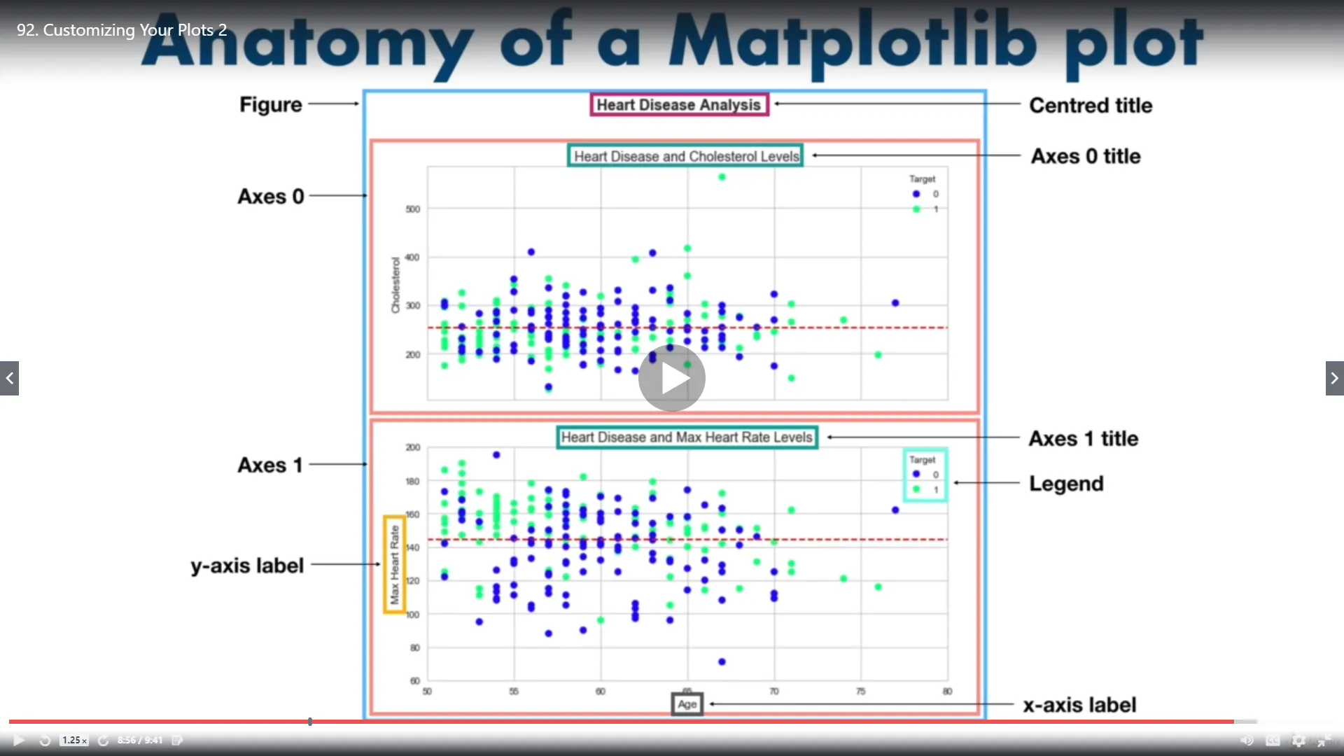
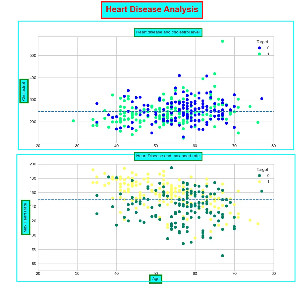
我想创建一个像这样的图像,但是我无法将单独的绘图放入框架中。
图形和轴有一个补丁属性,它是组成背景的矩形。因此,设置图形框架非常简单:
import matplotlib.pyplot as plt
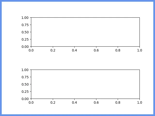
fig, axes = plt.subplots(2, 1)
# add a bit more breathing room around the axes for the frames
fig.subplots_adjust(top=0.85, bottom=0.15, left=0.2, hspace=0.8)
fig.patch.set_linewidth(10)
fig.patch.set_edgecolor('cornflowerblue')
# When saving the figure, the figure patch parameters are overwritten (WTF?).
# Hence we need to specify them again in the save command.
fig.savefig('test.png', edgecolor=fig.get_edgecolor())
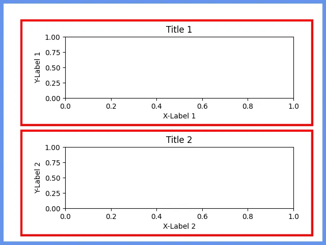
现在轴是一个更难解决的问题。我们可以采用与图形相同的方法(@jody-klymak我想是建议),但是该补丁仅对应于位于轴限制范围内的区域,即它不包括刻度标签、轴标签和标题。
然而,轴有一个get_tightbbox 方法,这就是我们需要的。但是,使用它也有一些小问题,如代码注释所述。
# We want to use axis.get_tightbbox to determine the axis dimensions including all
# decorators, i.e. tick labels, axis labels, etc.
# However, get_tightbox requires the figure renderer, which is not initialized
# until the figure is drawn.
plt.ion()
fig.canvas.draw()

for ii, ax in enumerate(axes):
    ax.set_title(f'Title {ii+1}')
    ax.set_ylabel(f'Y-Label {ii+1}')
    ax.set_xlabel(f'X-Label {ii+1}')
    bbox = ax.get_tightbbox(fig.canvas.get_renderer())
    x0, y0, width, height = bbox.transformed(fig.transFigure.inverted()).bounds
    # slightly increase the very tight bounds:
    xpad = 0.05 * width
    ypad = 0.05 * height
    fig.add_artist(plt.Rectangle((x0-xpad, y0-ypad), width+2*xpad, height+2*ypad, edgecolor='red', linewidth=3, fill=False))

fig.savefig('test2.png', edgecolor=fig.get_edgecolor())
plt.show()
 我发现了一些非常相似的东西,然后想办法配置出它在做什么。
autoAxis1 = ax8i[1].axis() #ax8i[1] is the axis where we want the border

import matplotlib.patches as ptch

rec = ptch.Rectangle((autoAxis1[0]-12,autoAxis1[2]-30),(autoAxis1[1]-
autoAxis1[0])+18,(autoAxis1[3]-
autoAxis1[2])+35,fill=False,lw=2,edgecolor='cyan')

rec = ax8i[1].add_patch(rec)

rec.set_clip_on(False)
seaborn是matplotlib的高级API。对于那些希望在seaborn轴级函数周围放置边框的人,流程与其他相同。但是,图级函数需要额外的步骤。
matplotlib方法,但必须从catplot FacetGrid中提取figure和axes对象,如下所示。'pink'用于使边框在使用黑色StackOverflow背景的人中显示出来。import seaborn as sns
# load sample dataframe and convert it to a long form
df = sns.load_dataset('geyser')
df = df.melt(id_vars='kind', var_name='cat', value_name='time')
# plot the catplot
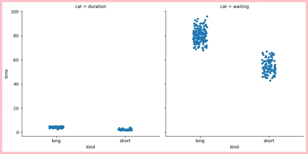
g = sns.catplot(data=df, x='kind', y='time', col='cat')
# extract the figure object
fig = g.figure
# use standard matplotlib figure methods
fig.patch.set_linewidth(10)
fig.patch.set_edgecolor('pink') # substitute 'k' for black
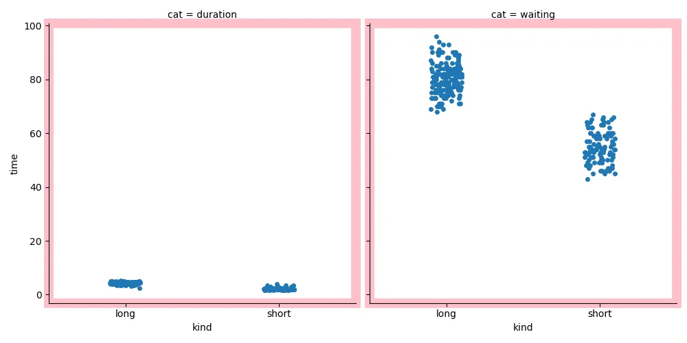
g = sns.catplot(data=df, x='kind', y='time', col='cat')

# extract and flatten the numpy array of axes
axes = g.axes.flat

# iterate through each axes and increase the linewidth and add a color
for ax in axes:
    ax.patch.set_linewidth(10)
    ax.patch.set_edgecolor('pink')
g = sns.catplot(data=df, x='kind', y='time', col='cat')

axes = g.axes.flat
for ax in axes:
    ax.patch.set_linewidth(5)
    ax.patch.set_edgecolor('k')

fig = g.figure
fig.patch.set_linewidth(10)
fig.patch.set_edgecolor('purple')
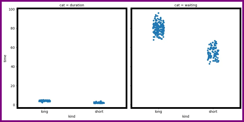
fig.canvas.renderer更改为fig.canvas.get_renderer()后,这个程序可以完美运行。 - Thomas Kühn