directlabels:避免裁剪(例如xpd = TRUE)

13
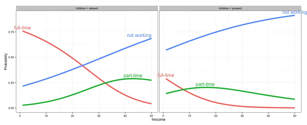
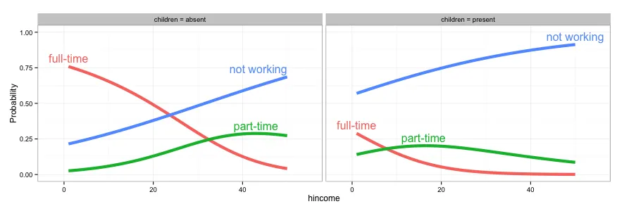
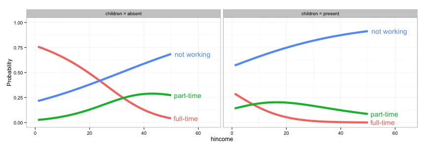
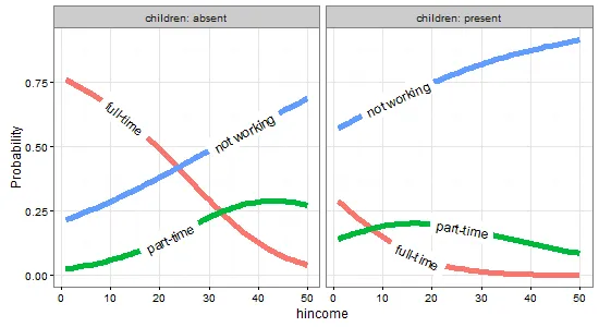
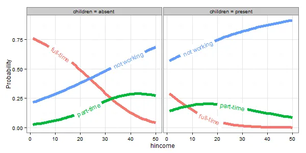
在下面的图中,直接标签位置在垂直方向上进行了微调,但它们在左/右边缘被剪裁。有没有办法避免剪裁(类似于xpd=TRUE)或者将被剪裁的标签向内调整到图框内部?
以下是此示例的代码:
library(car)
library(reshape2)
library(ggplot2)
library(directlabels)
library(nnet)

## Sec. 8.2 (Nested Dichotomies)

# transform data

Womenlf <- within(Womenlf,{
  working <-  recode(partic, " 'not.work' = 'no'; else = 'yes' ")
  fulltime <- recode(partic,
    " 'fulltime' = 'yes'; 'parttime' = 'no'; 'not.work' = NA")})

mod.working <- glm(working ~ hincome + children, family = binomial,
                   data = Womenlf)
mod.fulltime <- glm(fulltime ~ hincome + children, family = binomial,
                    data = Womenlf)

predictors <- expand.grid(hincome = 1:50,
                          children = c("absent", "present"))
fit <- data.frame(predictors,
    p.working = predict(mod.working, predictors, type = "response"),
    p.fulltime = predict(mod.fulltime, predictors, type = "response"),
    l.working = predict(mod.working, predictors, type = "link"),
    l.fulltime = predict(mod.fulltime, predictors, type = "link")
)

fit <- within(fit, {
  `full-time` <- p.working * p.fulltime
  `part-time` <- p.working * (1 - p.fulltime)
  `not working` <- 1 - p.working
  })

# Figure 8.10
fit2 = melt(fit,
            measure.vars = c("full-time","part-time","not working"),
            variable.name = "Participation",
            value.name = "Probability")

gg <- ggplot(fit2,
             aes(x = hincome, y = Probability, colour = Participation)) + 
        facet_grid(~ children, labeller = function(x, y) sprintf("%s = %s", x, y)) + 
        geom_line(size = 2) + theme_bw()

direct.label(gg, list("top.bumptwice", dl.trans(y = y + 0.2)))

可能是ggplot2 - annotate outside of plot的重复问题。 - rawr
2个回答

8
正如@rawr在评论中指出的那样,您可以使用链接问题中的代码来关闭剪切,但是如果您扩展绘图比例尺以适应标签,则绘图将更加美观。我没有使用directlabels,并不确定是否有一种方法可以调整单个标签的位置,但这里有三个其他选项:(1)关闭剪切,(2)扩展绘图区域以适应标签,以及(3)使用geom_text而不是directlabels来放置标签。
# 1. Turn off clipping so that the labels can be seen even if they are 
# outside the plot area.
gg = direct.label(gg, list("top.bumptwice", dl.trans(y = y + 0.2)))

gg2 <- ggplot_gtable(ggplot_build(gg))
gg2$layout$clip[gg2$layout$name == "panel"] <- "off"
grid.draw(gg2)

enter image description here

# 2. Expand the x and y limits so that the labels fit
gg <- ggplot(fit2,
             aes(x = hincome, y = Probability, colour = Participation)) + 
  facet_grid(~ children, labeller = function(x, y) sprintf("%s = %s", x, y)) + 
  geom_line(size = 2) + theme_bw() +
  scale_x_continuous(limits=c(-3,55)) +
  scale_y_continuous(limits=c(0,1))

direct.label(gg, list("top.bumptwice", dl.trans(y = y + 0.2)))

enter image description here

# 3. Create a separate data frame for label positions and use geom_text 
# (instead of directlabels) to position the labels. I've set this up so the
# labels will appear at the right end of each curve, but you can change
# this to suit your needs.
library(dplyr)
labs = fit2 %>% group_by(children, Participation) %>%
  summarise(Probability = Probability[which.max(hincome)],
            hincome = max(hincome))

  gg <- ggplot(fit2,
             aes(x = hincome, y = Probability, colour = Participation)) + 
    facet_grid(~ children, labeller = function(x, y) sprintf("%s = %s", x, y)) + 
    geom_line(size = 2) + theme_bw() +
    geom_text(data=labs, aes(label=Participation), hjust=-0.1) +
    scale_x_continuous(limits=c(0,65)) +
    scale_y_continuous(limits=c(0,1)) +
    guides(colour=FALSE)

enter image description here


8

更新到 ggplot2 v2.0.0 和 directlabels v2015.12.16

一种方法是更改direct.label的方法。目前没有太多好的选项来标记线条,但angled.boxes是一种可能的选择。

gg <- ggplot(fit2,
             aes(x = hincome, y = Probability, colour = Participation)) + 
        facet_grid(. ~ children, labeller = label_both) + 
        geom_line(size = 2) + theme_bw()

direct.label(gg, method = list(box.color = NA, "angled.boxes"))

或者

ggplot(fit2, aes(x = hincome, y = Probability, colour = Participation, label = Participation)) + 
        facet_grid(. ~ children, labeller = label_both) + 
        geom_line(size = 2) + theme_bw() + scale_colour_discrete(guide = 'none') +
        geom_dl(method = list(box.color = NA, "angled.boxes")) 

图片描述信息在此输入


原始回答

一种方法是更改 direct.label 的方法。 对于标记线条,没有太多其他好的选择,但 angled.boxes 是一个选择。 不幸的是, angled.boxes 不能直接使用。 需要加载函数 far.from.others.borders(),并修改另一个函数 draw.rects(),将方框边界的颜色更改为 NA。(这两个函数都可以在此处获取。)

(或者参考这里的答案

## Modify "draw.rects"

draw.rects.modified <- function(d,...){
  if(is.null(d$box.color))d$box.color <- NA
  if(is.null(d$fill))d$fill <- "white"
  for(i in 1:nrow(d)){
    with(d[i,],{
      grid.rect(gp = gpar(col = box.color, fill = fill),
                vp = viewport(x, y, w, h, "cm", c(hjust, vjust), angle=rot))
    })
  }
  d
}


## Load "far.from.others.borders"

far.from.others.borders <- function(all.groups,...,debug=FALSE){
  group.data <- split(all.groups, all.groups$group)
  group.list <- list()
  for(groups in names(group.data)){
    ## Run linear interpolation to get a set of points on which we
    ## could place the label (this is useful for e.g. the lasso path
    ## where there are only a few points plotted).
    approx.list <- with(group.data[[groups]], approx(x, y))
    if(debug){
      with(approx.list, grid.points(x, y, default.units="cm"))
    }
    group.list[[groups]] <- data.frame(approx.list, groups)
  }
  output <- data.frame()
  for(group.i in seq_along(group.list)){
    one.group <- group.list[[group.i]]
    ## From Mark Schmidt: "For the location of the boxes, I found the
    ## data point on the line that has the maximum distance (in the
    ## image coordinates) to the nearest data point on another line or
    ## to the image boundary."
    dist.mat <- matrix(NA, length(one.group$x), 3)
    colnames(dist.mat) <- c("x","y","other")
    ## dist.mat has 3 columns: the first two are the shortest distance
    ## to the nearest x and y border, and the third is the shortest
    ## distance to another data point.
    for(xy in c("x", "y")){
      xy.vec <- one.group[,xy]
      xy.mat <- rbind(xy.vec, xy.vec)
      lim.fun <- get(sprintf("%slimits", xy))
      diff.mat <- xy.mat - lim.fun()
      dist.mat[,xy] <- apply(abs(diff.mat), 2, min)
    }
    other.groups <- group.list[-group.i]
    other.df <- do.call(rbind, other.groups)
    for(row.i in 1:nrow(dist.mat)){
      r <- one.group[row.i,]
      other.dist <- with(other.df, (x-r$x)^2 + (y-r$y)^2)
      dist.mat[row.i,"other"] <- sqrt(min(other.dist))
    }
    shortest.dist <- apply(dist.mat, 1, min)
    picked <- calc.boxes(one.group[which.max(shortest.dist),])
    ## Mark's label rotation: "For the angle, I computed the slope
    ## between neighboring data points (which isn't ideal for noisy
    ## data, it should probably be based on a smoothed estimate)."
    left <- max(picked$left, min(one.group$x))
    right <- min(picked$right, max(one.group$x))
    neighbors <- approx(one.group$x, one.group$y, c(left, right))
    slope <- with(neighbors, (y[2]-y[1])/(x[2]-x[1]))
    picked$rot <- 180*atan(slope)/pi
    output <- rbind(output, picked)
  }
  output
}


## Draw the plot

angled.boxes <-
  list("far.from.others.borders", "calc.boxes", "enlarge.box", "draw.rects.modified")

gg <- ggplot(fit2,
             aes(x = hincome, y = Probability, colour = Participation)) + 
        facet_grid(~ children, labeller = function(x, y) sprintf("%s = %s", x, y)) + 
        geom_line(size = 2) + theme_bw()

direct.label(gg, list("angled.boxes"))

enter image description here


网页内容由stack overflow 提供, 点击上面的
可以查看英文原文,
原文链接