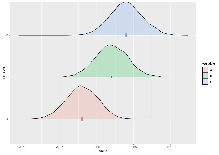
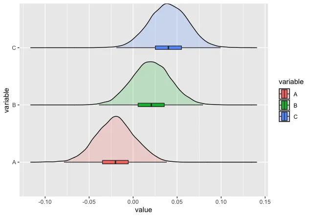
我知道有一种方法可以绘制一个带有箱线图的密度图,如下所示:因此,在这个图中,使用了中位数和四分位数。
我尝试使用geom_errorbarh,但未能生成我想要看到的内容。
这是R代码,其中包含保存在sum_stat中的平均值和95%置信区间计算结果。
我期待着收到大家的任何消息!谢谢。
我尝试使用geom_errorbarh,但未能生成我想要看到的内容。
这是R代码,其中包含保存在sum_stat中的平均值和95%置信区间计算结果。
library(ggplot2)
library(ggridges)
library(grid)
library(reshape2)
library(ggstance)
library(dplyr)

# Generating the dataset
x <- data.frame(v1=rnorm(5000, mean = -0.02, sd = 0.022),
                v2=rnorm(5000, mean =  0.02, sd = 0.022),
                v3=rnorm(5000, mean =  0.04, sd = 0.022))

colnames(x) <- c("A", "B", "C")

# Summary statistics
mean_vec <- colMeans(x)
sd_vec   <- apply(x, 2, sd)
n        <- nrow(x)

error <- qnorm(0.975)*sd_vec/sqrt(n)
left  <- mean_vec - error
right <- mean_vec + error

sum_stat <- cbind(left, mean_vec, right)

# Melting the data
data <- melt(x)
# head(data); str(data)


ggplot(data, aes(x = value, y = variable)) +
  geom_density_ridges(aes(fill = variable), alpha=0.2, scale=0.8) +
  geom_boxploth(aes(fill = variable), width = 0.06, outlier.shape = NA)
我期待着收到大家的任何消息!谢谢。