我正在构建一个Seaborn条形图。X轴是日期,Y轴是整数。
我想要为日期格式化主/次刻度线。我想让星期一的刻度线加粗并且颜色不同(即“主要刻度线”),而这一周的其他日期则不那么加粗。
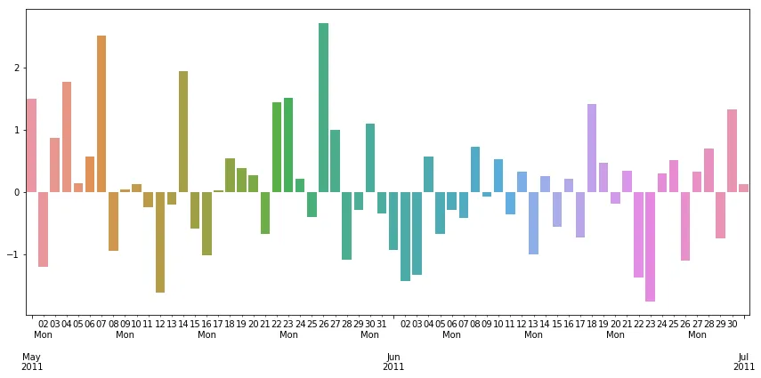
我无法在Seaborn条形图上使X轴的主/次刻度线格式化。我被难住了,因此在这里求助。
我从stackoverflow示例开始回答这个问题:Pandas timeseries plot setting x-axis major and minor ticks and labels 如果我对它进行简单修改以使用Seaborn条形图,我会失去X轴刻度线。
我尝试了多种方法,但是在Seaborn中似乎有些东西会覆盖或取消我所设计的主轴和次轴格式化尝试,除了使用
我想要为日期格式化主/次刻度线。我想让星期一的刻度线加粗并且颜色不同(即“主要刻度线”),而这一周的其他日期则不那么加粗。
我无法在Seaborn条形图上使X轴的主/次刻度线格式化。我被难住了,因此在这里求助。
我从stackoverflow示例开始回答这个问题:Pandas timeseries plot setting x-axis major and minor ticks and labels 如果我对它进行简单修改以使用Seaborn条形图,我会失去X轴刻度线。
import numpy as np
import pandas as pd
import matplotlib.pyplot as plt
import matplotlib.dates as dates

import seaborn as sns

idx = pd.date_range('2011-05-01', '2011-07-01')
s = pd.Series(np.random.randn(len(idx)), index=idx)

###########################################
## Swap out these two lines of code:
#fig, ax = plt.subplots()
#ax.plot_date(idx.to_pydatetime(), s, 'v-')

## with this one
ax = sns.barplot(idx.to_pydatetime(), s)
###########################################

ax.xaxis.set_minor_locator(dates.WeekdayLocator(byweekday=(1),
                                                interval=1))
ax.xaxis.set_minor_formatter(dates.DateFormatter('%d\n%a'))
ax.xaxis.grid(True, which="minor")
ax.yaxis.grid()
ax.xaxis.set_major_locator(dates.MonthLocator())
ax.xaxis.set_major_formatter(dates.DateFormatter('\n\n\n%b\n%Y'))
plt.tight_layout()

## save the result to a png instead of plotting to screen:
myFigure = plt.gcf()
myFigure.autofmt_xdate()
myFigure.set_size_inches(11,3.8)

plt.title('Example Chart', loc='center')

plt.savefig('/tmp/chartexample.png', format='png', bbox_inches='tight')
我尝试了多种方法,但是在Seaborn中似乎有些东西会覆盖或取消我所设计的主轴和次轴格式化尝试,除了使用
set_xticklabels()对所有刻度进行简单样式设置外。
我可以通过使用MultipleLocator()在仅主要刻度上进行格式化,但我无法在次要刻度上进行任何格式化。
我还尝试过myFigure.autofmt_xdate()来查看它是否有帮助,但它似乎也不喜欢在同一轴上混合使用主要和次要刻度。