我正在尝试使用Python制作极坐标图,到目前为止我有些成功了。以下是我希望得到一些想法/建议的问题:
1. 是否可以将圆圈的颜色设置为特定值(例如:下面示例代码中的“n”)?如果可以,我可以设置特定的颜色范围吗?例如:0-30:红色,31-40:黄色;41-60:绿色。
注意:参考自Plot with conditional colors based on values in R的示例,我尝试使用
2. 如何使数据圆圈变大一点?
3. 我可以移动“90”标签,以便图形标题不重叠吗?我尝试过:
4. 是否可能仅显示0、30和60高度标签?是否可以将它们水平定向(例如:沿着0方位线)?
谢谢您!期待听到您的建议=)
1. 是否可以将圆圈的颜色设置为特定值(例如:下面示例代码中的“n”)?如果可以,我可以设置特定的颜色范围吗?例如:0-30:红色,31-40:黄色;41-60:绿色。
注意:参考自Plot with conditional colors based on values in R的示例,我尝试使用
ax.scatter(ra,dec,c = ifelse(n < 30,’red','green'), pch = 19 )但没有成功=(2. 如何使数据圆圈变大一点?
3. 我可以移动“90”标签,以便图形标题不重叠吗?我尝试过:
x.set_rlabel_position(-22.5)但出现错误("AttributeError:'PolarAxes'对象没有属性'set_rlabel_position'")4. 是否可能仅显示0、30和60高度标签?是否可以将它们水平定向(例如:沿着0方位线)?
谢谢您!期待听到您的建议=)
import numpy
import matplotlib.pyplot as pyplot

dec = [10,20,30,40,50,60,70,80,90,80,70,60,50,40,30,20,10]
ra = [225,225,225,225,225,225,225,225,225,45,45,45,45,45,45,45,45]
n = [20,23,36,43,47,48,49,50,51,50,48,46,44,36,30,24,21]

ra = [x/180.0*3.141593 for x in ra]
fig = pyplot.figure()
ax = fig.add_axes([0.1,0.1,0.8,0.8],polar=True)
ax.set_ylim(0,90)
ax.set_yticks(numpy.arange(0,90,10))
ax.scatter(ra,dec,c ='r')
ax.set_title("Graph Title here", va='bottom')
pyplot.show()
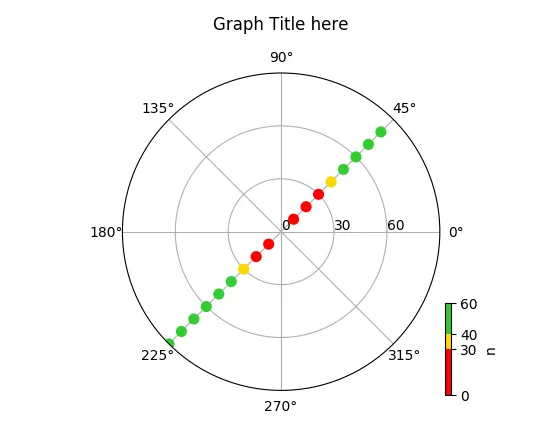
- 更改 ylim 的顺序: ax.set_ylim(90,0)
- 对每个 dec 值减去 90: dec[:] = [90 - x for x in dec]
完美解决 =)再次感谢大家的帮助!! - luke