PolyCollection 期望一组顶点,这与您的数据相当匹配。由于您没有提供任何示例数据,因此我将为说明而进行一些假设(我的200维将是您的4000维..尽管如果您有如此多的数据点,我可能会考虑其他绘图方式):
import matplotlib.pyplot as plt
from matplotlib.collections import PolyCollection
from mpl_toolkits.mplot3d import axes3d
import numpy as np
freq_data = np.linspace(0,300,200)[:,None] * np.ones(4)[None,:]
amp_data = np.random.rand(200*4).reshape((200,4))
rad_data = np.linspace(0,2,4)
verts = []
for irad in range(len(rad_data)):
xs = np.concatenate([[freq_data[0,irad]], freq_data[:,irad], [freq_data[-1,irad]]])
ys = np.concatenate([[0],amp_data[:,irad],[0]])
verts.append(list(zip(xs, ys)))
poly = PolyCollection(verts, facecolors = ['r', 'g', 'c', 'y'])
poly.set_alpha(0.7)
fig = plt.figure()
ax = fig.add_subplot(111, projection='3d')
ax.add_collection3d(poly, zs=rad_data, zdir='y')
ax.set_xlim3d(freq_data.min(), freq_data.max())
ax.set_xlabel('Frequency')
ax.set_ylim3d(rad_data.min(), rad_data.max())
ax.set_ylabel('Radius')
ax.set_zlim3d(amp_data.min(), amp_data.max())
ax.set_zlabel('Amplitude')
plt.show()
这大部分内容都来自于你提到的示例,我只是让你清楚了解你特定数据集的位置。这将产生以下图表:
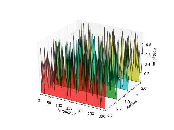
 X轴表示频率,Y轴表示半径,Z轴表示振幅。请问该如何解决这个问题?