D3 - 在简单折线图中添加网格

6
在下面这个简单的折线图中,我想要在x轴和y轴上添加网格。有人能帮我实现吗? 代码片段:
<html>

<head>

    <script src="https://cdnjs.cloudflare.com/ajax/libs/angular.js/1.4.12/angular.min.js"></script> 
    <script src="https://cdnjs.cloudflare.com/ajax/libs/jquery/3.1.1/jquery.min.js"></script> 
    <script src="https://cdnjs.cloudflare.com/ajax/libs/d3/4.3.0/d3.min.js"></script>

</head> 

<body ng-app="myApp" ng-controller="myCtrl"> 

    <svg></svg>

    <script>

        //module declaration 
        var app = angular.module('myApp',[]);

        //Controller declaration
        app.controller('myCtrl',function($scope){

            $scope.svgWidth = 800;//svg Width
            $scope.svgHeight = 500;//svg Height 

            //Data in proper format 
            var data = [
                  {"letter": "A","frequency": "5.01"},
                  {"letter": "B","frequency": "7.80"},
                  {"letter": "C","frequency": "15.35"},
                  {"letter": "D","frequency": "22.70"},
                  {"letter": "E","frequency": "34.25"},
                  {"letter": "F","frequency": "10.21"},
                  {"letter": "G","frequency": "7.68"},
            ];

                //removing prior svg elements ie clean up svg 
                d3.select('svg').selectAll("*").remove();

                //resetting svg height and width in current svg 
                d3.select("svg").attr("width", $scope.svgWidth).attr("height", $scope.svgHeight);

                //Setting up of our svg with proper calculations 
                var svg = d3.select("svg");
                var margin = {top: 20, right: 20, bottom: 30, left: 40};
                var width = svg.attr("width") - margin.left - margin.right;
                var height = svg.attr("height") - margin.top - margin.bottom;

                //Plotting our base area in svg in which chart will be shown 
                var g = svg.append("g").attr("transform", "translate(" + margin.left + "," + margin.top + ")");

                //X and Y scaling 
                var x = d3.scaleBand().rangeRound([0, width]).padding(0.4);
                var y = d3.scaleLinear().rangeRound([height, 0]);

                x.domain(data.map(function(d) { return d.letter; }));
                y.domain([0, d3.max(data, function(d) { return +d.frequency; })]);

                //Final Plotting 

                //for x axis 
                g.append("g")
                    .call(d3.axisBottom(x))
                    .attr("transform", "translate(0," + height + ")");

                //for y axis 
                g.append("g")
                    .call(d3.axisLeft(y))
                    .append("text").attr("transform", "rotate(-90)").attr("text-anchor", "end");

                //the line function for path 
                var lineFunction = d3.line()
                    .x(function(d) {return x(d.letter); })
                    .y(function(d) { return y(d.frequency); })
                    .curve(d3.curveLinear);

                //defining the lines
                var path = g.append("path");

                //plotting lines
                path
                    .attr("d", lineFunction(data))
                    .attr("stroke", "blue")
                    .attr("stroke-width", 2)
                    .attr("fill", "none");

        });

    </script> 

</body> 

</html> 

结果:

enter image description here

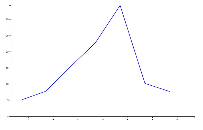
请帮我找到如何在图表的x轴和y轴上添加网格线。

提示:如果您需要更详细的说明,请提供相关代码或软件名称。

2个回答

10

创建网格线的主要方法有两种,其中一种是将innerTickSize设置为负数(请参见此答案)。这种方法的问题在于您会失去外部刻度线。因此,我将解释第二种方法:

首先,为两个轴设置类:

//for x axis 
g.append("g")
     .attr("class", "xAxis")
     .call(d3.axisBottom(x))
     .attr("transform", "translate(0," + height + ")");

 //for y axis 
 g.append("g")
     .attr("class", "yAxis")
     .call(d3.axisLeft(y))
     .append("text").attr("transform", "rotate(-90)").attr("text-anchor", "end");

然后,使用这些类,添加这些行:

d3.selectAll("g.yAxis g.tick")
    .append("line")
    .attr("class", "gridline")
    .attr("x1", 0)
    .attr("y1", 0)
    .attr("x2", width)
    .attr("y2", 0)
    .attr("stroke", "#9ca5aecf") // line color
    .attr("stroke-dasharray","4") // make it dashed;;

d3.selectAll("g.xAxis g.tick")
    .append("line")
    .attr("class", "gridline")
    .attr("x1", 0)
    .attr("y1", -height)
    .attr("x2", 0)
    .attr("y2", 0)
    .attr("stroke", "#9ca5aecf") // line color
    .attr("stroke-dasharray","4") // make it dashed;

这里是一个演示:

//Data in proper format 
            var data = [
                  {"letter": "A","frequency": "5.01"},
                  {"letter": "B","frequency": "7.80"},
                  {"letter": "C","frequency": "15.35"},
                  {"letter": "D","frequency": "22.70"},
                  {"letter": "E","frequency": "34.25"},
                  {"letter": "F","frequency": "10.21"},
                  {"letter": "G","frequency": "7.68"},
            ];
                        
                        var width = 500, height = 300;

                //removing prior svg elements ie clean up svg 
                d3.select('svg').selectAll("*").remove();

                //resetting svg height and width in current svg 
                d3.select("svg").attr("width", width).attr("height", height);

                //Setting up of our svg with proper calculations 
                var svg = d3.select("svg");
                var margin = {top: 20, right: 20, bottom: 30, left: 40};
                var width = svg.attr("width") - margin.left - margin.right;
                var height = svg.attr("height") - margin.top - margin.bottom;

                //Plotting our base area in svg in which chart will be shown 
                var g = svg.append("g").attr("transform", "translate(" + margin.left + "," + margin.top + ")");

                //X and Y scaling 
                var x = d3.scaleBand().rangeRound([0, width]).padding(0.4);
                var y = d3.scaleLinear().rangeRound([height, 0]);

                x.domain(data.map(function(d) { return d.letter; }));
                y.domain([0, d3.max(data, function(d) { return +d.frequency; })]);

                //Final Plotting 

                //for x axis 
                g.append("g")
                                .attr("class", "xAxis")
                    .call(d3.axisBottom(x))
                    .attr("transform", "translate(0," + height + ")");

                //for y axis 
                g.append("g")
                                .attr("class", "yAxis")
                    .call(d3.axisLeft(y))
                    .append("text").attr("transform", "rotate(-90)").attr("text-anchor", "end");
                                        
                                         d3.selectAll("g.yAxis g.tick") 
        .append("line") 
            .attr("class", "gridline")
            .attr("x1", 0) 
            .attr("y1", 0)
            .attr("x2", width)
            .attr("y2", 0);
            
         d3.selectAll("g.xAxis g.tick") 
        .append("line") 
            .attr("class", "gridline")
            .attr("x1", 0) 
            .attr("y1", -height)
            .attr("x2", 0)
            .attr("y2", 0);

                //the line function for path 
                var lineFunction = d3.line()
                    .x(function(d) {return x(d.letter); })
                    .y(function(d) { return y(d.frequency); })
                    .curve(d3.curveLinear);

                //defining the lines
                var path = g.append("path");

                //plotting lines
                path
                    .attr("d", lineFunction(data))
                    .attr("stroke", "blue")
                    .attr("stroke-width", 2)
                    .attr("fill", "none");
.gridline{
stroke: black;
shape-rendering: crispEdges;
stroke-opacity: .2;
}
<script src="https://d3js.org/d3.v4.min.js"></script>
<svg></svg>


5

您可以通过在XY轴定义中添加.innerTickSize(-height) .innerTickSize(-width)以及.axis path,.axis line CSS样式来实现。

enter image description here


var xAxis = d3.svg.axis()
    .scale(xScale)
    .orient("bottom")
    .innerTickSize(-height)
    .outerTickSize(0)
    .tickPadding(10);

var yAxis = d3.svg.axis()
    .scale(yScale)
    .orient("left")
    .innerTickSize(-width)
    .outerTickSize(0)
    .tickPadding(10);

svg.append("g")
    .attr("class", "y axis")
    .call(yAxis);

svg.append("g")
    .attr("class", "x axis")
    .attr("transform", "translate(0," + height + ")")
    .call(xAxis);

.axis path,
.axis line {
  fill: none;
  stroke: grey;
  stroke-width: 1;
  shape-rendering: crispEdges;
}

.axis path,
.axis line {
  fill: none;
  stroke: black;
  opacity: 0.2;
}

网页内容由stack overflow 提供, 点击上面的
可以查看英文原文,
原文链接