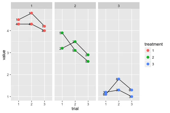
让我们来看一些虚拟数据。我有各种不同的科目、治疗和试验组合。事实上,每个受试者只与特定的治疗配对(听起来很愚蠢,但这只是一个例子)。
library(ggplot2)
d = read.table(text = '
subject   treatment trial     value
1    1    1    4.5
2    2    1    3.2
3    3    1    1.2
1    1    2    4.8
2    2    2    3.5
3    3    2    1.3
1    1    3    4.2
2    2    3    2.9
3    3    3    1
4    1    1    4.3
5    2    1    3.9
6    3    1    1.1
4    1    2    4.3
5    2    2    3.1
6    3    2    1.8
4    1    3    4
5    2    3    2.6
6    3    3    1.3
', header = TRUE)
d$treatment = as.factor(d$treatment)
d$subject = as.factor(d$subject)
d$trial = as.factor(d$trial)

dodge = position_dodge(.3)
p = ggplot(d, aes(x = treatment, y = value, color = trial, label = subject)) +
  geom_point(position = dodge) +
  scale_y_continuous(breaks = pretty_breaks(n = 10)) +
  ylim(1,5) +
  geom_text(hjust = 1.5, position = dodge, size = 3)

print(p)
我理解的要求是这样的:
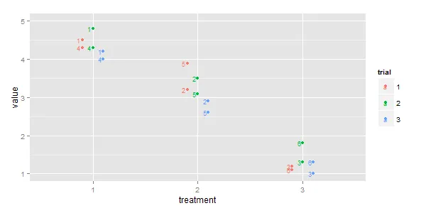
我想在相同项目之间添加一条线,也就是说,我想用黑线将左上角所有的“4”组合起来。
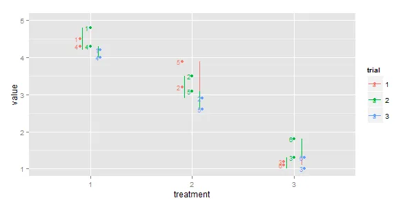
一个简单的
geom_line(aes(group = subject), position = dodge)
然而,这种方法不起作用,因为它在位置上并没有得到尊重,只会画出一条垂直线:
还有什么其他的方法可以实现这个效果呢?