在CSS-Grid中创建叠加层

6

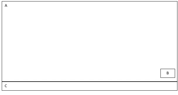
我正在尝试在CSS3网格中创建一个覆盖层,但似乎无法弄清楚如何实现。我已经在网上搜索过,但没有找到任何有用的东西。我想要实现以下效果:

enter image description here

body {
  margin: 0;
  padding: 0;
}

.wrapper {
  display: grid;
  grid-template-rows: 1f;
    width: 100vw;
    height: 100vh; 
    grid-template-areas:
      "a"
      "b"
      "c";
 }

.box {
  background-color: #444;
  color: #fff;
}

.a {
  grid-area: a;
}

.b {
  grid-area: b;
}

.c {
  grid-area: c;
}
<div class="wrapper">
  <div class="box a">A</div>
  <div class="box b">B</div>
  <div class="box c">C</div>
</div>

这里有一个CodePen的链接:https://codepen.io/anon/pen/PROVeY
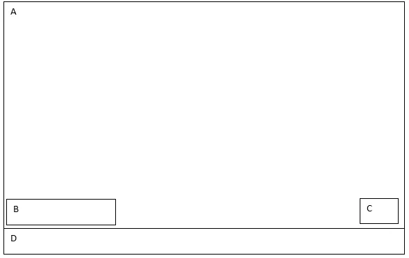
编辑:

如何在CSS3网格布局中将div放置在左侧和右侧,与其后面的大div重叠 enter image description here

 body {
      margin: 0;
      padding: 0;
    }

    .wrapper {
            display: grid;
            grid-template-rows: 1f;
        width: 100vw;
        height: 100vh; 
        grid-template-areas:
          "a"
          "b"
          "c";
        }

    .box {
      background-color: #444;
      color: #fff;
    }

    .a {
      grid-area: a;
    }

    .b {
      grid-area: b;
    }

    .c {
      grid-area: c;
    }
    .D {
      grid-area: D;
    }


    <div class="wrapper">
      <div class="box a">A</div>
      <div class="box b">B</div>
      <div class="box c">C</div>
      <div class="box D">C</div>
    </div>
3个回答

6

就像这样:

在这里,网格模板区域并不是最有用的东西。最好独立定义列/行,然后将元素单独分配到它们上面。然后根据需要对它们进行对齐。

body {
    margin: 0;
    padding: 0;
}

.wrapper {
  margin:auto;
  width:90vw;
    display: grid;
    height: 100vh; 
  grid-template-columns:1fr; /* only one column */
  grid-template-rows:1fr auto; /* 2 rows */
    }
.a,
.b {
  grid-column:1; /* first-column */
  grid-row:1; /* first row */
}


.b {
  width:3em;
  height:3em;
  align-self: end; /* bottom of column */
  justify-self: end; /* right of row */
  margin:1em;
}

.box {
  border:1px solid green;
}
<div class="wrapper">
  <div class="box a">A</div>
  <div class="box b">B</div>
  <div class="box c">C</div>
</div>


抱歉再次打扰你,我正在尝试根据帖子编辑部分更新我的页面,我想把一个div放在左边,另一个放在右边,但是似乎无法实现。请你能帮忙吗?谢谢。 - Jackie

1

更新您的问题后请更新答案

尝试以下代码片段:

body {
    margin: 0;
    padding: 0;
}

.wrapper {
  margin:auto;
  width:90vw;
    display: grid;
    height: 100vh; 
  grid-template-columns:1fr; /* only one column */
  grid-template-rows:1fr auto; /* 2 rows */
    }
.a,
.b,.c {
  grid-column:1; /* first-column */
  grid-row:1; /* first row */
}

.c {
  width:3em;
  height:3em;
  align-self: end; /* bottom of column */
  justify-self: end; /* right of row */
  margin:1em;
}

.b {
  width:9em;
  height:3em;
  align-self: end; /* bottom of column */
  justify-self: start; /* left of row */
  margin:0.5em;
 
}

.box {
  border:1px solid green;
}
<div class="wrapper">
  <div class="box a">A</div>
  <div class="box b">B</div>
  <div class="box c">C</div>
  <div class="box d">D</div>
</div>


0

我知道这是一个旧问题,但是我认为CSS Grid是你在这里的最好选择:

<div class="wrapper">
  <div class="box a">A</div>
  <div class="box b">B</div>
  <div class="box c">C</div>
  <div class="box d">D</div>
</div>

.wrapper {
  display: grid;
  grid-template-columns: 2fr 4fr 1fr; /* 3 columns */
  grid-template-rows: 350px 40px 40px; /* 3 rows */
}

.a {
  background: pink;
  grid-row: 1 / 3;
  grid-column: 1 / 4;
}

.b {
  background: teal;
  grid-row: 2 / 3;
  grid-column: 1 / 2;
}

.c {
  background: yellow;
  grid-row: 2 / 3;
  grid-column: 3 / 4;
}

.d {
  background: orange;
  grid-row: 3 / 4;
  grid-column: 1 / 4;
}

网页内容由stack overflow 提供, 点击上面的
可以查看英文原文,
原文链接