当窗口大小改变时,固定SVG元素的位置

3
我有一个SVG三角形,用作网站上的“楔形”效果。然而,当我缩小窗口大小时,SVG会移动到不正确的位置。
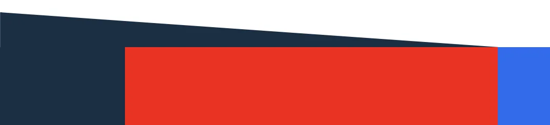
我已经附上了一个图像(如下所示),以及下面的codepen链接。
有人知道如何让此效果在调整窗口大小时保持固定位置吗?
这让我发疯了。
codepen链接:https://codepen.io/emilychews/pen/LrgwZV Emily 所需外观的图像:

enter image description here

body {margin: 0; padding: 0;}

.section {
    position: relative;
    display: flex;
    margin: 0 auto; 
    width: 100%;
    box-sizing: border-box;
    padding: 3.583rem 0;
}

.row {
    position: relative;
    display: flex;
    justify-content: center;
    margin: auto;
    width: 80%;
    box-sizing: border-box;
    z-index: 9;
}

.background-block-left-top {
    position: absolute;
    width: 40%;
    height: 50%;
    background: #162f45;
    top: 57px;
}

.two-col {
    padding:8.916rem 2.074rem;
    box-sizing: border-box;
    width: 50%;
    background: wheat;
}

.two-col.col-2 {
    display: flex;
    align-items: center;
    position: relative;
    background: #2b67f3;
    width: 85.5%;
    min-width: 0;
}

#wedge{
  position: absolute;
  width: 40%;
  height: auto;
  top: 23px;
  left: 0;
  z-index: 9;
}
1个回答

2
这里有一个更少代码且带有渐变的另一种方法来创建三角形:

body {
  margin: 0;
  padding: 0;
}

.section {
  position: relative;
  display: flex;
  margin: 0 auto;
  width: 100%;
  box-sizing: border-box;
  padding: 3.583rem 0;
}

.row {
  position: relative;
  display: flex;
  justify-content: center;
  margin: auto;
  width: 80%;
  box-sizing: border-box;
  z-index: 9;
}

.two-col {
  padding: 8.916rem 2.074rem;
  box-sizing: border-box;
  width: 37.5%;
  background: red;
}

.two-col.col-2 {
  display: flex;
  align-items: center;  
  position: relative;
  background: #2b67f3;
  width: 62.5%;
  min-width: 0;
}
.two-col.col-1:before {
    content: "";
    position: absolute;
    top: -150px;
    right: 62.5%;
    left: -100vw;
    height: calc(50% + 150px);
    background: 
      linear-gradient(to top right,#162f45 49.5%,transparent 50%) top/100% 150px no-repeat, 
      linear-gradient(#162f45,#162f45) 0 150px/100% 100% no-repeat;
    z-index: -1;
}
<section class="section">
  <div id="row-2" class="row">
    <div class="two-col col-1"></div>
    <div class="two-col col-2">
      <div class="folio-wrap">
        <h2 class="tl">LOREM IPSUM</h2>
        <p class="tl">Performant, secure and search engine optimised sites and applications. Inset covers content managment, commerce sites or a brochure site to promote a product or service.</p>
      </div>
    </div>
  </div>
</section>

另一个选择是改变SVG的位置,使其位于用作背景的元素内,并调整其位置:

body {
  margin: 0;
  padding: 0;
}

.section {
  position: relative;
  display: flex;
  margin: 0 auto;
  width: 100%;
  box-sizing: border-box;
  padding: 3.583rem 0;
}

.row {
  position: relative;
  display: flex;
  justify-content: center;
  margin: auto;
  width: 80%;
  box-sizing: border-box;
  z-index: 9;
}

.background-block-left-top {
  position: absolute;
  width: 40%;
  height: 50%;
  background: #162f45;
  top: 57px;
}

.two-col {
  padding: 8.916rem 2.074rem;
  box-sizing: border-box;
  width: 50%;
  background: red;
}

.two-col.col-2 {
  display: flex;
  align-items: center;
  position: relative;
  background: #2b67f3;
  width: 85.5%;
  min-width: 0;
}

#wedge {
  position: absolute;
  width: 100%;
  height: auto;
  bottom:100%;
  left: 0;
  z-index: 9;
}
<section class="section">
  <div class="background-block-left-top">
  <svg id="wedge" xmlns="http://www.w3.org/2000/svg" viewBox="0 0 692 49"><polygon fill="#162f45" points="0 0 0 49 692 49 "/></svg>
  </div>
  <div id="row-2" class="row">
    <div class="two-col col-1"></div>
    <div class="two-col col-2">
      <div class="folio-wrap">
        <h2 class="tl">LOREM IPSUM</h2>
        <p class="tl">Performant, secure and search engine optimised sites and applications. Inset covers content managment, commerce sites or a brochure site to promote a product or service.</p>
      </div>
    </div>
  </div>
</section>


哇,太棒了。你能解释一下那是怎么回事吗?因为背景属性是用简写方式编写的,我无法理解它是如何工作的,也不知道你是如何使定位工作的。我非常印象深刻!! - pjk_ok
@TheChewy,正如您所看到的,我使用了多个背景(用逗号分隔),第一个将创建三角形,它位于顶部,高度为150px,宽度为100%。第二个是正方形,具有100%的高/宽,并向下偏移150像素(即三角形的高度)。当然,它们两个都不应重复;) - Temani Afif
谢谢Temani。这太令人印象深刻了。唯一的问题是,在网站上还有其他需要使用无法通过CSS渐变创建的形状的情况。所以我还是处于同样的境地。我相信我可以向人们捐赠声望点数,所以我会给你20个声望点数,因为你的回答/解释非常出色。虽然我还陷入了困境,但仍需要尝试找到一种使用内联SVG完成此操作的方法。 - pjk_ok
虽然实际上我认为我会接受与三角形相关的其他答案。我会重新发布另一个问题并将此标记为正确答案。 - pjk_ok
感谢您添加另一种方法,非常感激。 - pjk_ok
显示剩余4条评论

网页内容由stack overflow 提供, 点击上面的
可以查看英文原文,
原文链接