不要使用groupby()(需要输入已排序),而是使用collections.Counter();这样就不必创建中间列表来计算输入:
from collections import Counter

counts = Counter(a)
您并没有明确指定什么是 'histogram'(直方图)。假设您想在终端上执行此操作:
width = 120
longest_key = max(len(key) for key in counts)
graph_width = width - longest_key - 2
widest = counts.most_common(1)[0][1]
scale = graph_width / float(widest)
for key, size in sorted(counts.items()):
print('{}: {}'.format(key, int(size * scale) * '*'))
演示:
>>> from collections import Counter
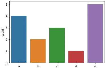
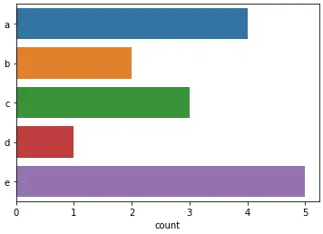
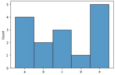
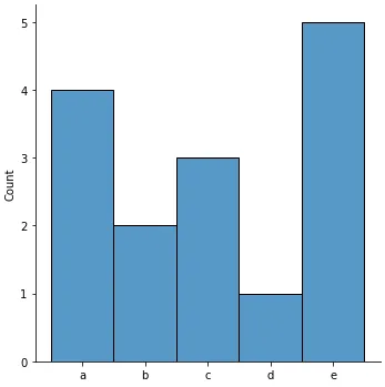
>>> a = ['a', 'a', 'a', 'a', 'b', 'b', 'c', 'c', 'c', 'd', 'e', 'e', 'e', 'e', 'e']
>>> counts = Counter(a)
>>> width = 120
>>> longest_key = max(len(key) for key in counts)
>>> graph_width = width - longest_key - 2
>>> widest = counts.most_common(1)[0][1]
>>> scale = graph_width / float(widest)
>>> for key, size in sorted(counts.items()):
... print('{}: {}'.format(key, int(size * scale) * '*'))
...
a: *********************************************************************************************
b: **********************************************
c: **********************************************************************
d: ***********************
e: *********************************************************************************************************************
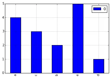
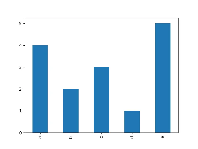
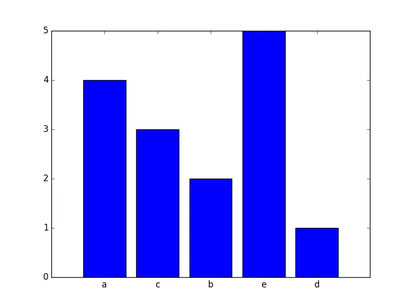
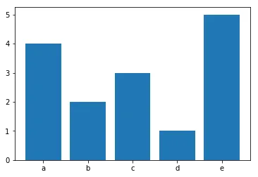
更复杂的工具可以在numpy.histogram()和matplotlib.pyplot.hist()函数中找到。这些函数为您进行了总计,而matplotlib.pyplot.hist()还提供了图形输出。