我正在处理一些数据,想要将其显示为一个nxn的图形网格。 编辑: 为了更加清晰,我的数据中有21个类别。我想按照类别进行分面,并在一个5 x 5的正方形网格中显示这21个图形(其中孤立的图形位于第五行)。因此使用facet_wrap而不是facet_grid。
我已经编写了以下代码来实现它(使用经典的鸢尾花数据集作为可重现的示例):
我已经编写了以下代码来实现它(使用经典的鸢尾花数据集作为可重现的示例):
library(ggplot2)
library(grid)

cust_theme <- theme_bw() + theme(legend.position="none",
              axis.title = element_blank(), axis.ticks = element_blank(),
              axis.text = element_blank(), strip.text = element_blank(),
              strip.background = element_blank(), panel.margin = unit(0, "lines"),
              panel.border = element_rect(size = 0.25, color = "black"),
              panel.grid = element_blank())

iris.plot <- ggplot(data = iris, aes(x = Sepal.Length, y = Sepal.Width, color = Species)) +
             geom_point() + cust_theme + facet_wrap( ~ Species, ncol = 2) +
             labs(title = "Irises by species")
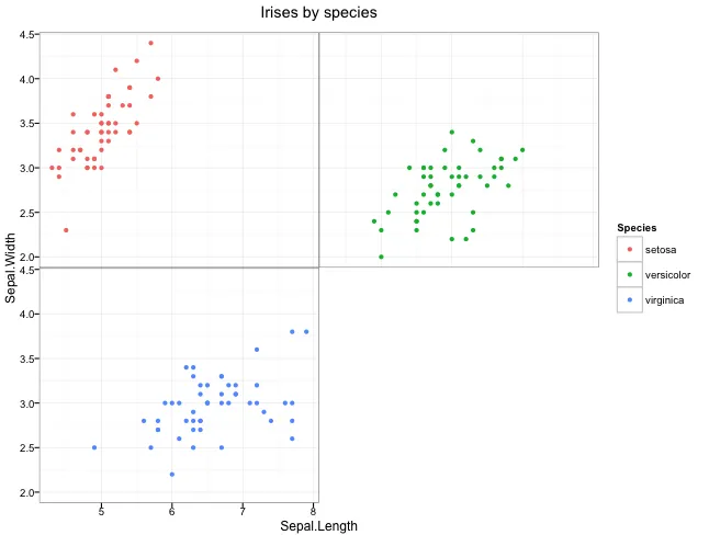
这几乎实现了我想要的,但还差一点:
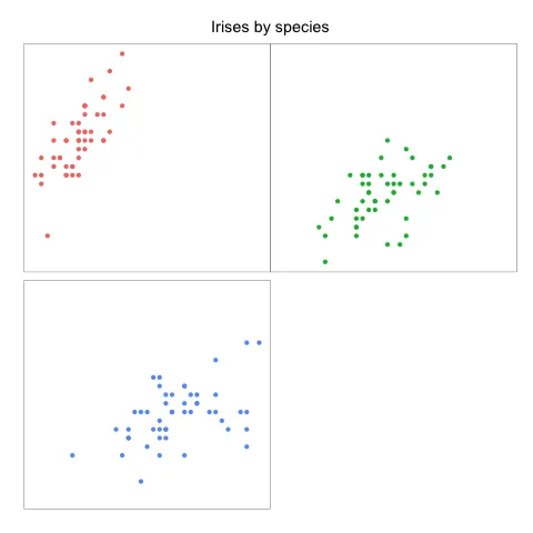
我仍然在顶行图形和底部行之间有一小条空白。我希望完全消除它,但panel.margin显然做不到。有没有办法做到这一点?

+运算符放在行的末尾,因为现有的代码会在R脚本中产生错误。或者,你可以将整个绘图调用用括号括起来。 - cr1msonB1ade