Seaborn小提琴图中HUE参数的多列

13

我正在使用小费数据集,以下是数据集的开头。


 total_bill tip     sex    smoker day time  size
0   16.99   1.01    Female  No  Sun Dinner  2
1   10.34   1.66    Male    No  Sun Dinner  3
2   21.01   3.50    Male    No  Sun Dinner  3
3   23.68   3.31    Male    No  Sun Dinner  2
4   24.59   3.61    Female  No  Sun Dinner  4
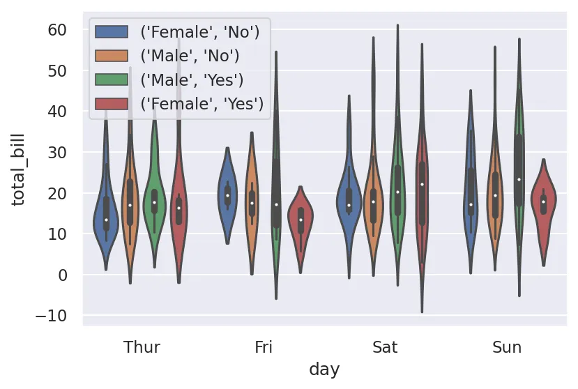
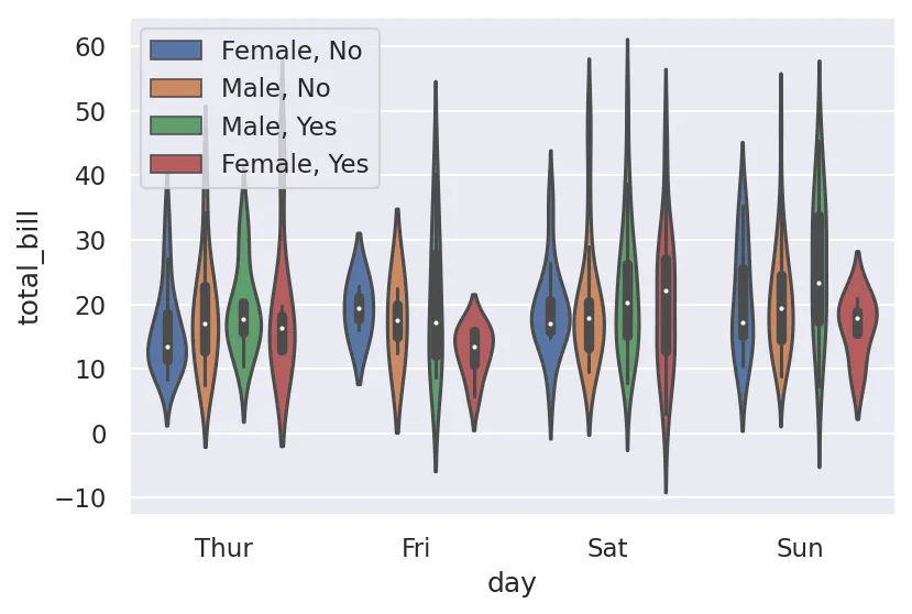
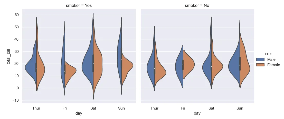
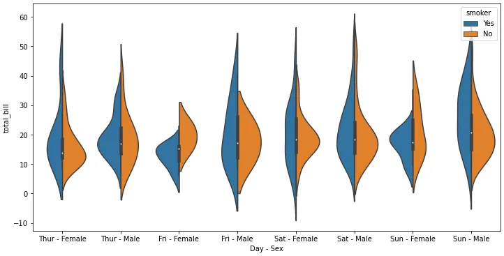
我的代码是

sns.violinplot(x='day',y='total_bill',data=tips, hue=['sex','smoker'])

我想要一个小提琴图,显示每天的总账单金额,并根据性别和是否吸烟来区分,但是我找不到设置多个hue值的选项。有没有办法?

3个回答

21

采纳答案建议的分面方法在这种情况下可能更好,但可能不容易适用于其他类型的Seaborn图(例如,在我的情况下,ecdfplot)。所以我想分享一下我找到的解决方案,它可以实现OP最初要求的目标,即实际上使用多列作为hue参数。

诀窍是hue可以是列名称,也可以是与数据长度相同的序列,列出要将每个数据点分配给的颜色类别。 所以...

sns.violinplot(x='day', y='total_bill', data=tips, hue='sex')

...基本上和以下的内容是一样的:

sns.violinplot(x='day', y='total_bill', data=tips, hue=tips['sex'])

通常情况下,您不会使用后者,因为这只是为了实现相同的功能而增加了更多的输入量 - 除非您想即时构建自定义序列:

sns.violinplot(x='day', y='total_bill', data=tips,
               hue=tips[['sex', 'smoker']].apply(tuple, axis=1))

使用两列作为色调参数的小提琴图

通过 hue 传递的序列可以由你自己构建,唯一的要求是它必须与你的数据具有相同的长度,如果是类数组,则必须是一维的,因此你不能只传递 hue=tips[['sex', 'smoker']],必须将这些列连接起来。我选择使用 tuple 作为最通用的方式,但如果你想更加控制格式,可以构建一个字符串的 Series(在这里将其保存到单独的变量中以提高可读性,但你不必这样做):

hue = tips['sex'].astype(str) + ', ' + tips['smoker'].astype(str)
sns.violinplot(x='day', y='total_bill', data=tips, hue=hue)

输入图像描述


5

你可以使用seaborn.catplot,将'sex'作为hue参数,将'smoker'作为列参数,生成并排的两个小提琴图。
以下是示例代码:

import seaborn as sns
import matplotlib.pyplot as plt
sns.set()

tips = sns.load_dataset("tips")

sns.catplot(x = "day",
            y = "total_bill",
            hue = "sex",
            col = "smoker",
            data = tips,
            kind = "violin",
            split = True)

plt.show()

这给了我这个图:

enter image description here


1
  • 创建一个新的列选项,类似于dlukes的答案。
  • 'day'/'sex''day'/'smoker'中创建一个组合字符串的列,将其设置为x=,分别使用'smoker''sex'作为hue=,并设置split=True
  • python 3.10pandas 1.4.2matplotlib 3.5.1seaborn 0.11.2中测试通过。
import seaborn as sns
import matplotlib.pyplot as plt
import pandas as pd

# load sample data
tips = sns.load_dataset("tips")

# create a new column
tips['Day - Sex'] = tips.day.astype(str) + ' - ' + tips.sex.astype(str)

# set to categorical to specify an order
categories = ['Thur - Female', 'Thur - Male', 'Fri - Female', 'Fri - Male', 'Sat - Female', 'Sat - Male', 'Sun - Female', 'Sun - Male']
tips['Day - Sex'] = pd.Categorical(tips['Day - Sex'], categories=categories, ordered=True)

# plot
fig, ax = plt.subplots(figsize=(12, 6))
sns.violinplot(x='Day - Sex', y='total_bill', data=tips, hue='smoker', ax=ax, split=True)

enter image description here


网页内容由stack overflow 提供, 点击上面的
可以查看英文原文,
原文链接