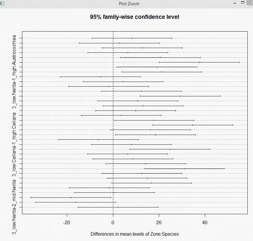
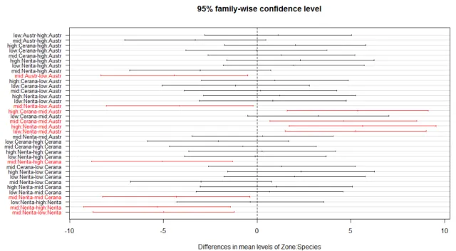
我想知道如何改变Tukey's HSD图的坐标轴,以便缩短单词长度,使每个比较都适合并且不显得荒谬。
如果您能帮助我编写更改轴标签、字体大小和颜色的代码,那将非常有帮助。
图中有很多比较,因此我希望通过改变它们的颜色来突出显示那些重要的比较(其间隔不在“0”线上)。
`Gastropods = read.csv(file = "MaroubraZones.csv", header = TRUE)
boxplot(Abundance ~ Zone*Species,data = Gastropods, names = c("A.high", "A.mid", "A.low", "C.high", "C.mid", "C.low", "N.high", "N.mid", "N.low"))
Gastropods.ANOVA = aov(Abundance ~ Zone * Species, data = Gastropods)
hist(Gastropods.ANOVA$residuals)
plot(Gastropods.ANOVA)


Gastropods$LOGAbundance = log10(Gastropods$Abundance + 1)

Gastropods$SQRTAbundance = sqrt(Gastropods$Abundance + 1)

summary(Gastropods.ANOVA)
summary(Gastropods$SQRTAbundance.ANOVA)

interaction.plot(Gastropods$Zone, Gastropods$Species, Gastropods$Abundance, main= "Gastropod Interaction Plot", xlab = "Gastropod Zone", ylab= "Mean of Gastropod Abundance",legend = FALSE))

interaction.plot(Gastropods$Zone, Gastropods$Species, Gastropods$Abundance, main= "Gastropod Interaction Plot", xlab = "Gastropod Zone", ylab= "Mean of Gastropod Abundance", legend = FALSE)


TukeyHSD(Gastropods.ANOVA)
tuk<-TukeyHSD(Gastropods.ANOVA)
plot(tuk)`
如您所见,这些轴线很糟糕,我想要突出显示零区间之外的重要数值。