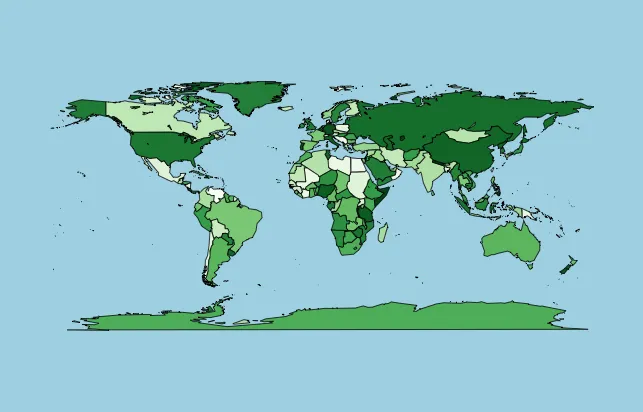
如何在使用maps绘制的R地图中添加连续色例图

3
我正在使用以下R代码,加载mapsRColorBrewer库,创建一个按人口排名颜色编码的世界地图。如下图所示,我使用绿色调色板,较深的绿色表示人口较多。

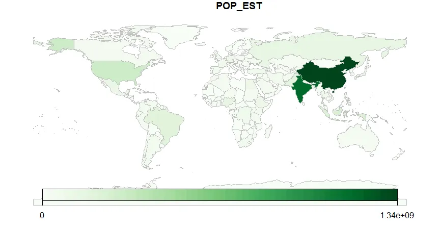
我想添加一个连续的颜色图例来显示完整的调色板,以表示浅绿色=小人口,深绿色=大人口,但我无法通过maps找到实现方法。请告诉我在我的地图上添加连续的颜色图例(或颜色键/颜色比例尺)的最简单方法是什么?

# Load libraries
library(maps)
library(RColorBrewer)

# Load world data
data(world.cities)

# Calculate world population by country
world.pop = aggregate(x=world.cities$pop, by=list(world.cities$country.etc),
                      FUN=sum)
world.pop = setNames(world.pop, c('Country', 'Population'))

# Create a color palette
palette = colorRampPalette(brewer.pal(n=9, name='Greens'))(nrow(world.pop))

# Sort the colors in the same order as the countries' populations
palette = palette[rank(-world.pop$Population)]

# Draw a map of the world
map(database='world', fill=T, col=palette, bg='light blue')

enter image description here


1
那不是使用基本图形吗?你可以在plotrix?legendcolor.legend中使用。 - rawr
感谢您的回复,rawr。这是我目前为止所拥有的:image.plot(legend.only=T, zlim=range(world.pop$Population), col=sort(palette, decreasing=T))。这种方法的问题在于图例出现在地图的顶部。我将尝试使用plotrix中的color.legend并查看其效果。感谢您的建议。 - Gyan Veda
额..这与您的问题无关, 但如果您的目标是绘制人口(相对或绝对), 那么您的代码中一定有一个错误: 我非常怀疑格陵兰岛是否位于德国和葡萄牙之间! - Jealie
你说得完全正确,Jealie。我正在研究这个问题。感谢你的指出! - Gyan Veda
2个回答

4
maps包中的世界地图已经有大约30年历史了(例如,包含苏联和南斯拉夫)。
另外,您的代码中存在一个错误,导致格陵兰人口过度密集,如@Jealie所指出(印度的人口比南极洲少)。
您可以使用rworldmap创建一个现代世界地图,并且可以创建一个连续的图例。
library(rworldmap)
library(RColorBrewer)

#get a coarse resolution map
sPDF <- getMap()

#using your green colours
mapDevice('x11') #create a map shaped device
numCats <- 100 #set number of categories to use
palette = colorRampPalette(brewer.pal(n=9, name='Greens'))(numCats)
mapCountryData(sPDF, 
               nameColumnToPlot="POP_EST", 
               catMethod="fixedWidth", 
               numCats=numCats, 
               colourPalette=palette)

带有连续图例的rworldmap人口地图

您可以通过以下方式更改图例,添加更多标签等:

mapParams <- mapCountryData(sPDF, nameColumnToPlot="POP_EST", catMethod="pretty", numCats=100, colourPalette=palette, addLegend=FALSE)

#add a modified legend using the same initial parameters as mapCountryData               
do.call( addMapLegend, c( mapParams
                          , legendLabels="all"
                          , legendWidth=0.5
))

简单地探讨一下您代码中的问题。这是因为您为world.cities中的国家数量(239)创建了调色板,然后将其应用于maps中世界数据库中多边形的数量(2026)。因此,它可能会被回收利用,并且您的国家颜色与人口没有任何关系。下面的代码演示了您问题的来源。

#find the countries used in the maps world map
mapCountries <- unique( map('world',namesonly=TRUE) )
length(mapCountries)
#[1] 2026
#exclude those containing ':' e.g. "USA:Alaska:Baranof Island"
mapCountries2 <- mapCountries[-grep(':',mapCountries)]
length(mapCountries2)
#[1] 186

#which don't match between the map and world.cities ?
#cityCountries <- unique( world.cities$country.etc )
cityCountries <- world.pop$Country
length(cityCountries)
#[1] 239

#which countries are in the map but not in world.cities ?
mapCountries2[ is.na(match(mapCountries2,cityCountries)) ]
#includes USSR, Yugoslavia & Czechoslovakia

谢谢你周到的回复,Andy!我昨天诊断了这个问题,并意识到在没有使用正则表达式进行一些主要工作的情况下给“maps”上色是不现实的。可能不值得花那么多功夫,所以我会尝试使用“rworldmap”。只是好奇,除了这个包,你还用过其他地图包吗?再次感谢。 - Gyan Veda
2
我认为rworldmap最适合这种情况,但我有偏见,因为是我写的。sp适用于空间操作,rgdal适用于投影转换,raster适用于网格地图。希望这能帮到你。 - Andy

3

在SDMTools库中,有一个名为legend.gradient的函数。

将以下代码添加到你的代码末尾,应该能得到你想要的结果:

# Draw a map of the world
map(database='world', fill=T, col=palette, bg='light blue')
x = c(-20, -15, -15, -20)
y = c(0, 60, 60, 0)
legend.gradient(cbind(x = x - 150, y = y - 30), 
                  cols = brewer.pal(n=9, name='Greens'), title = "TITLE", limits = "")

你需要调整x和y坐标,以便将图例放置在所需位置。但是要注意,x和y坐标还会调整框的形状,所以如果只更改legend.gradient函数中的数字,则框的形状不会改变。下面是这段代码应该产生的结果。

网页内容由stack overflow 提供, 点击上面的
可以查看英文原文,
原文链接