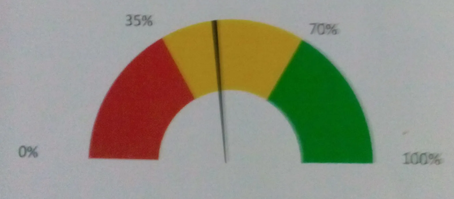
我该如何在R中绘制以下图形?
Red = 30
Yellow = 40
Green = 30

Needle at 52.
这里是一个完全使用ggplot的解决方案。
注意:从原始帖子中进行了编辑,以在刻度线处添加数字指示器和标签,这似乎是OP在他们的评论中要求的。如果不需要指示器,请删除annotate(...)行。如果不需要标签,请删除geom_text(...)行。
gg.gauge <- function(pos,breaks=c(0,30,70,100)) {
require(ggplot2)
get.poly <- function(a,b,r1=0.5,r2=1.0) {
th.start <- pi*(1-a/100)
th.end <- pi*(1-b/100)
th <- seq(th.start,th.end,length=100)
x <- c(r1*cos(th),rev(r2*cos(th)))
y <- c(r1*sin(th),rev(r2*sin(th)))
return(data.frame(x,y))
}
ggplot()+
geom_polygon(data=get.poly(breaks[1],breaks[2]),aes(x,y),fill="red")+
geom_polygon(data=get.poly(breaks[2],breaks[3]),aes(x,y),fill="gold")+
geom_polygon(data=get.poly(breaks[3],breaks[4]),aes(x,y),fill="forestgreen")+
geom_polygon(data=get.poly(pos-1,pos+1,0.2),aes(x,y))+
geom_text(data=as.data.frame(breaks), size=5, fontface="bold", vjust=0,
aes(x=1.1*cos(pi*(1-breaks/100)),y=1.1*sin(pi*(1-breaks/100)),label=paste0(breaks,"%")))+
annotate("text",x=0,y=0,label=pos,vjust=0,size=8,fontface="bold")+
coord_fixed()+
theme_bw()+
theme(axis.text=element_blank(),
axis.title=element_blank(),
axis.ticks=element_blank(),
panel.grid=element_blank(),
panel.border=element_blank())
}
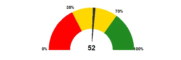
gg.gauge(52,breaks=c(0,35,70,100))
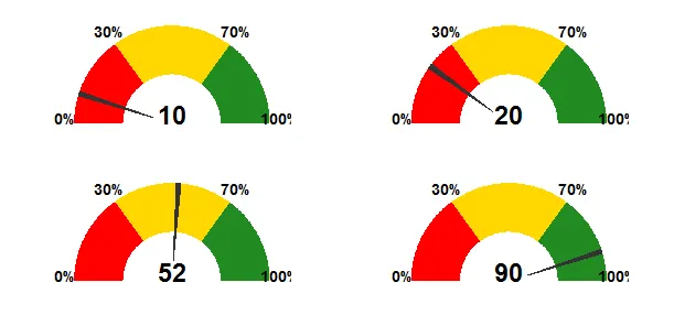
## multiple guages
library(gridExtra)
grid.newpage()
grid.draw(arrangeGrob(gg.gauge(10),gg.gauge(20),
                      gg.gauge(52),gg.gauge(90),ncol=2))
根据您仪表的实际大小,您可能需要微调geom_text(...)和annotate(...)的size=...参数。
我认为分段标签是一个非常糟糕的想法:它们会混乱图片并破坏了图形的目的(一目了然地指示度量是否处于“安全”,“警告”或“危险”领域)。
library(grid)

draw.gauge<-function(x, from=0, to=100, breaks=3,
    label=NULL, axis=TRUE, cols=c("red","yellow","green")) {

    if (length(breaks)==1) {
        breaks <- seq(0, 1, length.out=breaks+1)
    } else {
        breaks <- (breaks-from)/(to-from)
    }
    stopifnot(length(breaks) == (length(cols)+1))

    arch<-function(theta.start, theta.end, r1=1, r2=.5, col="grey", n=100) {
        t<-seq(theta.start, theta.end, length.out=n)
        t<-(1-t)*pi
        x<-c(r1*cos(t), r2*cos(rev(t)))
        y<-c(r1*sin(t), r2*sin(rev(t)))
        grid.polygon(x,y, default.units="native", gp=gpar(fill=col))
    }
    tick<-function(theta, r, w=.01) {
        t<-(1-theta)*pi
        x<-c(r*cos(t-w), r*cos(t+w), 0)
        y<-c(r*sin(t-w), r*sin(t+w), 0)
        grid.polygon(x,y, default.units="native", gp=gpar(fill="grey"))
    }
    addlabel<-function(m, theta, r) {
        t<-(1-theta)*pi
        x<-r*cos(t)
        y<-r*sin(t)
        grid.text(m,x,y, default.units="native")
    }

    pushViewport(viewport(w=.8, h=.40, xscale=c(-1,1), yscale=c(0,1)))
    bp <- split(t(embed(breaks, 2)), 1:2)
    do.call(Map, list(arch, theta.start=bp[[1]],theta.end=bp[[2]], col=cols))
    p<-(x-from)/(to-from)
    if (!is.null(axis)) {
            if(is.logical(axis) && axis) {
            m <- round(breaks*(to-from)+from,0)
            } else if (is.function(axis)) {
            m <- axis(breaks, from, to)
            } else if(is.character(axis)) {
            m <- axis
            } else {
                   m <- character(0)
            }
        if(length(m)>0) addlabel(m, breaks, 1.10)
    }
    tick(p, 1.03)
    if(!is.null(label)) {
            if(is.logical(label) && label) {
            m <- x
            } else if (is.function(label)) {
            m <- label(x)
            } else {
            m <- label
            }
            addlabel(m, p, 1.15)
    }
    upViewport()
}
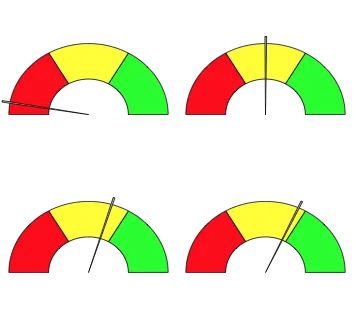
grid.newpage()
draw.gauge(100*runif(1))
grid.newpage()
pushViewport(viewport(layout=grid.layout(2,2)))
for(i in 1:4) {
    pushViewport(viewport(layout.pos.col=(i-1) %/%2 +1, layout.pos.row=(i-1) %% 2 + 1))
    draw.gauge(100*runif(1))
    upViewport()
}
popViewport()
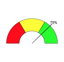
这不是太花哨,因此应该很容易进行自定义。
现在您还可以添加标签。
draw.gauge(75, label="75%")
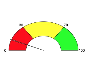
我添加了另一个更新,允许绘制“轴”。您可以将其设置为TRUE以使用默认值,或者您可以传递字符向量以提供任何标签,或者您可以传递函数,该函数将获取断点(按比例缩放为0-1)和from/to值,并应返回字符值。
grid.newpage()
draw.gauge(100*runif(1), breaks=c(0,30,70,100), axis=T)
breaks= 参数。如果你喜欢的话,你可以设置 breaks=c(0,30,70,100) 来获得30/40/30。 - MrFlickFlexdashboard有一个简单的函数可以生成仪表图。详情请查看https://rdrr.io/cran/flexdashboard/man/gauge.html
您可以使用以下简单的调用来绘制图表:
gauge(42, min = 0, max = 100, symbol = '%',
gaugeSectors(success = c(80, 100), warning = c(40, 79), danger = c(0, 39)))
library(googleVis)

plot(gvisGauge(data.frame(Label=”UserR!”, Value=80),
options=list(min=0, max=100,
yellowFrom=80, yellowTo=90,
redFrom=90, redTo=100)))

Here is the function created later:

# Original code by Gaston Sanchez   http://www.r-bloggers.com/gauge-chart-in-r/
#
dial.plot <- function(label = "UseR!", value = 78, dial.radius = 1
          , value.cex = 3, value.color = "black"
          , label.cex = 3, label.color = "black"
          , gage.bg.color = "white"
          , yellowFrom = 75, yellowTo = 90, yellow.slice.color = "#FF9900"
          , redFrom = 90, redTo = 100, red.slice.color = "#DC3912"
          , needle.color = "red", needle.center.color = "black", needle.center.cex = 1
          , dial.digets.color = "grey50"
          , heavy.border.color = "gray85", thin.border.color = "gray20", minor.ticks.color = "gray55", major.ticks.color = "gray45") {

  whiteFrom = min(yellowFrom, redFrom) - 2
  whiteTo = max(yellowTo, redTo) + 2

  # function to create a circle
  circle <- function(center=c(0,0), radius=1, npoints=100)
  {
    r = radius
    tt = seq(0, 2*pi, length=npoints)
    xx = center[1] + r * cos(tt)
    yy = center[1] + r * sin(tt)
    return(data.frame(x = xx, y = yy))
  }

  # function to get slices
  slice2xy <- function(t, rad)
  {
    t2p = -1 * t * pi + 10*pi/8
    list(x = rad * cos(t2p), y = rad * sin(t2p))
  }

  # function to get major and minor tick marks
  ticks <- function(center=c(0,0), from=0, to=2*pi, radius=0.9, npoints=5)
  {
    r = radius
    tt = seq(from, to, length=npoints)
    xx = center[1] + r * cos(tt)
    yy = center[1] + r * sin(tt)
    return(data.frame(x = xx, y = yy))
  }

  # external circle (this will be used for the black border)
  border_cir = circle(c(0,0), radius=dial.radius, npoints = 100)

  # open plot
  plot(border_cir$x, border_cir$y, type="n", asp=1, axes=FALSE,
       xlim=c(-1.05,1.05), ylim=c(-1.05,1.05),
       xlab="", ylab="")

  # gray border circle
  external_cir = circle(c(0,0), radius=( dial.radius * 0.97 ), npoints = 100)
    # initial gage background
  polygon(external_cir$x, external_cir$y,
          border = gage.bg.color, col = gage.bg.color, lty = NULL)

  # add gray border
  lines(external_cir$x, external_cir$y, col=heavy.border.color, lwd=18)
  # add external border
  lines(border_cir$x, border_cir$y, col=thin.border.color, lwd=2)

  # yellow slice (this will be used for the yellow band)
  yel_ini = (yellowFrom/100) * (12/8)
  yel_fin = (yellowTo/100) * (12/8)
  Syel = slice2xy(seq.int(yel_ini, yel_fin, length.out = 30), rad= (dial.radius * 0.9) )
  polygon(c(Syel$x, 0), c(Syel$y, 0),
          border = yellow.slice.color, col = yellow.slice.color, lty = NULL)

  # red slice (this will be used for the red band)
  red_ini = (redFrom/100) * (12/8)
  red_fin = (redTo/100) * (12/8)
  Sred = slice2xy(seq.int(red_ini, red_fin, length.out = 30), rad= (dial.radius * 0.9) )
  polygon(c(Sred$x, 0), c(Sred$y, 0),
          border = red.slice.color, col = red.slice.color, lty = NULL)

  # white slice (this will be used to get the yellow and red bands)
  white_ini = (whiteFrom/100) * (12/8)
  white_fin = (whiteTo/100) * (12/8)
  Swhi = slice2xy(seq.int(white_ini, white_fin, length.out = 30), rad= (dial.radius * 0.8) )
  polygon(c(Swhi$x, 0), c(Swhi$y, 0),
          border = gage.bg.color, col = gage.bg.color, lty = NULL)

  # calc and plot minor ticks
  minor.tix.out <- ticks(c(0,0), from=5*pi/4, to=-pi/4, radius=( dial.radius * 0.89 ), 21)
  minor.tix.in <- ticks(c(0,0), from=5*pi/4, to=-pi/4, radius=( dial.radius * 0.85 ), 21)
  arrows(x0=minor.tix.out$x, y0=minor.tix.out$y, x1=minor.tix.in$x, y1=minor.tix.in$y,
         length=0, lwd=2.5, col=minor.ticks.color)

  # coordinates of major ticks (will be plotted as arrows)
  major_ticks_out = ticks(c(0,0), from=5*pi/4, to=-pi/4, radius=( dial.radius * 0.9 ), 5)
  major_ticks_in = ticks(c(0,0), from=5*pi/4, to=-pi/4, radius=( dial.radius * 0.77 ), 5)
  arrows(x0=major_ticks_out$x, y0=major_ticks_out$y, col=major.ticks.color,
         x1=major_ticks_in$x, y1=major_ticks_in$y, length=0, lwd=3)

  # calc and plot numbers at major ticks
  dial.numbers <- ticks(c(0,0), from=5*pi/4, to=-pi/4, radius=( dial.radius * 0.70 ), 5)
  dial.lables <- c("0", "25", "50", "75", "100")
  text(dial.numbers$x, dial.numbers$y, labels=dial.lables, col=dial.digets.color, cex=.8)


  # Add dial lables
  text(0, (dial.radius * -0.65), value, cex=value.cex, col=value.color)
  # add label of variable
  text(0, (dial.radius * 0.43), label, cex=label.cex, col=label.color)

  # add needle
  # angle of needle pointing to the specified value
  val = (value/100) * (12/8)
  v = -1 * val * pi + 10*pi/8 # 10/8 becuase we are drawing on only %80 of the cir
  # x-y coordinates of needle
  needle.length <- dial.radius * .67
  needle.end.x = needle.length * cos(v)
  needle.end.y = needle.length * sin(v)

  needle.short.length <- dial.radius * .1
  needle.short.end.x = needle.short.length * -cos(v)
  needle.short.end.y = needle.short.length * -sin(v)

  needle.side.length <- dial.radius * .05
  needle.side1.end.x = needle.side.length * cos(v - pi/2)
  needle.side1.end.y = needle.side.length * sin(v - pi/2)
  needle.side2.end.x = needle.side.length * cos(v + pi/2)
  needle.side2.end.y = needle.side.length * sin(v + pi/2)

  needle.x.points <- c(needle.end.x, needle.side1.end.x, needle.short.end.x, needle.side2.end.x)
  needle.y.points <- c(needle.end.y, needle.side1.end.y, needle.short.end.y, needle.side2.end.y)
  polygon(needle.x.points, needle.y.points, col=needle.color)

  # add central blue point
  points(0, 0, col=needle.center.color, pch=20, cex=needle.center.cex)
  # add values 0 and 100
}


par(mar=c(0.2,0.2,0.2,0.2), bg="black", mfrow=c(2,2))

dial.plot ()
dial.plot (label = "Working", value = 25, dial.radius = 1
      , value.cex = 3.3, value.color = "white"
      , label.cex = 2.7, label.color = "white"
      , gage.bg.color = "black"
      , yellowFrom = 73, yellowTo = 95, yellow.slice.color = "gold"
      , redFrom = 95, redTo = 100, red.slice.color = "red"
      , needle.color = "red", needle.center.color = "white", needle.center.cex = 1
      , dial.digets.color = "white"
      , heavy.border.color = "white", thin.border.color = "black", minor.ticks.color = "white", major.ticks.color = "white")


dial.plot (label = "caffeine", value = 63, dial.radius = .7
           , value.cex = 2.3, value.color = "white"
           , label.cex = 1.7, label.color = "white"
           , gage.bg.color = "black"
           , yellowFrom = 80, yellowTo = 93, yellow.slice.color = "gold"
           , redFrom = 93, redTo = 100, red.slice.color = "red"
           , needle.color = "red", needle.center.color = "white", needle.center.cex = 1
           , dial.digets.color = "white"
           , heavy.border.color = "black", thin.border.color = "lightsteelblue4", minor.ticks.color = "orange", major.ticks.color = "tan")


dial.plot (label = "Fun", value = 83, dial.radius = .7
           , value.cex = 2.3, value.color = "white"
           , label.cex = 1.7, label.color = "white"
           , gage.bg.color = "black"
           , yellowFrom = 20, yellowTo = 75, yellow.slice.color = "olivedrab"
           , redFrom = 75, redTo = 100, red.slice.color = "green"
           , needle.color = "red", needle.center.color = "white", needle.center.cex = 1
           , dial.digets.color = "white"
           , heavy.border.color = "black", thin.border.color = "lightsteelblue4", minor.ticks.color = "orange", major.ticks.color = "tan")