基于x轴的ggplot2密度图颜色的更改

3
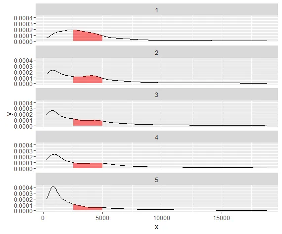
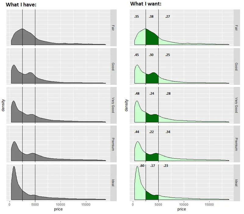
我有一些数据需要可视化,我可以制作左边的图表,但我希望能通过实现右边图片中的功能来向观众提供更多信息:根据预定义范围进行阴影处理,并显示每个范围内区域的百分比。 enter image description here 我知道这个问题与以下两个答案类似,但是我不了解密度以使数据框格式正确: 这里是复制我的示例的代码。
如果可以,请在您的回复中使用dplyr。
提前感谢。
library(dplyr)
library(ggplot2)
options(scipen = 999)

#Get percentages
  diamonds%>%
    mutate(Cut = cut,
           Prices = cut(price, 
                        breaks=c(0,2499,4999, 19000), 
                        include.lowest=T, dig.lab=10))%>%
    group_by(Cut, Prices)%>%
      summarise(Count = n())%>%
    group_by(Cut)%>%
      mutate(Pct = round(Count/sum(Count), 2))%>%
    ungroup()


#Plot
  ggplot(diamonds, aes(x=price))+
    geom_density(fill="grey50")+
    facet_grid(cut~.)+
    geom_vline(xintercept = c(2500,5000))+
    theme(axis.text.y = element_blank(),
          axis.ticks.y = element_blank())

1
你正在通过处理步骤传输的“diamonds”数据和“ggplot”调用之间没有任何连接。 - shekeine
1个回答

2
问题在于您在diamonds data.frame中没有密度数据。您面临的另一个问题是需要保留分面信息。我不确定如何使用dplyrcut分组并获取density()。您可以像您所做的那样生成摘要数据,但为了制作密度图,您需要每个点的x、y信息。
我找到的一个解决方法是将密度图p设置为这样
p<-ggplot(diamonds,aes(x=price))+geom_density()+facet_wrap(~cut,nrow=5)

然后使用ggplot_build函数获取正在绘制的数据。
pg <- ggplot_build(p)

这将为您提供一个列表,其中第一个元素是实际数据集

pg_data<-data.frame(pg$data[[1]],stringsAsFactors = F)

你可以检查你感兴趣的y列(与密度相同),x将是价格,PANEL将是分面。我没有将其更改为Good、Very Good等因子模式,但我猜你可以。
head(pg_data)
              y        x       density    scaled      count    n PANEL group
1 0.00005370272 326.0000 0.00005370272 0.2756038 0.08646139 1610     1    -1
2 0.00005829975 362.1977 0.00005829975 0.2991959 0.09386259 1610     1    -1
3 0.00006307436 398.3953 0.00006307436 0.3236993 0.10154972 1610     1    -1
4 0.00006798165 434.5930 0.00006798165 0.3488836 0.10945045 1610     1    -1
5 0.00007298816 470.7906 0.00007298816 0.3745772 0.11751094 1610     1    -1
6 0.00007807049 506.9883 0.00007807049 0.4006598 0.12569348 1610     1    -1
  ymin          ymax fill weight colour alpha size linetype
1    0 0.00005370272   NA      1  black    NA  0.5        1
2    0 0.00005829975   NA      1  black    NA  0.5        1
3    0 0.00006307436   NA      1  black    NA  0.5        1
4    0 0.00006798165   NA      1  black    NA  0.5        1
5    0 0.00007298816   NA      1  black    NA  0.5        1
6    0 0.00007807049   NA      1  black    NA  0.5        1

现在,我们可以再次绘制所有内容,但使用我们需要的密度数据。
ggplot(data=pg_data,aes(x,y))+geom_line()+facet_wrap(~PANEL,nrow=5)+geom_area(data=subset(pg_data,x>2499&x<5000),aes(x,y),fill = "red", alpha = 0.5)

enter image description here


网页内容由stack overflow 提供, 点击上面的
可以查看英文原文,
原文链接