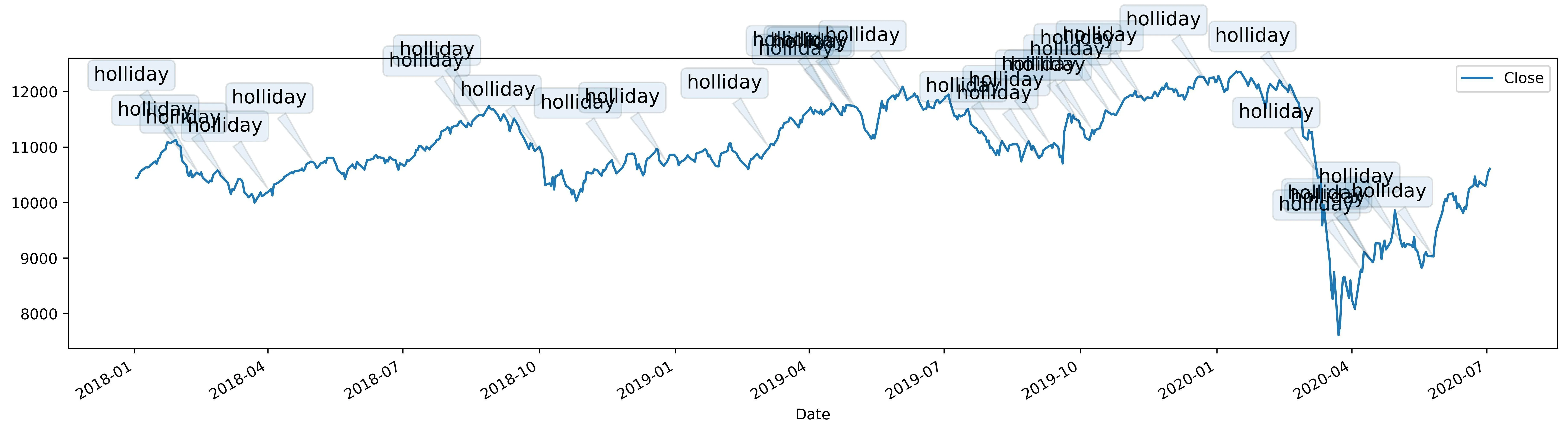
根据我的理解,自动布局是指当您放大缩小时,数据和UI将自动调整,因为即使您将气泡放在图形线的上方和下方,由于大量数据点不可忽略,您无法避免重叠。我使用了plotly库,因为matplotlib有限制。我选择了英国假期。您可以根据需要进行更改。
import plotly.graph_objects as go
import plotly.express as px
from pandas_datareader import data as web
import holidays

data = web.DataReader('fb', 'yahoo')
uk_holidays = holidays.UnitedKingdom()
data["is_holiday"] = [True if i in uk_holidays else False for i in data.index]
data["Date"] = data.index
data.reset_index(drop=True, inplace=True)

fig = px.line(data, x='Date', y='Close')

fig.update_xaxes(
    rangeslider_visible=True,
    rangeselector=dict(
        buttons=list([
            dict(count=1, label="1m", step="month", stepmode="backward"),
            dict(count=6, label="6m", step="month", stepmode="backward"),
            dict(count=1, label="YTD", step="year", stepmode="todate"),
            dict(count=1, label="1y", step="year", stepmode="backward"),
            dict(step="all")
        ])
    )
)


for close, date in data[data["is_holiday"] == True][["Close","Date"]].itertuples(index=False):
    fig.add_annotation(
        x=date.date(),
        y=close,
        xref="x",
        yref="y",
        text="Holiday",
        showarrow=True,
        font=dict(
            family="Courier New, monospace",
            size=16,
            color="#ffffff"
            ),
        align="center",
        arrowhead=2,
        arrowsize=1,
        arrowwidth=2,
        arrowcolor="#636363",
        ax=20,
        ay=-30,
        bordercolor="#c7c7c7",
        borderwidth=2,
        borderpad=4,
        bgcolor="#ff7f0e",
        opacity=0.8
        )
fig.update_layout(title_text='Trend Analysis with Holiday', title_x=0.5,showlegend=False)
fig.show()
以上代码的工作原理:
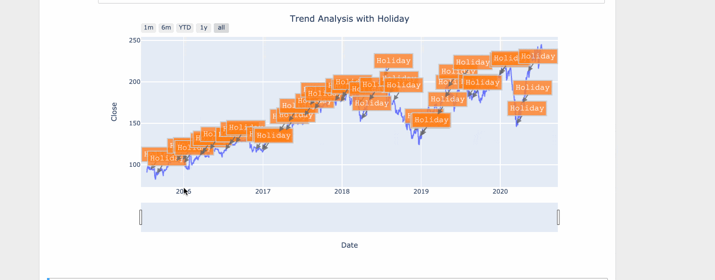
 如您所见,我已经明确提到了
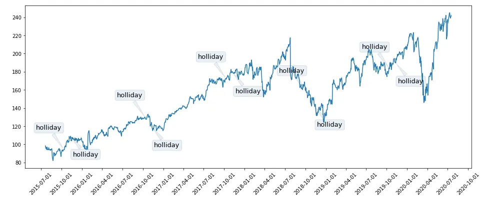
web.DataReader('fb', 'yahoo')的数据。这是来自于from pandas_datareader import data as web。 - Slartibartfast