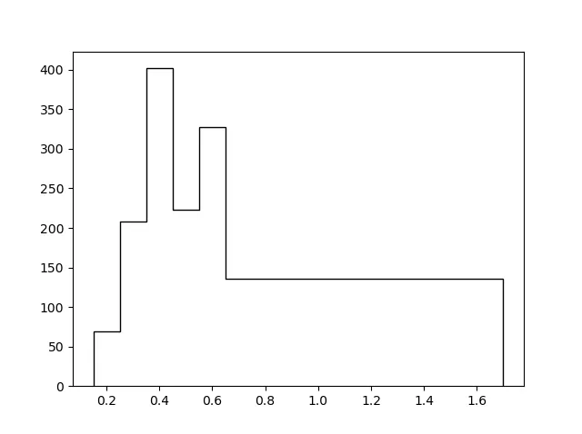
Matplotlib中的双变量直方图

3
我有这样的一组数据:
ID  z  N
0   0.15    69.0
1   0.25    208.0
2   0.35    402.0
3   0.45    223.0
4   0.55    327.0
5   0.65    136.0
6   0.75    136.0
7   0.85    136.0
8   0.95    136.0
9   1.05    136.0
10  1.15    136.0
11  1.25    136.0
12  1.35    136.0
13  1.45    136.0
14  1.55    136.0
15  1.65    136.0

我想绘制这个enter image description here的图。

我找不到方法。一个简单的plt.hist()只能绘制单一函数图。或者plt.bar(z,N)不能消除条形之间的线。

1个回答

4

这是因为plt.hist需要一个值列表来计算频率。由于您已经有了频率,您可以重新制作值列表,让plt.hist按照其设计的方式工作。

import matplotlib.pyplot as plt

z = [0.15, 0.25, 0.35, 0.45, 0.55, 0.65, 0.75, 0.85, 0.95, 1.05, 1.15, 1.25, 1.35, 1.45, 1.55, 1.65]
N = [69.0, 208.0, 402.0, 223.0, 327.0, 136.0, 136.0, 136.0, 136.0, 136.0, 136.0, 136.0, 136.0, 136.0, 136.0, 136.0]
hist_vals = []
for n,zz in zip(N,z):
    hist_vals += [zz]*int(n)
plt.hist(hist_vals,bins=z+[1.7], histtype='step', edgecolor='k')
plt.show()

Histogram


网页内容由stack overflow 提供, 点击上面的
可以查看英文原文,
原文链接