我希望在
这是默认行为:
我也试过这个方法,只是碰巧而已:
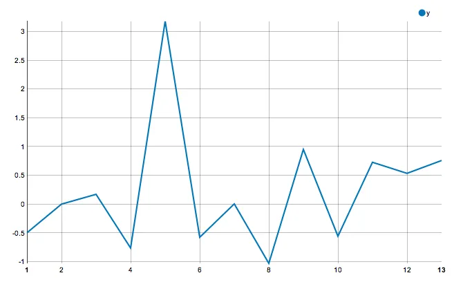
nvd3库的rCharts nPlot中,强制所有刻度标记和刻度标签沿轴线出现。我尝试过几种方法,但都没有成功。这是默认行为:
df <- data.frame(x = 1:13, y = rnorm(13))
library(rCharts)
n <- nPlot(data = df, y ~ x, type = 'lineChart')
n$yAxis(showMaxMin = FALSE)
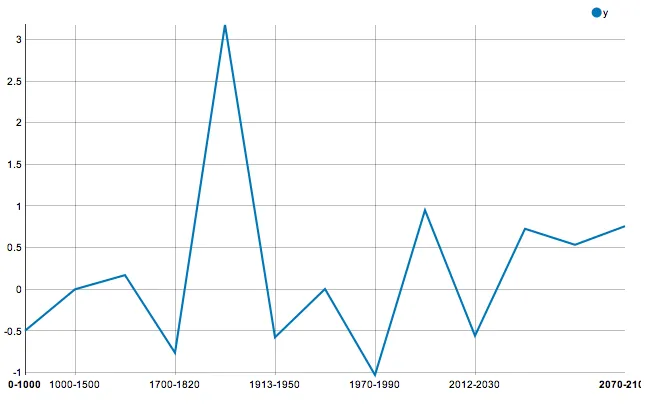
我希望将1:13的所有数据显示在x轴上。
最终,我想要用以下替换方式显示自定义刻度尺:等间距。
n$xAxis(tickFormat = "#! function (x) {
    ticklabels = ['0-1000', '1000-1500', '1500-1700', '1700-1820', '1820-1913',
        '1913-1950', '1950-1970', '1970-1990', '1990-2012', '2012-2030',
        '2030-2050', '2050-2070', '2070-2100']
        return ticklabels[x-1];
} !#")
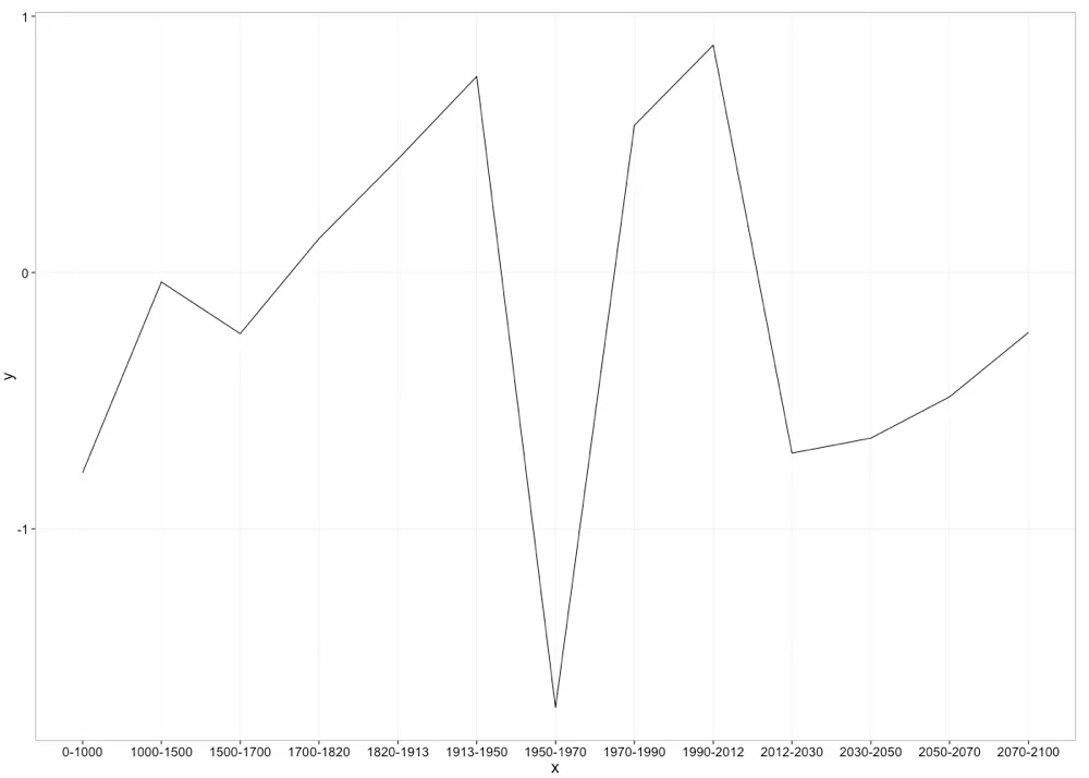
我希望清楚地表达为什么我希望所有的刻度和标签都被打印出来(并且等间距)。
下面是一个ggplot2示例,可以让您了解最终产品的效果:
library(ggplot2)
df <- data.frame(x = c('0-1000', '1000-1500', '1500-1700', '1700-1820', '1820-1913',
    '1913-1950', '1950-1970', '1970-1990', '1990-2012', '2012-2030', '2030-2050',
    '2050-2070', '2070-2100'), y = rnorm(13), z = "group1")
ggplot(data = df, aes(x = x, y = y, group = z)) + geom_line()
以下是我尝试过的几件事情,都是基于我在这里和那里找到的一些建议:都没有起作用。
根据我对文档的阅读,我认为这应该可以工作:
n$xAxis(tickFormat = "#! function (x) {
  return [1, 2, 3, 4, 5, 6, 7, 8, 9, 10, 11, 12, 13][x-1];
} !#")
我也试过这个方法,只是碰巧而已:
n$xAxis(ticks = 13)
我也尝试过结合tickValues和tickFormat,但没有成功。
我还考虑编写脚本,但是我对nvd3库的理解又不足。
n$setTemplate(afterScript =
    "<script>
        var chart = nv.models.lineChart();
        var newAxisScale = d3.scale.linear();
            .range(d3.extent(chart.axes[0]._scale.range()))
            .domain([1, d3.max(chart.axes[0]._scale.domain())])
        chart.axes[0].shapes.call(
            d3.svg.axis()
            .orient('bottom')
            .scale(newAxisScale)
            .ticks(13)
            //.tickValues()
            //.tickFormat(d3.format())
        ).selectAll('text')
          .attr('transform','')
    </script>"
)
这些代码在控制台没有报错,但是它们都没有改变上面第一个图表的外观。