在rcharts NVD3折线图中绘制区域

10

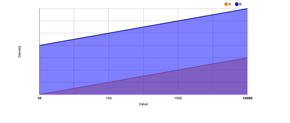
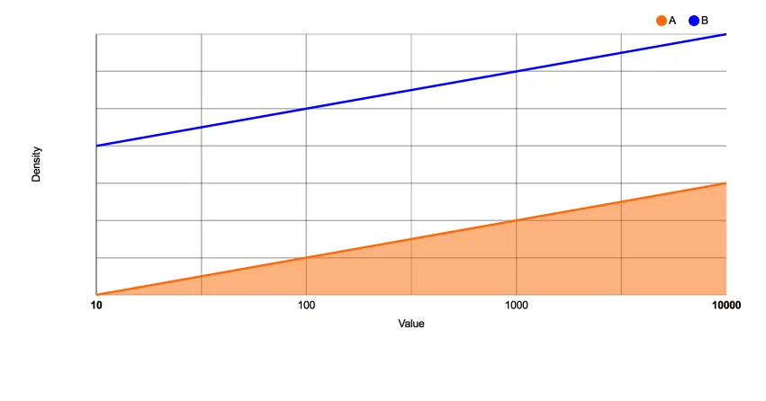
我想使用rCharts的NVD3 lineChart图表绘制不同人口的分布情况,并使用area=true选项,就像http://nvd3.org/examples/line.html中所示。

以下是我的工作内容:

require(devtools)
install_github('ramnathv/rCharts')
require(rCharts)

df<-data.frame(X=rep(1:4,2),Y=1:8,fil=c(rep("A",4),rep("B",4)))

denp <- nPlot(Y ~ X, group = 'fil', data = df, type = 'lineChart')
denp$chart(color =c('#ff7f0e', 'blue', 'green'))
denp$yAxis(axisLabel= 'Density')
denp$xAxis(axisLabel= 'Value')
denp$chart(margin = list(left=80,bottom=80))
denp$yAxis(tickFormat = "#!function (x,y,e) { return }!#")
denp$xAxis(tickFormat = "#!function (x,y,e) { 
tickformat = ['0,01','0,1',1,10,100,1000,10000,'100k'];
return tickformat[x+2];}!#")
denp$chart(tooltipContent = "#! function(key, val, e, graph){
return '<h3>' + '<font color=blue>'+ key +'</font>'+ '</h3>' + '<p>'+ val } !#")

denp

我发现的问题是,我无法将区域参数切换为true。 我尝试过:

denp$chart(area=TRUE)
denp$chart(area=c(TRUE,TRUE,TRUE))
denp$chart(area=c('true'))
denp$chart(area=c('true','true','true'))
denp$chart(area=c('#!true!#'))
denp$chart(area=c('#!true!#','#!true!#','#!true!#'))

所有这些图的结果都是一张空白的图。是否有一种方法可以在rCharts中使用面积选项来绘制这种类型的图表,或者它超出了该库的范围?

3个回答

3

您是否在寻找类似的内容?

enter image description here

我通过添加以下行实现了这一点:

denp$chart(isArea=TRUE)

将以下代码添加到您的代码中。看起来设置区域布尔值为true的函数被称为isArea (文档)。


这更接近我想要的。但是,我希望其中一个组是区域,另一个是线条。我无法根据组设置isArea为TRUE或FALSE。 - Jon Nagra

3
你可以像@seaotternerd建议的那样使用isArea函数,并使用自定义的JavaScript函数来明确设置你想要设置为true的区域参数。
例如,使用以下代码:
denp$chart(isArea="#! function(d) {
           if(d.key=='A') return true;
           } !#")

这里的d表示数据。
你会得到: 输入图像描述

这就是我在寻找的。谢谢,我不确定是否可以使用isArea函数。 - Jon Nagra

1

将类型更改为'stackedAreaChart'

这是您想要的吗?

denp <- nPlot(Y ~ X, group = 'fil', data = df, type = 'stackedAreaChart')
denp$chart(color =c('#ff7f0e', 'blue', 'green'))
denp$yAxis(axisLabel= 'Density')
denp$xAxis(axisLabel= 'Value')
denp$chart(margin = list(left=80,bottom=80))
denp$yAxis(tickFormat = "#!function (x,y,e) { return }!#")
denp$xAxis(tickFormat = "#!function (x,y,e) { 
tickformat = ['0,01','0,1',1,10,100,1000,10000,'100k'];
return tickformat[x+2];}!#")
denp$chart(tooltipContent = "#! function(key, val, e, graph){
return '<h3>' + '<font color=blue>'+ key +'</font>'+ '</h3>' + '<p>'+ val } !#")

denp

如果您想要组合图表类型(就像您链接到的示例中一样),您需要使用type = 'multiChart',请参见此处的示例here

我正在寻找的是一条线图,其中一条线的区域被填充,而另一条线没有。'stackedAreaChart' 用于堆叠时间序列,即按部门和时间销售产品,而 'multiChart' 则用于需要两个 y 轴的情况,即价格和销售随时间变化。在我的情况下,我希望两条线都使用相同的 y 轴,并且不需要数量相加。 - Jon Nagra

网页内容由stack overflow 提供, 点击上面的
可以查看英文原文,
原文链接