如何在gnuplot上绘制树形/图形/网络数据?

10
我有一组数据集,其中包含边和颜色,我想以类似于网状的方式绘制它们,使用线条和圆圈,例如下面的图片,并可能使用聚类着色。
数据的组织形式如下:
point1a_x point1a_y color
point1b_x point1b_y color

point2a_x point2a_y color
point2b_x point2b_y color
(...)

point2n_x point2n_y color

我该如何在gnuplot上实现它?
3个回答

10

好的,我已经自己解决了,并在这里留下细节以帮助有同样问题的人。

具有节点标签的单色图:

这将生成一个类似于问题中的图形,连接带有内部标签的圆圈的线条。

具有节点标签的单色图

plot 'edges.dat' u 1:2 with lines lc rgb "black" lw 2 notitle,\
'edges.dat' u 1:2:(0.6) with circles fill solid lc rgb "black" notitle,\
'edges.dat' using 1:2:($0) with labels tc rgb "white" offset (0,0) font 'Arial Bold' notitle

只需进行少量更改,就可以完全匹配问题图片中的内容。

enter image description here

plot 'edges.dat' u 1:2 with lines lc rgb "black" lw 2 notitle,\
'edges.dat' u 1:2:(0.8) with circles linecolor rgb "white" lw 2 fill solid border lc lt 0 notitle, \
'edges.dat' using 1:2:($0) with labels offset (0,0) font 'Arial Bold' notitle

集群着色图:

集群着色图

unset colorbox

set palette model RGB defined ( 0 0 0 0 , 1 1 0 0 , 2 1 0.9 0, 3 0 1 0, 4 0 1 1 , 5 0 0 1 , 6 1 0 1 )

plot 'edges.dat' u 1:2:3 with lines lc palette notitle,\
'edges.dat' u 1:2:(0.15):3 with circles fill solid palette notitle

所有图表中使用的数据都遵循以下结构:

21.53 9.55 0
24.26 7.92 0

5.63 3.23 1
2.65 1.77 1

5.63 3.23 0
4.27 7.04 0

(...)

只有一个问题... 如果点有多条线,它会被绘制两次,并带有不同的标签... 有什么解决方法吗? - rgcalsaverini
我成功找到了一个解决方法;请看我的其他答案。简而言之,您需要在输入文件中指定标签,而不是让gnuplot计算它们。 - hugomg

5

接受的答案对我来说并不完全适用。这是我不得不做出的更改:

输入文件的格式

# A vertex has 3 fields: x coordinate, y coordnate and the label
# An edge consists of two points in consecutive lines
# There must be one or more blank lines between each edge.

21.53 9.55 A
24.26 7.92 B

5.63 3.23 C
2.65 1.77 D

5.63 3.23 C
4.27 7.04 E

#...

与其他答案相比,最大的区别在于标签属于顶点而不是边。
此外,请注意我将标签更改为字母而不是数字。标签可以是任何字符串,并且这使得它们在示例中不是连续的索引更加清晰。
绘图命令:
plot \
  'edges.dat' using 1:2       with lines lc rgb "black" lw 2 notitle,\
  'edges.dat' using 1:2:(0.6) with circles fill solid lc rgb "black" notitle,\
  'edges.dat' using 1:2:3     with labels tc rgb "white" offset (0,0) font 'Arial Bold' notitle

这里的重大变化是,在绘制标签时,我们现在绘制第三个字段而不是顺序编号的$0字段。


尽管用户没有包括节点名称字段,但我认为这应该是被接受的答案 - 为了完整性。顺便问一下,有没有办法将其转换为有向图,并且是否也可以选择每个边缘的线条样式? - wtf8_decode
@wtf8_decode 是的,你也可以为每个边缘单独选择线条样式,但这会使脚本变得有点复杂。如果您感兴趣,我可以修改我的答案中的脚本。 - theozh

2

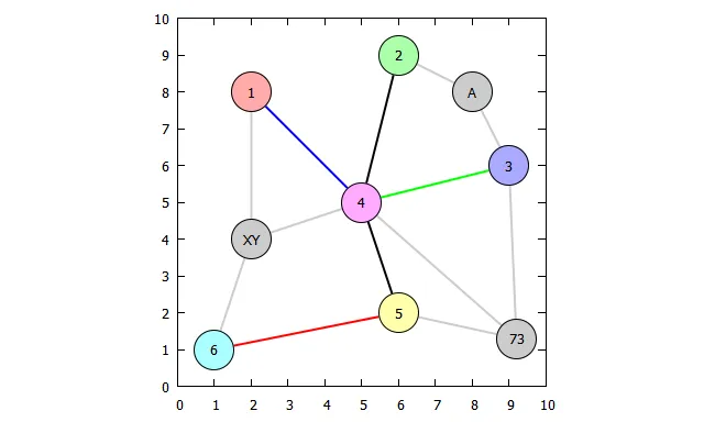
我看到了这个问题,想到可以使数据输入更加用户友好。如果您需要更改某个点的x、y坐标,您可能不希望在所有连接器中进行搜索并相应地更改所有坐标。因此,下面的示例使用节点ID和两个ID之间的连接线。

x、y坐标和颜色存储在一个字符串中,并使用函数strstrt()创建查找表。下面的脚本是一个起点,可以扩展,例如虚线、不同的点形状、字符串标签等。

数据文件如下:

  • 第一块:带有x、y坐标和颜色的ID
  • 第二块,由两个(!)空行隔开:要连接的ID和线的颜色。

数据: SO20406346.dat

# ID  x     y     PointColor
  1   2.0   8.0   0xffaaaa
  2   6.0   9.0   0xaaffaa
  3   9.0   6.0   0xaaaaff
  4   5.0   5.0   0xffaaff
  5   6.0   2.0   0xffffaa
  6   1.0   1.0   0xaaffff
 73   9.2   1.3   0xcccccc
  A   8.0   8.0   0xcccccc
 XY   2.0   4.0   0xcccccc


# ID1 ID2   LineColor
  1   4     0x0000ff
  2   4     0x000000
  3   4     0x00ff00
  4   4     0x000000
  5   4     0x000000
  6   5     0xff0000
 73   3     0xcccccc
 73   4     0xcccccc
 73   5     0xcccccc
  A   2     0xcccccc
  A   3     0xcccccc
 XY   1     0xcccccc
 XY   4     0xcccccc
 XY   6     0xcccccc

编辑:已更改以适用于字符串“IDs”。

脚本:(适用于gnuplot>=4.6.0,2012年3月)

### plot a node graph
reset

FILE = "SO20406346.dat"

IdIdxs = XYs = ' '
stats FILE u (IdIdxs=IdIdxs.sprintf("%s:%d ",strcol(1),$0), \
              XYs=XYs.sprintf("%g %g ",$2,$3)) index 0 nooutput
Px(i) = real(word(XYs,2*i+1))
Py(i) = real(word(XYs,2*i+2))

getIdx(col) = (c0=strstrt(IdIdxs,sprintf(" %s:",strcol(col))), \
              c1=strstrt(IdIdxs[c0+1:],' ')+c0, \
              s0=IdIdxs[c0:c1], c2=strstrt(s0,':'), int(s0[c2+1:]))

set size ratio 1
set key noautotitle
set offsets 0.25,0.25,0.25,0.25

plot FILE index 1 u (idx0=getIdx(1),x0=Px(idx0)):(y0=Py(idx0)): \
         (idx1=getIdx(2),Px(idx1)-x0):(Py(idx1)-y0):3 w vec lw 2 lc rgb var nohead, \
       '' index 0 u 2:3:4 w p pt 7 ps 6 lc rgb var, \
       '' index 0 u 2:3 w p pt 6 ps 6 lc rgb "black", \
       '' index 0 u 2:3:1 w labels
### end of script

结果:

enter image description here


网页内容由stack overflow 提供, 点击上面的
可以查看英文原文,
原文链接