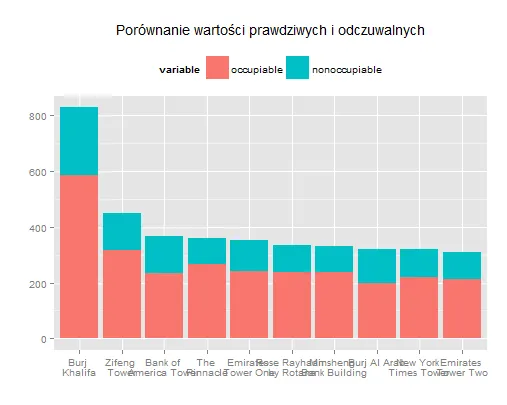
堆积条形图上仅显示顶部的geom_text

3

我希望在堆叠条形图的顶部标注标签。

这是我的数据框:

#create data frame 
building <- c("Burj \nKhalifa", "Zifeng \nTower", "Bank of \nAmerica Tower", 
              "Burj Al Arab", "Emirates \nTower One", "New York \nTimes Tower",
              "Emirates \nTower Two", "Rose Rayhaan \nby Rotana", "The \nPinnacle", 
              "Minsheng \nBank Building")
occupiable<- c(585, 317, 235, 198, 241, 220, 213, 237, 265, 237)
nonoccupiable <- c(244, 133, 131, 124, 113, 99, 97, 96, 95, 94)
df.build <- data.frame(building, occupiable, nonoccupiable)

#melt data frame for stack bar plot
df.build2 <- melt(df.build, id.vars="building")

这是我的堆积条形图:

#comparision true and percived values
ggplot(df.build2, aes(x=reorder(building, -value), y=value, fill=variable)) +
  geom_bar(stat="identity") +
  xlab("") +
  ylab("") +
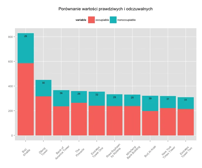
 #geom_text(aes(label = c("29%" "30%", "36%", "39%", "32%", "31%", "31%", "29%", "29%", "28%")), size = 3, hjust = 0.5, vjust = 3, position = "stack") +
  theme(legend.position="top") +
  ggtitle("Porównanie wartości prawdziwych i odczuwalnych") 

enter image description here

我希望在我的绘图代码中使用geom_text()标签,用于显示蓝色区域的高度与整个柱状图的高度之比。请问如何实现?


请看这个问题,得分最高的答案看起来与您想要的解决方案非常相似。 - tonytonov
好的,但我只想要一半的标签(仅适用于蓝色条)。因此,如果我定义 
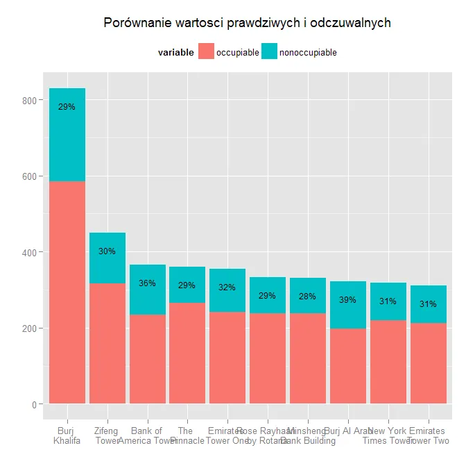
percentage <- nonoccupiable/(nonoccupiable+occupiable) 并添加到 ggplot 行 geom_text(aes(y=percentage, label = paste(round(percentage*100,0),"%",sep="")), size = 3, hjust = 0.5, vjust = 3),我会得到错误:美学必须是长度为一或与数据问题相同的长度:百分比 - jjankowiak
2个回答

5

有两个问题,你的标签向量的前两个元素之间缺少逗号;并且,你的标签向量太短了。尽管看起来你有10个条形图,但实际上你有20个(因为它们是堆叠起来的)。为了解决这个问题,在你的标签之前加上10个空白字符串:

geom_text(
 aes(label = c(rep("",10),
 "29%", "30%", "36%", "39%", "32%", "31%", "31%", "29%", "29%", "28%")),
size = 3, hjust = 0.5, vjust = 3, position = "stack")

这给出了:

堆叠条形图


4

另一种解决方案(我还更改了x轴文本的角度):

# creating percentage variables
df.build$occ.perc <- round(df.build$occupiable / (df.build$occupiable + df.build$nonoccupiable) * 100)
df.build$nonocc.perc <- round(df.build$nonoccupiable / (df.build$occupiable + df.build$nonoccupiable) * 100)

# melt data frame for stack bar plot![enter image description here][1]
df.build2 <- cbind(
  melt(df.build, id = c("building"), measure = c(2:3)),
  melt(df.build, id = c("building"), measure = c(4:5), value.name = "perc")
)
df.build2 <- df.build2[,-c(4,5)]
df.build2$perc <- ifelse(df.build2$variable=="occupiable", df.build2$perc==NA, df.build2$perc)

# creating the plot
ggplot(df.build2, aes(x=reorder(building, -value), y=value, fill=variable)) +
  geom_bar(stat="identity") +
  xlab("") +
  ylab("") +
  geom_text(aes(label = perc), size = 3, hjust = 0.5, vjust = 2, position = "stack") +
  theme(legend.position="top", axis.text.x = element_text(angle = 45, vjust=0.5)) +
  ggtitle("Porównanie wartości prawdziwych i odczuwalnych")

结果: 在此输入图片描述
(注:该段文字为格式要求,无需翻译)

网页内容由stack overflow 提供, 点击上面的
可以查看英文原文,
原文链接