Seaborn针对hue条形图的解决方法

11

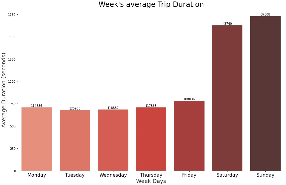
我在Jupyter notebook上有一个DataFrame,使用seaborn绘制了一个条形图:

data = {'day_index': [0, 1, 2, 3, 4, 5, 6],
        'avg_duration': [708.852242, 676.7021900000001, 684.572677, 708.92534, 781.767476, 1626.575057, 1729.155673],
        'trips': [114586, 120936, 118882, 117868, 108036, 43740, 37508]}

df = pd.DataFrame(data)

daysOfWeek = ['Monday', 'Tuesday', 'Wednesday', 'Thursday', 'Friday', 'Saturday', 'Sunday']

plt.figure(figsize=(16,10));
sns.set_style('ticks')
ax = sns.barplot(data=df, \
                 x='day_index', \
                 y='avg_duration', \
                 hue='trips', \
                 palette=sns.color_palette("Reds_d", n_colors=7, desat=1))

ax.set_xlabel("Week Days", fontsize=18, alpha=0.8)
ax.set_ylabel("Duration (seconds)", fontsize=18, alpha=0.8)
ax.set_title("Week's average Trip Duration", fontsize=24)
ax.set_xticklabels(daysOfWeek, fontsize=16)
ax.legend(fontsize=15)
sns.despine()
plt.show()

情节 A: enter image description here

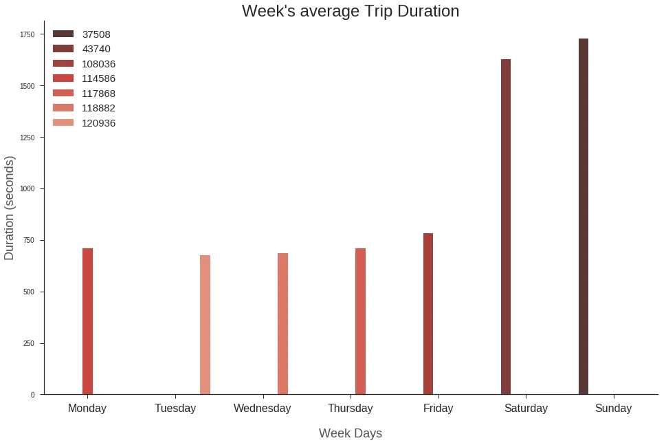
从图中可以看出,条形图与 x_ticklabels 不匹配且非常窄。
如果我删除 hue='trips' 部分,这一切都会解决,这是 seaborn 已知的问题。 尽管在可视化中显示行程次数非常重要,因此:有没有绕过 seaborn(或直接使用 matplotlib)来添加 hue 属性的方法?


请注意,您可以使用
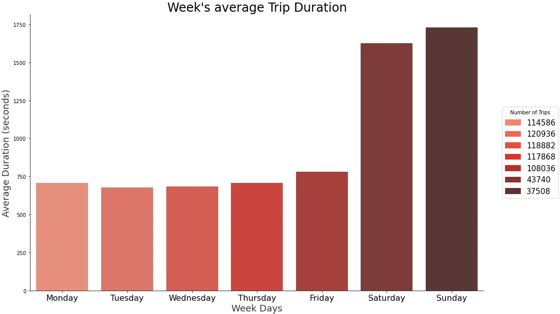
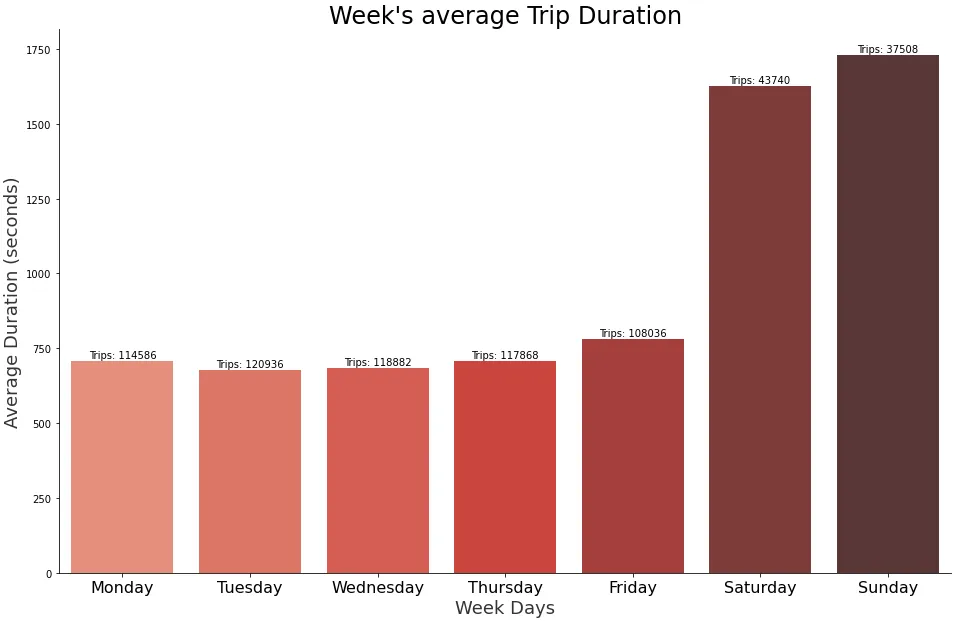
sns.barplot(..., hue='trips', dodge=False)来获得普通宽度的条形图。默认情况下,dodge=True以防止具有相同x值的多个条形图重叠。 - JohanC
4个回答

5
hue参数可能只有在引入新维度到图中时才有意义,而不是在同一维度上显示另一个量。最好不要使用hue参数来绘制条形图(实际上称其为色调相当具有误导性),而是根据"trips"列中的值对条形进行着色。这也可以在这个问题中看到:Seaborn Barplot - Displaying Values。代码如下:
import matplotlib.pyplot as plt
import seaborn as sns
import pandas as pd
import numpy as np

di = np.arange(0,7)
avg  = np.array([708.852242,676.702190,684.572677,708.925340,781.767476,
                 1626.575057,1729.155673])
trips = np.array([114586,120936,118882,117868,108036,43740,37508])
df = pd.DataFrame(np.c_[di, avg, trips], columns=["day_index","avg_duration", "trips"])

daysOfWeek = ['Monday', 'Tuesday', 'Wednesday', 'Thursday', \
'Friday', 'Saturday', 'Sunday']

plt.figure(figsize=(10,7));
sns.set_style('ticks')
v  = df.trips.values
colors=plt.cm.viridis((v-v.min())/(v.max()-v.min()))
ax = sns.barplot(data=df, x='day_index',   y='avg_duration', palette=colors)

for index, row in df.iterrows():
    ax.text(row.day_index,row.avg_duration, row.trips, color='black', ha="center")

ax.set_xlabel("Week Days", fontsize=16, alpha=0.8)
ax.set_ylabel("Duration (seconds)", fontsize=16, alpha=0.8)
ax.set_title("Week's average Trip Duration", fontsize=18)
ax.set_xticklabels(daysOfWeek, fontsize=14)
ax.legend(fontsize=15)
sns.despine()
plt.show()

enter image description here


3

我认为在这种情况下,您不需要指定 hue 参数:

In [136]: ax = sns.barplot(data=dfGroupedAgg, \
     ...:                  x='day_index', \
     ...:                  y='avg_duration', \
     ...:                  palette=sns.color_palette("Reds_d", n_colors=7, desat=1))
     ...:

您可以将旅行次数作为注释添加:

def autolabel(rects, labels=None, height_factor=1.05):
    for i, rect in enumerate(rects):
        height = rect.get_height()
        if labels is not None:
            try:
                label = labels[i]
            except (TypeError, KeyError):
                label = ' '
        else:
            label = '%d' % int(height)
        ax.text(rect.get_x() + rect.get_width()/2., height_factor*height,
                '{}'.format(label),
                ha='center', va='bottom')

autolabel(ax.patches, labels=df.trips, height_factor=1.02)

enter image description here


1

使用颜色映射构建图例

  • 删除hue。如前所述,使用此参数时,条形将不会居中,因为它们是根据色调级别的数量放置的,在这种情况下有7个级别。
  • 使用palette参数替换hue,将条形直接放置在刻度上。
  • 此选项需要手动将'trips'与颜色相关联并创建图例。
    • patches使用Patch来创建图例中的每个项目(例如与颜色和名称相关联的矩形)。
import pandas as pd
import matplotlib.pyplot as plt
import seaborn as sns
from matplotlib.patches import Patch

daysOfWeek = ['Monday', 'Tuesday', 'Wednesday', 'Thursday', 'Friday', 'Saturday', 'Sunday']

# specify the colors
colors = sns.color_palette('Reds_d', n_colors=len(df))

# create the plot
plt.figure(figsize=(16,10))
ax = sns.barplot(data=df, x='day_index', y='avg_duration', palette=colors)

# plot cosmetics
ax.set_xlabel("Week Days", fontsize=18, alpha=0.8)
ax.set_ylabel("Average Duration (seconds)", fontsize=18, alpha=0.8)
ax.set_title("Week's average Trip Duration", fontsize=24)
ax.set_xticklabels(daysOfWeek, fontsize=16)
sns.despine()

# setup the legend

# map names to colors
cmap = dict(zip(df.trips, colors))

# create the rectangles for the legend
patches = [Patch(color=v, label=k) for k, v in cmap.items()]

# add the legend
ax.legend(title='Number of Trips', handles=patches, bbox_to_anchor=(1.04, 0.5), loc='center left', borderaxespad=0, fontsize=15)

enter image description here


plt.figure(figsize=(16,10))
ax = sns.barplot(data=df, x='day_index', y='avg_duration', palette=colors)

# plot cosmetics
ax.set_xlabel("Week Days", fontsize=18, alpha=0.8)
ax.set_ylabel("Average Duration (seconds)", fontsize=18, alpha=0.8)
ax.set_title("Week's average Trip Duration", fontsize=24)
ax.set_xticklabels(daysOfWeek, fontsize=16)
sns.despine()

# add bar labels
_ = ax.bar_label(ax.containers[0], labels=df.trips, padding=1)

enter image description here

# add bar labels with customized text in a list comprehension
_ = ax.bar_label(ax.containers[0], labels=[f'Trips: {v}' for v in df.trips], padding=1)

enter image description here


1
这是解决方案。
ax = sns.barplot(data=df, \
                 x='day_index', \
                 y='avg_duration', \
                 hue='trips', \
                 dodge=False, \
                 palette=sns.color_palette("Reds_d", n_colors=7, desat=1))

网页内容由stack overflow 提供, 点击上面的
可以查看英文原文,
原文链接