CSS变换, 谷歌浏览器中的锯齿边缘

204

我一直在我的网站上使用CSS3转换来旋转图片和带有边框的文本框。

问题在于Chrome中的边框看起来很锯齿,就像没有反锯齿的低分辨率游戏。在IE、Opera和FF中看起来好多了,因为使用了AA(还是清晰可见但不那么糟糕)。我无法测试Safari,因为我没有Mac。

旋转后的照片和文本本身看起来很好,只有边框看起来很锯齿。

我使用的CSS如下:

.rotate2deg {
    transform: rotate(2deg);
    -ms-transform: rotate(2deg); /* IE 9 */
    -webkit-transform: rotate(2deg); /* Safari and Chrome */
    -o-transform: rotate(2deg); /* Opera */
    -moz-transform: rotate(2deg); /* Firefox */
}

有没有办法解决这个问题,例如强制Chrome使用抗锯齿(AA)?

以下是示例:

Jagged Edges example


对于那些后来阅读此内容的人:Chrome 版本 15(2011 年 11 月)已经修复了这个问题,但是 Safari 在 Mac 上的 5.1 版本引入了完全相同的问题,目前尚未修复。 - dtech
他们修复得非常好,回到以前的状态是不可能的。我们有一些情况,抗锯齿是我们最不想要的东西,但现在Chrome/Chromium/Safari没有方法可以关闭转换图像中的抗锯齿,尽管它们是1位图像(例如黑白gif)。模糊效果很酷,非常酷,更多的模糊效果就更酷,他们说!确保清晰边缘的唯一方法是将所有内容转换为SVG路径或对象,并添加属性shape-rendering="crispEdges"。 - Timo Kähkönen
对我来说,问题出在使用透明边框来创建箭头上。这是在Chrome 40上的win和mac中出现的。这里的任何选项都无法解决这个问题。 - Gurnard
13个回答

408

如果有人以后搜索这个问题,一个不错的解决方法是在Chrome中添加CSS属性-webkit-backface-visibility,并将其值设置为hidden,这可以消除CSS变换中出现的锯齿状边缘。在我的测试中,这个方法完全使它们平滑了。

-webkit-backface-visibility: hidden;

7
救星——这个技巧使我们能够在许多之前因反锯齿问题而被迫关闭变换的网站上重新启用-webkit-transform。感谢! - Darren
5
在 Chrome 中可以工作,但在 iOS 6 中会使它们再次变得不清晰! - lazd
11
要在iOS中修复它,请添加padding: 1px; -webkit-background-clip: content-box; - Rob Fletcher
这为我在iOS7中消除了锯齿边缘。 - Fisu
3
@RobFletcher 添加了填充和背景剪辑,这似乎是跨浏览器和跨操作系统解决方案的必要条件,根据此线程。这也解决了我的OSX/Chrome问题,所以...我认为完整的解决方案应该是:padding: 1px;-webkit-backface-visibility:hidden;backface-visibility:hidden;-webkit-background-clip:content-box;background-clip:content-box; - Benjamin Luoma
显示剩余12条评论

130
如果您使用的是transition而不是transform,那么-webkit-backface-visibility: hidden;将不起作用。在透明png文件动画期间会出现锯齿状的边缘。
为了解决这个问题,我使用了outline: 1px solid transparent;

4
这似乎有助于在 web-kit-backface-visibility 属性无法正常工作的情况下使用。 - dgibbs
2
其他方法都不行,只有这个对我有效。在添加这个属性之前,Chrome Android存在问题。现在所有浏览器似乎都正常工作了。 - Bernie Sumption
完美的解决方案。其他的都不行。我差点放弃了,开始怀疑这是否可行。但它确实可行! - Garconis
1
队列 Handle's Messiah - Moss
2
完美地满足了我的需求。我确实在使用过渡效果,而其他答案会导致我的 PNG 图像在默认状态下变得像素化。您的答案帮助消除了任何像素化现象 - 在默认状态和过渡期间都如此。太棒了! - Garconis
显示剩余4条评论

28

添加1像素的透明边框将触发反锯齿效果。

outline: 1px solid transparent;

或者,添加一个1像素的透明盒子阴影。

box-shadow: 0 0 1px rgba(255,255,255,0);

rgba(255, 255, 255, 0) 可能更好。 - mjs
4
在你的答案中添加CSS的顶部部分和outline: 1px solid transparent;对我很有效。上面的其他解决方案不够好。 - Timothy Zorn
轮廓:1像素实心透明边框;触发抗锯齿,也适用于Firefox 52(与Chrome存在相同问题)。 - Luca Detomi

19

尝试使用3D变换,这个效果很棒!

/* Due to a bug in the anti-liasing*/
-webkit-transform-style: preserve-3d; 
-webkit-transform: rotateZ(2deg);

1
现在(2013年8月,Mac上)在Chrome中尝试此操作,接受的解决方案不起作用,但是使用这个(特别是preserve-3d;可以继续使用rotate而无需更改为rotateZ)可以解决问题。 - Dave
非常hacky,但对我有效。尝试使用更小的度数,如0.05,以避免明显的错位。 - cpursley
preserve-3d 拯救了我的生命。 - Hannes Schneidermayer

12

我试过这里提供的所有解决方案,但在我的情况下都没有起作用。不过,使用

will-change: transform;

修复了锯齿问题。


2
这是唯一在 Chrome 97(不确定何时开始)上有效的解决方案。 - Persk
从来没听说过这个。谢谢,那个完美解决了。 - Flex Elektro Deimling
iPhone上唯一可行的解决方案! - smohadjer
这也对我有帮助,谷歌浏览器114,谢谢。 - JeFawk

8

选择的答案(包括其他答案)对我都不起作用,但是这个可以:

img {outline:1px solid transparent;}


2
在包含该元素的 div 上添加上述内容解决了我的问题。
-webkit-transform-style: preserve-3d;

在我的情况下,视频窗口周围出现了锯齿状边缘。

2
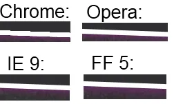
我一直有一个关于CSS3渐变的问题,它是-45度。背景倾斜,非常粗糙,比原帖子更糟糕。所以我开始尝试调整background-size。这会拉伸粗糙的部分,但仍然存在。然后我读到其他人也有45度间隔的问题,所以我将角度从-45度调整为-45.0001度,我的问题解决了。
在我的CSS中,background-size最初为30px,背景渐变的deg恰好为-45度,所有关键帧都为30px 0
    @-webkit-keyframes progressStripeLTR {
        to {
            background-position: 60px 0;
        };
    }

    @-moz-keyframes progressStripeLTR {
        to {
            background-position: 60px 0;
        };
    }

    @-ms-keyframes progressStripeLTR {
        to {
            background-position: 60px 0;
        };
    }

    @-o-keyframes progressStripeLTR {
        to {
            background-position: 60px 0;
        };
    }

    @keyframes progressStripeLTR {
        to {
            background-position: 60px 0;
        };
    }

    @-webkit-keyframes progressStripeRTL {
        to {
            background-position: -60px 0;
        };
    }

    @-moz-keyframes progressStripeRTL {
        to {
            background-position: -60px 0;
        };
    }

    @-ms-keyframes progressStripeRTL {
        to {
            background-position: -60px 0;
        };
    }

    @-o-keyframes progressStripeRTL {
        to {
            background-position: -60px 0;
        };
    }

    @keyframes progressStripeRTL {
        to {
            background-position: -60px 0;
        };
    }

    .pro-bar-candy {
        width: 100%;
        height: 15px;

        -webkit-border-radius:  3px;
        -moz-border-radius:     3px;
        border-radius:          3px;

        background: rgb(187, 187, 187);
        background: -moz-linear-gradient(
                        -45.0001deg,
                        rgba(187, 187, 187, 1.00) 25%,
                        transparent 25%,
                        transparent 50%,
                        rgba(187, 187, 187, 1.00) 50%,
                        rgba(187, 187, 187, 1.00) 75%,
                        transparent 75%,
                        transparent
                    );
        background: -webkit-linear-gradient(
                        -45.0001deg,
                        rgba(187, 187, 187, 1.00) 25%,
                        transparent 25%,
                        transparent 50%,
                        rgba(187, 187, 187, 1.00) 50%,
                        rgba(187, 187, 187, 1.00) 75%,
                        transparent 75%,
                        transparent
                    );
        background: -o-linear-gradient(
                        -45.0001deg,
                        rgba(187, 187, 187, 1.00) 25%,
                        transparent 25%,
                        transparent 50%,
                        rgba(187, 187, 187, 1.00) 50%,
                        rgba(187, 187, 187, 1.00) 75%,
                        transparent 75%,
                        transparent
                    );
        background: -ms-linear-gradient(
                        -45.0001deg,
                        rgba(187, 187, 187, 1.00) 25%,
                        transparent 25%,
                        transparent 50%,
                        rgba(187, 187, 187, 1.00) 50%,
                        rgba(187, 187, 187, 1.00) 75%,
                        transparent 75%,
                        transparent
                    );
        background: linear-gradient(
                        -45.0001deg,
                        rgba(187, 187, 187, 1.00) 25%,
                        transparent 25%,
                        transparent 50%,
                        rgba(187, 187, 187, 1.00) 50%,
                        rgba(187, 187, 187, 1.00) 75%,
                        transparent 75%,
                        transparent
                    );
        background: -webkit-gradient(
                        linear,
                        right bottom,
                        right top,
                        color-stop(
                            25%,
                            rgba(187, 187, 187, 1.00)
                        ),
                        color-stop(
                            25%,
                            rgba(0, 0, 0, 0.00)
                        ),
                        color-stop(
                            50%,
                            rgba(0, 0, 0, 0.00)
                        ),
                        color-stop(
                            50%,
                            rgba(187, 187, 187, 1.00)
                        ),
                        color-stop(
                            75%,
                            rgba(187, 187, 187, 1.00)
                        ),
                        color-stop(
                            75%,
                            rgba(0, 0, 0, 0.00)
                        ),
                        color-stop(
                            rgba(0, 0, 0, 0.00)
                        )
                    );

        background-repeat: repeat-x;
        -webkit-background-size:    60px 60px;
        -moz-background-size:       60px 60px;
        -o-background-size:         60px 60px;
        background-size:            60px 60px;
        }

    .pro-bar-candy.candy-ltr {
        -webkit-animation:  progressStripeLTR .6s linear infinite;
        -moz-animation:     progressStripeLTR .6s linear infinite;
        -ms-animation:      progressStripeLTR .6s linear infinite;
        -o-animation:       progressStripeLTR .6s linear infinite;
        animation:          progressStripeLTR .6s linear infinite;
        }

    .pro-bar-candy.candy-rtl {
        -webkit-animation:  progressStripeRTL .6s linear infinite;
        -moz-animation:     progressStripeRTL .6s linear infinite;
        -ms-animation:      progressStripeRTL .6s linear infinite;
        -o-animation:       progressStripeRTL .6s linear infinite;
        animation:          progressStripeRTL .6s linear infinite;
        }

1

我们也遇到了在Chrome/Windows上相同的问题,所以想分享我们的解决方案。

我们尝试了@stevenWatkins提供的解决方案,但仍然存在“跳步”的问题。

我们采用了以下方法:

-webkit-backface-visibility: hidden;

我们使用:

-webkit-backface-visibility: initial;

对我们来说,这个很管用


1

你可以尝试使用模糊的box-shadows来掩盖锯齿。使用-webkit-box-shadow而不是box-shadow将确保它不影响非webkit浏览器。但你可能需要检查Safari和移动webkit浏览器。

结果会好一些,但仍然比其他浏览器差很多:

with box shadow (underside)


网页内容由stack overflow 提供, 点击上面的
可以查看英文原文,
原文链接