我一直在尝试使用CSS制作这个形状。
理想情况下,它将覆盖整个浏览器窗口的长度,可能会延伸到视野之外以支持更大的屏幕,并且居中以使角度不变。
有人有解决方案吗?
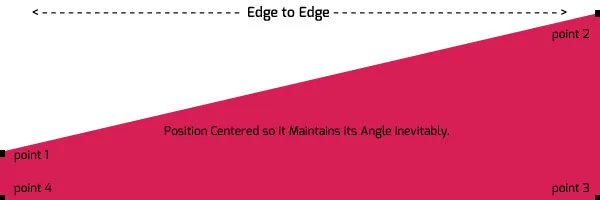
而且我认为我可能会遇到角度的锯齿问题。我可能需要使用图像。但我想使用CSS。
** 图片拼写错误。(无限期不可避免)
我一直在尝试使用CSS制作这个形状。
理想情况下,它将覆盖整个浏览器窗口的长度,可能会延伸到视野之外以支持更大的屏幕,并且居中以使角度不变。
有人有解决方案吗?
而且我认为我可能会遇到角度的锯齿问题。我可能需要使用图像。但我想使用CSS。
** 图片拼写错误。(无限期不可避免)
一种不需要CSS3支持的解决方案:
jsfiddle 演示
HTML
<div class="shape">
    <div class="top"></div>
    <div class="bottom"></div>
</div>
层叠样式表
.shape {
    width:400px;
    margin:0 auto;
}
.top {
    height:0;
    border-width:0 0 150px 400px;
    border-style:solid;
    border-color:transparent #d71f55 #d71f55 transparent;
}
.bottom {
    height: 50px;
    background-color:#d71f55;
}

/* Support transparent border colors in IE6. */
* html .top {
    filter:chroma(color=#123456);
    border-top-color:#123456;
    border-left-color:#123456;
}
注意:在一些浏览器中,对角线会出现过度的抗锯齿效果(比如过度模糊或阴影)。这个技巧在现代浏览器上有时可能会有点不可预知。
<div class="diagonal-shape bl-to-tr"></div>
<div class="block">Diagonal Shape</div>
<div class="diagonal-shape tr-to-bl"></div>
<br><br><br><br><br>
<div class="diagonal-shape tl-to-br"></div>
<div class="block">block2</div>
<div class="diagonal-shape br-to-tl"></div>
/**
 * Draw a diagonal shape, e.g. as diagonal segregation
 *
 * @author: Matt Coughlin, Pascal Garber
 *
 * @param $color: The color of the shape, default #d71f55
 * @param $direction:
 *  bl-to-tr for bottom-left to top right
 *  tr-to-bl for top-right to bottom left
 *  tl-to-br for top-left to bottom right
 *  br-to-tl for bottom-right to top left
 * @param $height: The height of the shape, default 100px
 * @param $width: The width of the shape, default 100vw
 * @param $color: The color of the shape, default #d71f55
 *
 * @see also: https://dev59.com/rWgu5IYBdhLWcg3wy558#11074735
 */
.diagonal-shape.bl-to-tr {
  height: 0;
  border-style: solid;
  border-width: 0 0 100px 100vw;
  border-color: transparent #d71f55 #d71f55 transparent;
}
.diagonal-shape.tr-to-bl {
  height: 0;
  border-style: solid;
  border-width: 100px 100vw 0 0;
  border-color: #d71f55 transparent transparent #d71f55;
}
.diagonal-shape.tl-to-br {
  height: 0;
  border-style: solid;
  border-width: 0 100vw 100px 0;
  border-color: transparent transparent #d71f55 #d71f55;
}
.diagonal-shape.br-to-tl {
  height: 0;
  border-style: solid;
  border-width: 100px 0 0 100vw;
  border-color: #d71f55 #d71f55 transparent transparent;
}

.block {
    height: 200px;
    line-height: 200px;
    background-color: #d71f55;
    color: white;
    text-align: center;

}

/* Support transparent border colors in IE6. */
* html .top {
    filter:chroma(color=#123456);
    border-top-color:#123456;
    border-left-color:#123456;
}
SCSS
/**
 * Draw a diagonal shape, e.g. as diagonal segregation
 *
 * @author: Matt Coughlin, Pascal Garber
 *
 * @param $color: The color of the shape, default #d71f55
 * @param $direction:
 *  bl-to-tr for bottom-left to top right
 *  tr-to-bl for top-right to bottom left
 *  tl-to-br for top-left to bottom right
 *  br-to-tl for bottom-right to top left
 * @param $height: The height of the shape, default 100px
 * @param $width: The width of the shape, default 100vw
 * @param $color: The color of the shape, default #d71f55
 *
 * @see also: https://dev59.com/rWgu5IYBdhLWcg3wy558#11074735
 */
@mixin diagonal-shape($color: #d71f55, $direction: 'bl-to-tr', $height: 100px, $width: 100vw) {
    height: 0;
    border-style: solid;

    @if $direction == 'bl-to-tr' {
        border-width: 0 0 $height $width;
        border-color: transparent $color $color transparent;
    } @else if $direction == 'tr-to-bl' {
        border-width: $height $width 0 0;
        border-color: $color transparent transparent $color;
    } @else if $direction == 'tl-to-br' {
        border-width: 0 $width $height 0;
        border-color: transparent  transparent $color $color;
    } @else if $direction == 'br-to-tl' {
        border-width: $height 0 0 $width;
        border-color: $color $color transparent  transparent ;
    }
}

.diagonal-shape {
    &.bl-to-tr {
        @include diagonal-shape($brand-primary, 'bl-to-tr');
    }
    &.tr-to-bl {
        @include diagonal-shape($brand-primary, 'tr-to-bl');
    }
    &.tl-to-br {
        @include diagonal-shape($brand-primary, 'tl-to-br');
    }
    &.br-to-tl {
        @include diagonal-shape($brand-primary, 'br-to-tl');
    }
}
.your-claas {
    @include diagonal-shape($color, $direction, $height, $width);
}