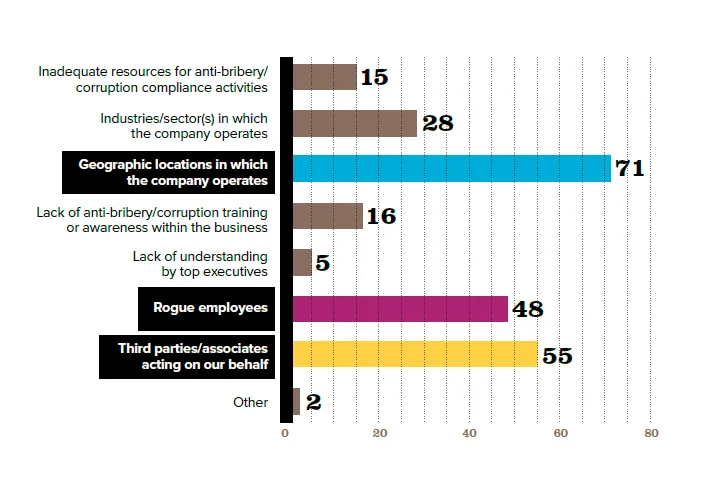
由于几个原因,我正在尝试复制如下所示的奇怪图表。它违反了许多良好数据可视化的原则,因此为了培训目的,我的目标是使用ggplot2并逐步去除或修改选择不当的特征。使用在底部复制的数据和图表下面的代码,我已经接近成功,但一直无法找到一种方法来包含一个值得注意的功能。
问题:是否有一种方法可以复制黑色阴影矩形框住的三个刻度标签? (如果有,可以轻松创建另一个因子变量来识别那三个标签,并将它们的字体更改为白色。)
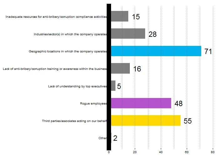
ggplot(plotpg19, aes(x = risks, y = scores, fill = colors)) +
  geom_bar(stat = "identity", width = 0.6) +
  scale_fill_manual(values = c("grey50", "deepskyblue2", "mediumorchid3", "gold")) +
  geom_text(aes(label = scores), hjust = -0.4, size = 8, face = "bold") +
  coord_flip() +
  theme_bw() + labs(x = NULL, y = NULL) +
  theme(panel.grid.major = element_blank()) +
  guides(fill = FALSE) +
  scale_y_continuous(breaks = seq(0, 100, 20), labels = seq(0, 100, 20), expand = c(0, 0)) +
  theme(
    panel.border = element_blank(),
    axis.line = element_line(colour = "black", size = 5, linetype = "solid", lineend = "square")
  ) +
  geom_hline(yintercept = seq(0, 80, 10), colour = "grey30", size = .5, linetype = "dotted") +
  theme(axis.line.x = element_blank()) # to get a single axis border, must format both and then blank one
顺便说一句,这个问题使用符号作为刻度标签可能提供了一些使用grImport包的见解,但它的教程对我来说太过深奥,我正在寻找一个在指定刻度标签周围绘制阴影框的方法。
plotpg19 <- structure(list(risks.format = structure(c(2L, 3L, 1L, 4L, 5L,
  7L, 8L, 6L), .Label = c("Geographic locations in which\n                                 the company operates",
  "Inadequate resources for anti-bribery/\ncorruption compliance activities",
  "Industries/sector(s) in which\n                                 the company operates",
  "Lack of anti-bribery/corruption training\n                                 or awareness within the business",
  "Lack of understanding\n                                 by top executives",
  "Other", "Rogue employees", "Third parties/associates\n                                 acting on our behalf"
  ), class = "factor"), risks = structure(c(8L, 7L, 6L, 5L, 4L,
  3L, 2L, 1L), .Label = c("Other", "Third parties/associates acting on our behalf",
  "Rogue employees", "Lack of understanding by top executives",
  "Lack of anti-bribery/corruption training or awareness within the business",
  "Geographic locations in which the company operates", "Industries/sector(s) in which the company operates",
  "Inadequate resources for anti-bribery/corruption compliance activities"
  ), class = "factor"), scores = c(15, 28, 71, 16, 5, 48, 55, 2
  ), colors = c("A", "A", "B", "A", "A", "C", "D", "A")), .Names = c("risks.format",
  "risks", "scores", "colors"), row.names = c(NA, -8L), class = "data.frame")
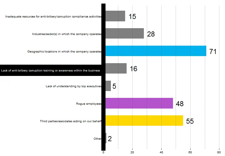
ggplot_build和ggplot_gtable来获取图形的网格版本,最后手动编辑适当的 grobs。 - Brian Diggs