用ggplot绘制回归线和正态分布叠加。

4

我正在尝试制作一个图表,以展示 logistic(或 probit)回归背后的直觉。我该如何使用 ggplot 制作类似于这样的图表?

Wolf & Best, The Sage Handbook of Regression Analysis and Causal Inference, 2015, p. 155

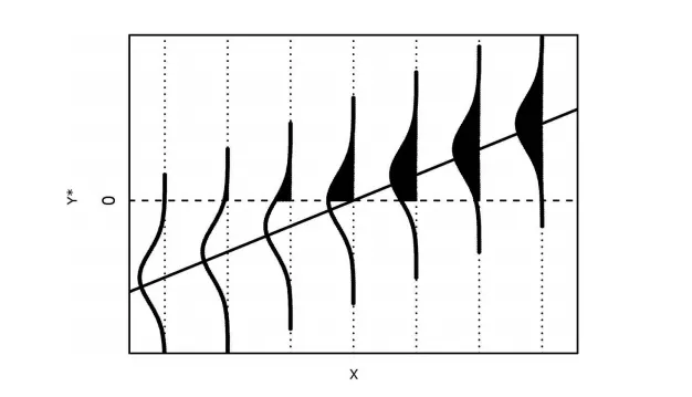
(Wolf & Best,《回归分析和因果推断的贤者手册》,2015年,第155页)

实际上,我更希望在y轴上显示一个单一的正态分布,均值为0,具有特定的方差,这样我就可以从线性预测器到y轴和侧向正态分布画出水平线。类似于这样:
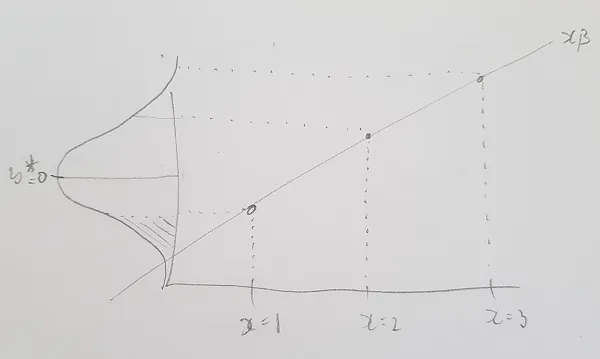
这段内容(假设我没有误解)所要展示的是 equation。到目前为止,我的进展不太顺利...

library(ggplot2)

x <- seq(1, 11, 1)
y <- x*0.5

x <- x - mean(x)
y <- y - mean(y)

df <- data.frame(x, y)

# Probability density function of a normal logistic distribution 
pdfDeltaFun <- function(x) {
  prob = (exp(x)/(1 + exp(x))^2)
  return(prob)
}

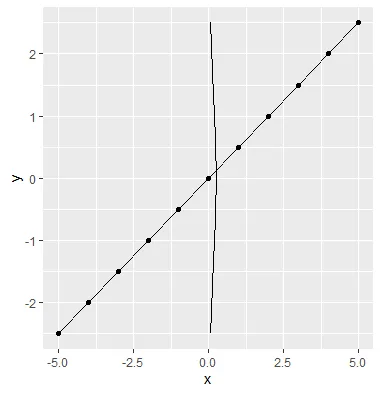
# Tried switching the x and y to be able to turn the 
# distribution overlay 90 degrees with coord_flip()
ggplot(df, aes(x = y, y = x)) + 
  geom_point() + 
  geom_line() + 
  stat_function(fun = pdfDeltaFun)+ 
  coord_flip() 

enter image description here

1个回答

4

我认为这非常接近你给出的第一张图解。如果这是一个你不需要重复多次的事情,最好在绘图之前计算密度曲线,并使用单独的数据框来绘制这些曲线。

library(ggplot2)

x <- seq(1, 11, 1)
y <- x*0.5

x <- x - mean(x)
y <- y - mean(y)

df <- data.frame(x, y)

# For every row in `df`, compute a rotated normal density centered at `y` and shifted by `x`
curves <- lapply(seq_len(NROW(df)), function(i) {
  mu <- df$y[i]
  range <- mu + c(-3, 3)
  seq <- seq(range[1], range[2], length.out = 100)
  data.frame(
    x = -1 * dnorm(seq, mean = mu) + df$x[i],
    y = seq,
    grp = i
  )
})
# Combine above densities in one data.frame
curves <- do.call(rbind, curves)


ggplot(df, aes(x, y)) +
  geom_point() +
  geom_line() +
  # The path draws the curve
  geom_path(data = curves, aes(group = grp)) +
  # The polygon does the shading. We can use `oob_squish()` to set a range.
  geom_polygon(data = curves, aes(y = scales::oob_squish(y, c(0, Inf)),group = grp))

第二个图示非常接近于您的代码。我通过标准正态密度函数简化了您的密度函数,并向stat函数添加了一些额外的参数:

library(ggplot2)

x <- seq(1, 11, 1)
y <- x*0.5

x <- x - mean(x)
y <- y - mean(y)

df <- data.frame(x, y)

ggplot(df, aes(x, y)) +
  geom_point() +
  geom_line() +
  stat_function(fun = dnorm,
                aes(x = after_stat(-y * 4 - 5), y = after_stat(x)),
                xlim = range(df$y)) +
  # We fill with a polygon, squishing the y-range
  stat_function(fun = dnorm, geom = "polygon",
                aes(x = after_stat(-y * 4 - 5), 
                    y = after_stat(scales::oob_squish(x, c(-Inf, -1)))),
                xlim = range(df$y))


非常感谢您的快速帮助!我需要花些时间来理解您所做的一切,但它们已经看起来非常不错了! - hendogg87

网页内容由stack overflow 提供, 点击上面的
可以查看英文原文,
原文链接