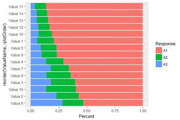
我被要求制作一个堆积条形图,其中的条和值按照精确的方式堆叠和排序。
在本例中,“A3”在左侧,“A2”在中间,“A1”在右侧,我已经完成了这个要求。
问题在于,我还被要求按“A1”的值的降序顺序对条进行排序。在本例中,这意味着“Value 11”出现在顶部,按顺序降序排列到“Value 6”。条的排序记录在向量“plotOrder”中,我尝试使用它在下面的代码中实现一些东西。
在SO上搜索有关排序堆积条形图的许多问题中,我没有找到一个问题或答案描述或解决这个特定的问题。非常感谢您的任何帮助。
下面的简化代码下载了一些随机数据,其形式与我目前正在使用的相同,并生成了以下图表。
在本例中,“A3”在左侧,“A2”在中间,“A1”在右侧,我已经完成了这个要求。
问题在于,我还被要求按“A1”的值的降序顺序对条进行排序。在本例中,这意味着“Value 11”出现在顶部,按顺序降序排列到“Value 6”。条的排序记录在向量“plotOrder”中,我尝试使用它在下面的代码中实现一些东西。
在SO上搜索有关排序堆积条形图的许多问题中,我没有找到一个问题或答案描述或解决这个特定的问题。非常感谢您的任何帮助。
下面的简化代码下载了一些随机数据,其形式与我目前正在使用的相同,并生成了以下图表。
library(ggplot2)

stackedBarPlot <-
        ggplot(data) +
        aes(x = ValueName, y = Percent, fill = reorder(Response, plotOrder)) +
        geom_bar(position = "fill", stat = "identity") +
        coord_flip()
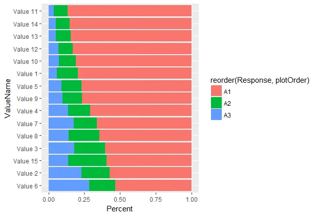
这将生成此图表:
数据:
structure(list(ValueName = c("Value 11", "Value 14", "Value 13",
"Value 12", "Value 10", "Value 1", "Value 5", "Value 9", "Value 4",
"Value 7", "Value 8", "Value 3", "Value 15", "Value 2", "Value 6",
"Value 11", "Value 14", "Value 13", "Value 12", "Value 10", "Value 1",
"Value 5", "Value 9", "Value 4", "Value 7", "Value 8", "Value 3",
"Value 15", "Value 2", "Value 6", "Value 11", "Value 14", "Value 13",
"Value 12", "Value 10", "Value 1", "Value 5", "Value 9", "Value 4",
"Value 7", "Value 8", "Value 3", "Value 15", "Value 2", "Value 6"
), plotOrder = c(1L, 2L, 3L, 4L, 5L, 6L, 7L, 8L, 9L, 10L, 11L,
12L, 13L, 14L, 15L, 1L, 2L, 3L, 4L, 5L, 6L, 7L, 8L, 9L, 10L,
11L, 12L, 13L, 14L, 15L, 1L, 2L, 3L, 4L, 5L, 6L, 7L, 8L, 9L,
10L, 11L, 12L, 13L, 14L, 15L), Response = c("A1", "A1", "A1",
"A1", "A1", "A1", "A1", "A1", "A1", "A1", "A1", "A1", "A1", "A1",
"A1", "A2", "A2", "A2", "A2", "A2", "A2", "A2", "A2", "A2", "A2",
"A2", "A2", "A2", "A2", "A2", "A3", "A3", "A3", "A3", "A3", "A3",
"A3", "A3", "A3", "A3", "A3", "A3", "A3", "A3", "A3"), Percent = c(86.5,
85.3, 84.5, 83.2, 81, 79.5, 77, 76.7, 71, 66.2, 64.5, 60.5, 59.6,
57.2, 53.2, 9.9, 9.4, 10.2, 9.9, 11.8, 14.7, 13.9, 13.5, 15.1,
16.1, 21.3, 21.3, 26.6, 19.8, 18.5, 3.6, 5.3, 5.3, 6.9, 7.2,
5.8, 9, 9.8, 13.9, 17.7, 14.1, 18.2, 13.8, 22.9, 28.2)), .Names = c("ValueName",
"plotOrder", "Response", "Percent"), row.names = c(NA, -45L), class = c("tbl_df",
"tbl", "data.frame"))
非常感谢您提供任何建议或解决方案。